US Economy Archive:
US Housing Prices, Nominal and Real (1890-2010)
In: History Housing US Economy
25 Mar 2011Housing prices trends don’t look the same if you adjust for inflation.
On a side note, the designer of the above, Catherine Mulbrandon over at Visualizing Economics, has a kickstarter campaign to fund production of a new publication on US Income. She does great work and I recommend you donate, if so inclined.
Update: Economic Indicators Dashboard
23 Mar 2011One of my favorite economic dashboards. It highlights major macro indicators, what direction they are trending, and what the typical ranges are. It also lets you drill down to explanations of why you should care, and historical values.
The Wonderful Work of Karl Hartig
In: Culture Employment Finance Graphic Design (general) History Innovative Politics Science US Economy
22 Mar 2011Karl Hartig was creating beautiful complex data visualizations back when most of us “graphics experts” were still trying to figure out how to change colors in excel. Here is a selection of his work on population, electronics, energy, stocks, immigration, politics, and music. Soak it up!
Bailout Scorecard
18 Mar 2011Despite media spin, the United States is a long way from getting all of the bailout money back. (via Ritholtz)
US GDP Per Capita (1871-2009)
In: History US Economy
9 Mar 2011I’m just posting this into the chart rolodex in case I ever have a need for it. Long time series can be a surprisingly big pain in the ass to pull together. Case in point: I had never seen the site MeasuringWorth before (which is where this data came from). Nice!
Projections of when China’s GDP will be bigger than the USA’s, based on several different growth rates. There’s also an interactive version.
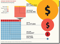
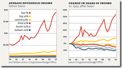
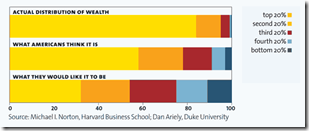
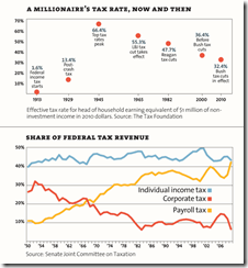
It’s the Inequality Stupid
22 Feb 2011“Eight charts that explain everything that’s wrong with America”, from Mother Jones. (Thanks to Matt Brown for the link!)
American Shame
In: Culture Employment Global Economy Science Source: NYT US Economy
21 Feb 2011How America compares to other industrial countries based on a variety of basic indicators (income inequality, life expectancy, education) as well as some uncommon ones (prison population, level of democracy, and “wellbeing”). Conclusion: America is not #1! Can anyone think of indicators that WOULD make us look good in this crowd?
Inflation: The Details
18 Feb 2011Sure, inflation in January was only 1.6%:
but there’s a lot of variation in the products that make up the CPI (butter was up 19.6% y-y, for example), which this tool from the WSJ lets you explore:
Want to know how the CPI weights all of these goods? Check out this oldie but goodie:
Consumer debt is down, though nobody knows whether that’s a sign of changing consumer habits or changing banker habits. (related article)
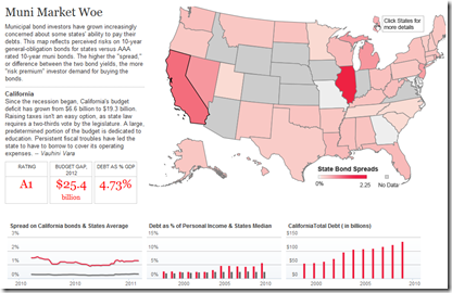
Muni Market Woes
10 Feb 2011There’s a lot of attention on the national debt, but states are in even deeper trouble. In part because investors don’t trust them to get their act together, resulting in lower ratings and higher borrowing costs. The below clickable map lets you view debt levels and interest rate spreads by state.
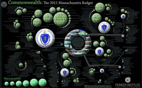
And while we’re talking about state fiscal policies, here’s a beautiful representation of the Massachusetts 2011 budget:
I have realized, after numerous conversations about politics and economics, that many people haven’t grasped that the economy doesn’t work the same way it did when they were growing up. As a commenter on The Big Picture said:
The role of a healthy financial sector is to support the “real economy”. But now it’s the opposite, like the tail wagging the dog.
Birth Year Inflation
In: US Economy
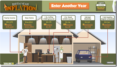
31 Jan 2011Type in the year you were born and see how the average incomes and the prices of houses, coffee, steak, electricity, and gasoline have changed. These kinds of broad comparisons are always statistically weak (a house how big? what job? etc) but it’s still kind of entertaining. (via The Big Picture)
The US Economy in Two Visualizations
In: Employment Finance Housing Interactive Maps Updated regularly US Economy
22 Jan 2011If you want to know the state of the US economy at any time, check out the below visualizations from Russell Investments and the AP. They are both updated monthly with the latest data, allow all kinds of drilling down, and both take the time to document sources and explain why you should give a shit about these particular numbers (for example, click on any of the “historical details” links on Russell’s dashboard).
How the Recession Changed Us
In: Culture History US Economy
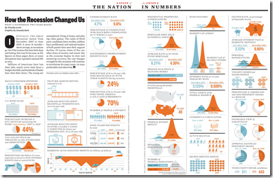
14 Jan 2011I’ve tried to avoid posting most of the trite “end of the year” infographics, but this one from the Atlantic comparing today to before the recession is interesting. (via)
What is Chart Porn?
An addictive collection of beautiful charts, graphs, maps, and interactive data visualization toys -- on topics from around the world.
Categories
- Bailout (118)
- Chartporn Related (3)
- Commentary (21)
- Culture (669)
- Emerging Markets (66)
- Employment (245)
- Environment/weather (133)
- Finance (298)
- Food (92)
- Global Economy (373)
- Graphic Design (bad) (26)
- Graphic Design (general) (183)
- Graphic Tools (23)
- History (158)
- Housing (162)
- Humor (204)
- Innovative (183)
- Interactive (545)
- Internet/tech (97)
- Maps (578)
- News Media (34)
- Politics (329)
- Reference (97)
- Science (331)
- Source: Economist (101)
- Source: FT (92)
- Source: NYT (147)
- Source: Ritholtz (76)
- Source: USA Today (27)
- Source: Washington Post (90)
- Source: WSJ (135)
- Sports (58)
- Stock Market (74)
- Uncategorized (2)
- Updated regularly (76)
- US Economy (553)
- Video (22)
- Aram Korevaar: This chart is now being used as a projection in which countries such as China see themselves as in a [...]
- David: Welcome back Chart Porn! [...]
- J S: Thanks for the great story. Miss reading this blog. Hope to see you more active again. [...]
- jake: I lived in a DC row house for 6 years, and I'm writing this comment from my tiny 1 bedroom apartment [...]
- ronny pettersen: Hilarious and unfortunately accurate... ;-) [...]


