US Economy Archive:
Too Big to Fail
30 Jun 2011A pretty comprehensive explanation of the financial crisis. (via The Big Picture)
Update: Economic Indicators Dashboard
23 Jun 2011My favorite economic status tool. Point and/or click on anything and everything to learn something new about the economy, and why you should care.
(Not) Spreading the Wealth
20 Jun 2011Try Your Hand at Saving Social Security
18 Jun 2011Interactive tool from the WSJ. Select benefit reductions, tax increases, and/or benefit increases to see if you can make it solvent. (note: to get around WSJ paywall, google search for “saving social security wsj” then jump to the tool using the result there)
What is Causing the Deficit?
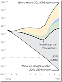
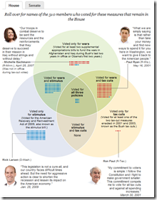
14 Jun 2011A number of these charts have been making the rounds, using different measures. Some of the projections obviously have to be taken with a grain of salt, but the basic message appears to be that letting the Bush era tax cuts expire would relieve a lot of budget pressure. Each of the links below go to fairly in-depth blog posts.

US Military Spending
10 Jun 2011Immigrants Highly Skilled
9 Jun 2011Despite public perception of immigrants as being poorly educated, the high-skilled U.S. immigrant population today outnumbers the low-skilled population. (related article; original study)
On the left, a comparison of budget proposals. On the right, a videographic that is sort of “debt ceiling for dummies”. Both from the Washington Post.
Housing Double Dip
In: Housing US Economy
31 May 2011Even with the low interest rates, housing prices continue to tank (with only Washington, DC showing an increase).
Where are the Jobs?
In: Employment Interactive Source: Washington Post US Economy
20 May 2011A fantastic annotated heatmap from the Washington Post breaking down job creation/loss by sector. On the right is an interactive, slightly more annotated, line chart version of the same data. I prefer the heatmap. (related article)
State Budget Crises
In: Interactive Maps Politics Source: Washington Post US Economy
26 Apr 2011The Washington Post has mapped out a bunch of interesting stats concerning States’ Budget problems: shortfalls, pension liabilities, proposed cuts (health care, education, etc), and who is in charge. To sum up: this is yet another way we’re screwed beyond belief. (related article)
Update: Economic Indicators Dashboard
25 Apr 2011Top Tax Rates (1916-2010)
15 Apr 2011More excellent work from VisualizingEconomics:
An 85 foot long annotated timeline of early American financial and industrial history. Similar to the 1775-1943 Booms and Busts timeline I posted last year, this one isn’t quite as technical, but the historical notes are fascinating: 1877: “Guaranteed Mtges coming into use”, 1899: “100 taxis in New York”, 1910: “Movie censorship being demanded”. (via)
Patchwork Nation
28 Mar 2011Patchwork Nation tracks a number of traditional economic and social indicators over time – but they also include some interesting alternative ones:
What is Chart Porn?
An addictive collection of beautiful charts, graphs, maps, and interactive data visualization toys -- on topics from around the world.
Categories
- Bailout (118)
- Chartporn Related (3)
- Commentary (21)
- Culture (669)
- Emerging Markets (66)
- Employment (245)
- Environment/weather (133)
- Finance (298)
- Food (92)
- Global Economy (373)
- Graphic Design (bad) (26)
- Graphic Design (general) (183)
- Graphic Tools (23)
- History (158)
- Housing (162)
- Humor (204)
- Innovative (183)
- Interactive (545)
- Internet/tech (97)
- Maps (578)
- News Media (34)
- Politics (329)
- Reference (97)
- Science (331)
- Source: Economist (101)
- Source: FT (92)
- Source: NYT (147)
- Source: Ritholtz (76)
- Source: USA Today (27)
- Source: Washington Post (90)
- Source: WSJ (135)
- Sports (58)
- Stock Market (74)
- Uncategorized (2)
- Updated regularly (76)
- US Economy (553)
- Video (22)
- Aram Korevaar: This chart is now being used as a projection in which countries such as China see themselves as in a [...]
- David: Welcome back Chart Porn! [...]
- J S: Thanks for the great story. Miss reading this blog. Hope to see you more active again. [...]
- jake: I lived in a DC row house for 6 years, and I'm writing this comment from my tiny 1 bedroom apartment [...]
- ronny pettersen: Hilarious and unfortunately accurate... ;-) [...]


