US Economy Archive:
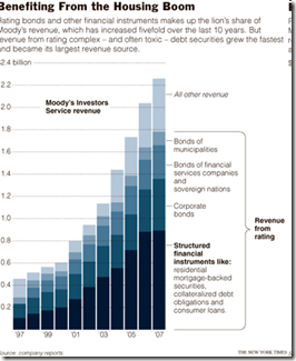
Wall Street Rating Profits
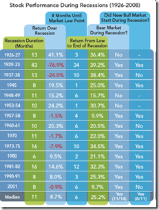
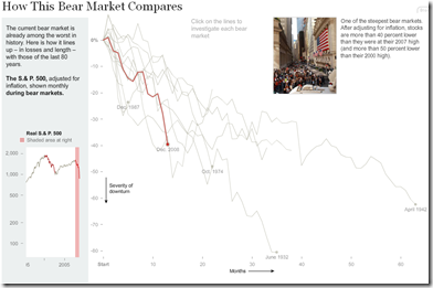
6 Dec 2008Equities During Recessions
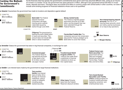
2 Dec 2008Bailout through November
26 Nov 2008Michael Lewis on Wall Street’s Screw-up
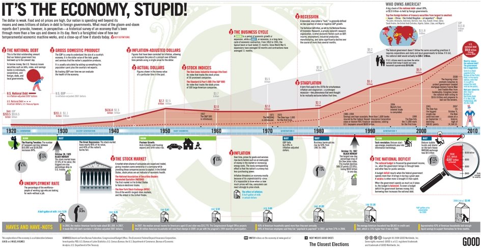
11 Nov 2008Politics and Economics
In: Commentary Employment Source: NYT Stock Market US Economy
18 Oct 2008Past Equity Crises
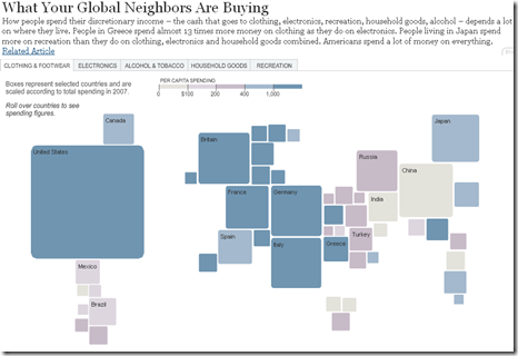
11 Oct 2008Global Consumption
4 Sep 2008A nice interactive chart showing what the world spends it’s money on. Click on the tabs at the top to see different sectors.
(note: September data. it’d be nice if they kept this updated)
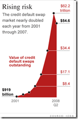
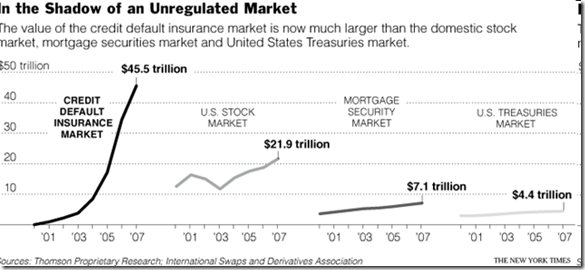
CDS Market Size
1 Sep 2008What is Chart Porn?
An addictive collection of beautiful charts, graphs, maps, and interactive data visualization toys -- on topics from around the world.
Categories
- Bailout (118)
- Chartporn Related (3)
- Commentary (21)
- Culture (669)
- Emerging Markets (66)
- Employment (245)
- Environment/weather (133)
- Finance (298)
- Food (92)
- Global Economy (373)
- Graphic Design (bad) (26)
- Graphic Design (general) (183)
- Graphic Tools (23)
- History (158)
- Housing (162)
- Humor (204)
- Innovative (183)
- Interactive (545)
- Internet/tech (97)
- Maps (578)
- News Media (34)
- Politics (329)
- Reference (97)
- Science (331)
- Source: Economist (101)
- Source: FT (92)
- Source: NYT (147)
- Source: Ritholtz (76)
- Source: USA Today (27)
- Source: Washington Post (90)
- Source: WSJ (135)
- Sports (58)
- Stock Market (74)
- Uncategorized (2)
- Updated regularly (76)
- US Economy (553)
- Video (22)
- Aram Korevaar: This chart is now being used as a projection in which countries such as China see themselves as in a [...]
- David: Welcome back Chart Porn! [...]
- J S: Thanks for the great story. Miss reading this blog. Hope to see you more active again. [...]
- jake: I lived in a DC row house for 6 years, and I'm writing this comment from my tiny 1 bedroom apartment [...]
- ronny pettersen: Hilarious and unfortunately accurate... ;-) [...]







A Failure of Leadership?
In: Commentary Source: Washington Post Stock Market US Economy
10 Dec 2008An interesting article on why nothing was done before the crisis exploded:
http://www.washingtonpost.com/wp-dyn/content/article/2008/12/09/AR2008120902816_pf.html
and a related online discussion:
http://www.washingtonpost.com/wp-dyn/content/discussion/2008/12/09/DI2008120901766.html?sid=ST2008120903238&s_pos=list