US Economy Archive:
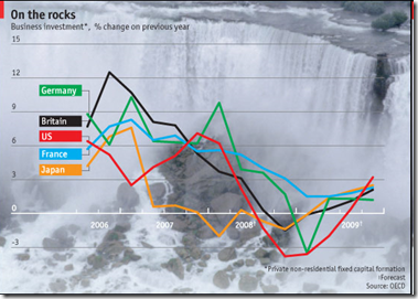
Key Interest Rates end-2008
30 Dec 2008Projections from the OECD via the Economist.
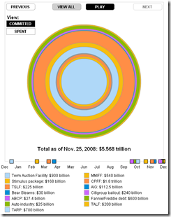
Animated Bailout Guide (another)
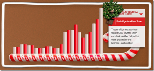
23 Dec 200812 Days of Christmas Price Index
23 Dec 2008Interactive chart of the prices of each item from the “12 days of Christmas” song (partridges in a pear tree are way up!)
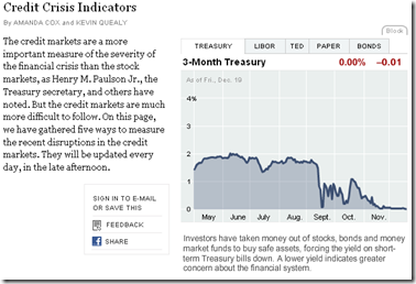
Daily Crisis Indicators
In: Finance Interactive Source: NYT Updated regularly US Economy
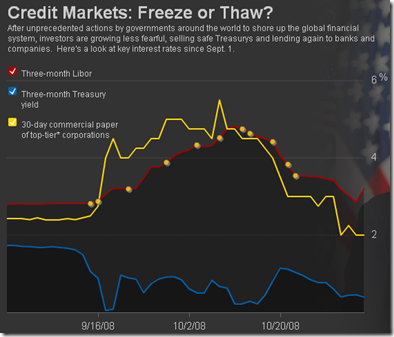
22 Dec 2008The NYT has an interactive chart that shows the Treasury rates, Libor, Ted Spread, commercial paper, and bond yields, updated daily.
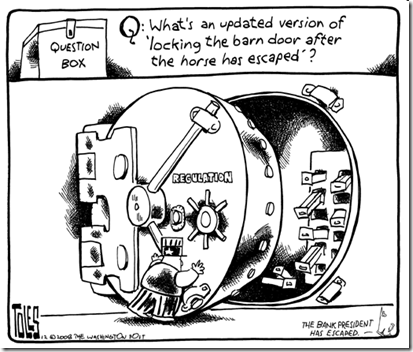
That Horse Has Left the Barn
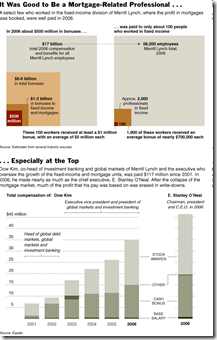
21 Dec 2008Wall Street Compensation
18 Dec 2008Related Article: http://www.nytimes.com/2008/12/18/business/18pay.html?_r=1
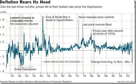
Deflation
17 Dec 2008Show Me the Tarp Money
In: Bailout Finance Interactive Source: NYT Stock Market US Economy
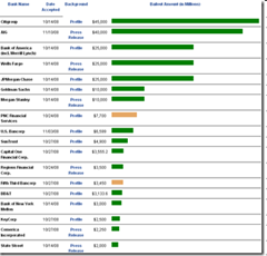
16 Dec 2008A regularly updated summary of what institutions are getting aid:
or, The NYT version: http://projects.nytimes.com/creditcrisis/recipients/table
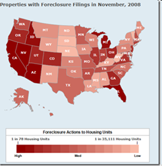
Foreclosures up 28% in November
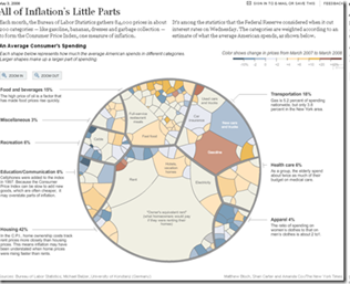
12 Dec 2008Inflation
12 Dec 2008What is Chart Porn?
An addictive collection of beautiful charts, graphs, maps, and interactive data visualization toys -- on topics from around the world.
Categories
- Bailout (118)
- Chartporn Related (3)
- Commentary (21)
- Culture (669)
- Emerging Markets (66)
- Employment (245)
- Environment/weather (133)
- Finance (298)
- Food (92)
- Global Economy (373)
- Graphic Design (bad) (26)
- Graphic Design (general) (183)
- Graphic Tools (23)
- History (158)
- Housing (162)
- Humor (204)
- Innovative (183)
- Interactive (545)
- Internet/tech (97)
- Maps (578)
- News Media (34)
- Politics (329)
- Reference (97)
- Science (331)
- Source: Economist (101)
- Source: FT (92)
- Source: NYT (147)
- Source: Ritholtz (76)
- Source: USA Today (27)
- Source: Washington Post (90)
- Source: WSJ (135)
- Sports (58)
- Stock Market (74)
- Uncategorized (2)
- Updated regularly (76)
- US Economy (553)
- Video (22)
- Aram Korevaar: This chart is now being used as a projection in which countries such as China see themselves as in a [...]
- David: Welcome back Chart Porn! [...]
- J S: Thanks for the great story. Miss reading this blog. Hope to see you more active again. [...]
- jake: I lived in a DC row house for 6 years, and I'm writing this comment from my tiny 1 bedroom apartment [...]
- ronny pettersen: Hilarious and unfortunately accurate... ;-) [...]







Buybacks and Dividends
In: Bailout Commentary Stock Market US Economy
10 Dec 2008Floyd Norris — NYT
December 10, 2008, 11:31 am
Shareholder Value
Three numbers, courtesy of Howard Silverblatt of Standard & Poor’s, shed some light on what companies did with their cash during boom times:
Over the last four years, since the buyback boom began, from the fourth quarter of 2004 through the third quarter of 2008, companies in the S.&P. 500 showed:
Reported earnings: $2.42 trillion
Stock buybacks: $1.73 trillion
Dividends: $0.91 trillion
As a group, every dime they made, and more, went to shareholders. Roughly $2 went to shareholders who sold out for every $1 that was paid in dividends to shareholders who held on to their shares.
article and discussion: http://norris.blogs.nytimes.com/2008/12/10/shareholder-value/