US Economy Archive:
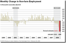
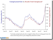
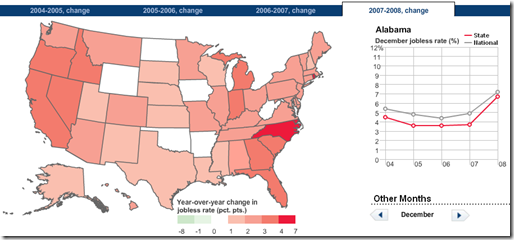
US Unemployment (Jan data)
In: Employment US Economy
6 Feb 2009Interactive drill-down map. Related article
FED Lending Instruments
22 Jan 2009A very nice table showing all of the FED’s Lending instruments and conditions:
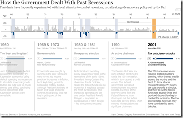
Past Recessions
22 Jan 2009Interactive narrated summary of previous US recessions, from NYT.
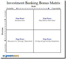
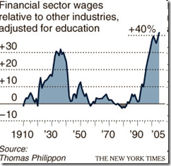
Wall Street Wages
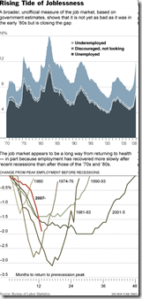
22 Jan 2009US Unemployment vs other Recessions
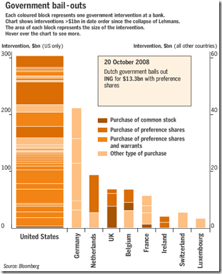
20 Jan 2009EU and US Bailouts
In: Bailout Finance Global Economy Interactive Source: FT US Economy
16 Jan 2009Currency Maps
In: Global Economy Interactive Maps Source: FT Updated regularly US Economy
7 Jan 2009From FT: An interactive map that shows the relative performance of a currency against other major currencies for a range of time periods (today, 5day,. up to 1 year)
[Note: There is no direct link to the map (silly java), you have to click on the “Currency Macromap Launch now” window on this page]
A similar heatmap (with more currency coverage) is available at Oanda.com
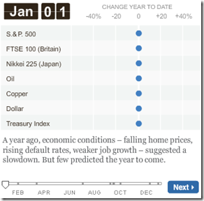
2008 in Review
5 Jan 2009An animated calendar of major indicators, showing max and min as it goes (click on the “Next” button to run it through).
What is Chart Porn?
An addictive collection of beautiful charts, graphs, maps, and interactive data visualization toys -- on topics from around the world.
Categories
- Bailout (118)
- Chartporn Related (3)
- Commentary (21)
- Culture (669)
- Emerging Markets (66)
- Employment (245)
- Environment/weather (133)
- Finance (298)
- Food (92)
- Global Economy (373)
- Graphic Design (bad) (26)
- Graphic Design (general) (183)
- Graphic Tools (23)
- History (158)
- Housing (162)
- Humor (204)
- Innovative (183)
- Interactive (545)
- Internet/tech (97)
- Maps (578)
- News Media (34)
- Politics (329)
- Reference (97)
- Science (331)
- Source: Economist (101)
- Source: FT (92)
- Source: NYT (147)
- Source: Ritholtz (76)
- Source: USA Today (27)
- Source: Washington Post (90)
- Source: WSJ (135)
- Sports (58)
- Stock Market (74)
- Uncategorized (2)
- Updated regularly (76)
- US Economy (553)
- Video (22)
- Aram Korevaar: This chart is now being used as a projection in which countries such as China see themselves as in a [...]
- David: Welcome back Chart Porn! [...]
- J S: Thanks for the great story. Miss reading this blog. Hope to see you more active again. [...]
- jake: I lived in a DC row house for 6 years, and I'm writing this comment from my tiny 1 bedroom apartment [...]
- ronny pettersen: Hilarious and unfortunately accurate... ;-) [...]

