US Economy Archive:
Top 20 Financial Institutions, 1999-2009
In: Finance Global Economy Interactive Source: FT US Economy
23 Mar 2009Click on a bank to highlight it, then move the year slider at the bottom to watch the rankings change
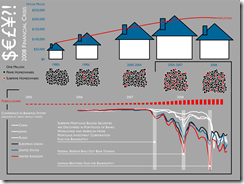
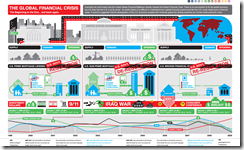
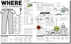
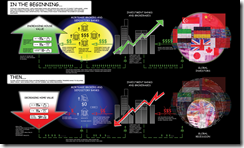
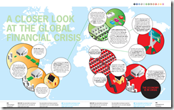
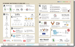
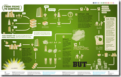
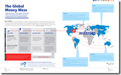
I recently came across FlowingData, a fantastic blog of data analysis and graphic design. Nathan covers a lot of the same territory that I do here, but casts a much broader net and has a lot of discussion about the design methods and tools of the trade. This post about Financial Crisis visualizations is a great example. The links below are to graphics I haven’t posted before (most of which are from a Good Magazine contest).
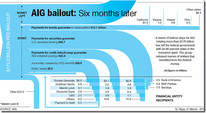
AIG Bailout
In: Bailout US Economy
23 Mar 2009A nice chart by Nicolas Rapp and a team at Associated Press.
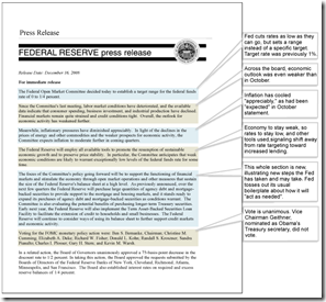
Parsing the FED (updated Mar 18)
18 Mar 2009The Wall Street Journal provides an "interpretation" of most FED press releases, comparing them to previous statements.
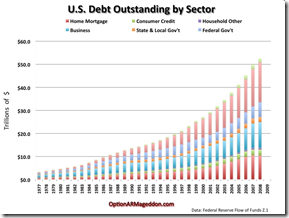
US Debt
13 Mar 2009Ritholtz via option ARMageddon.
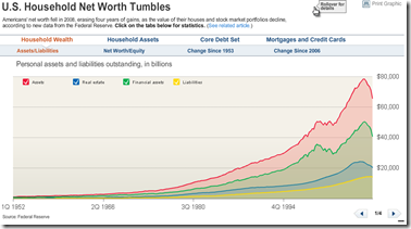
Household Net Worth down $11 trillion
13 Mar 2009Lots of good analyses here. click on the tabs for differ datasets and presentations. Related article.
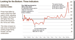
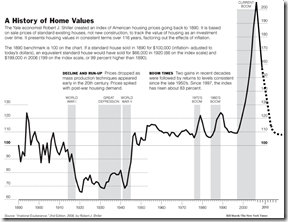
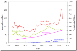
Nice Presentation of the Shiller Index
9 Mar 2009Most people are familiar with how this is calculated, but if you’re not:
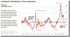
While we’re at it, here’s the famous long term chart and explanation:
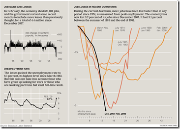
US Job losses (Feb data)
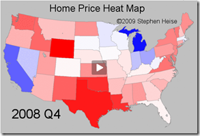
7 Mar 2009US Home Price Heat Map 1975-2008
6 Mar 2009Another Look at Unemployment (3/5 update)
In: Employment Interactive Source: WSJ Updated regularly US Economy
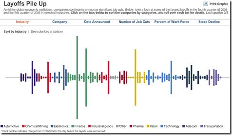
6 Mar 2009A funky look at layoffs that can be sorted in a number of different ways (industry, company, date, etc)
What is Chart Porn?
An addictive collection of beautiful charts, graphs, maps, and interactive data visualization toys -- on topics from around the world.
Categories
- Bailout (118)
- Chartporn Related (3)
- Commentary (21)
- Culture (669)
- Emerging Markets (66)
- Employment (245)
- Environment/weather (133)
- Finance (298)
- Food (92)
- Global Economy (373)
- Graphic Design (bad) (26)
- Graphic Design (general) (183)
- Graphic Tools (23)
- History (158)
- Housing (162)
- Humor (204)
- Innovative (183)
- Interactive (545)
- Internet/tech (97)
- Maps (578)
- News Media (34)
- Politics (329)
- Reference (97)
- Science (331)
- Source: Economist (101)
- Source: FT (92)
- Source: NYT (147)
- Source: Ritholtz (76)
- Source: USA Today (27)
- Source: Washington Post (90)
- Source: WSJ (135)
- Sports (58)
- Stock Market (74)
- Uncategorized (2)
- Updated regularly (76)
- US Economy (553)
- Video (22)
- Aram Korevaar: This chart is now being used as a projection in which countries such as China see themselves as in a [...]
- David: Welcome back Chart Porn! [...]
- J S: Thanks for the great story. Miss reading this blog. Hope to see you more active again. [...]
- jake: I lived in a DC row house for 6 years, and I'm writing this comment from my tiny 1 bedroom apartment [...]
- ronny pettersen: Hilarious and unfortunately accurate... ;-) [...]


