US Economy Archive:
US Intervention Programs
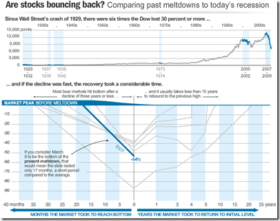
8 Apr 2009Recession Comparison
8 Apr 2009Interactive toy that bases recessions around the “bottoms”, from nicolasrapp.
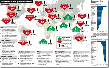
Global Recession Summary
2 Apr 2009Market Tree Map
In: Finance Interactive Maps Reference Stock Market Updated regularly US Economy
2 Apr 2009A tree map of more than 500 stocks, updated every 15 minutes. Click on the roll-over popups to bring up a pretty detailed drill down menu.
Stock Market Heat Map
In: Global Economy Interactive Maps Source: WSJ Stock Market US Economy
1 Apr 2009Interactive map of equity market performance (click on tabs to switch between quarters; click on dots for values)
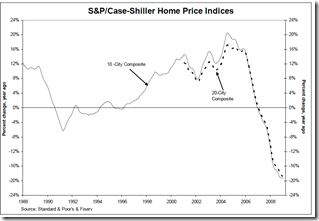
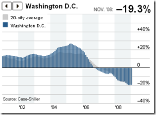
Housing Continues to Tank (Jan 09 data)
1 Apr 2009What Will It Take to Stabilize the Banks?
30 Mar 2009A decent article by Martin Baily and Douglas Elliot on how big the crisis is – and comparisons of different estimates of the remaining problem:
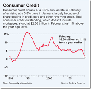
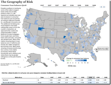
Consumer Loan Balances
30 Mar 2009(note: appears to have some display problems related to updating the table at the bottom – it takes a few seconds for the map to update)
G-20 Stimulus Spending
In: Bailout Commentary Finance Global Economy Interactive Maps Source: Washington Post US Economy
30 Mar 2009Related Washington Post article.
Of course, not being in terms of GDP, that isn’t the best perspective.
Here’s the original data from Brookings:
And here’s a nice interactive heatmap of the plans (roll-over for country details):
Read These Now
27 Mar 2009 It’s been a slow week graphic-wise, but I came across two fantastic articles on the crisis — can’t recommend them enough:
Matt Taibbi (Hunter S Thompson successor):
The Big Takeover
Simon Johnson (former IMF Chief Economist):
The Quiet Coup
State of the Economy (2/28 update)
In: Employment Finance Housing Interactive Source: Ritholtz Updated regularly US Economy
26 Mar 2009A very powerful interactive analytical presentation/tool.
From Russell Investments (via Ritholtz)
What is Chart Porn?
An addictive collection of beautiful charts, graphs, maps, and interactive data visualization toys -- on topics from around the world.
Categories
- Bailout (118)
- Chartporn Related (3)
- Commentary (21)
- Culture (669)
- Emerging Markets (66)
- Employment (245)
- Environment/weather (133)
- Finance (298)
- Food (92)
- Global Economy (373)
- Graphic Design (bad) (26)
- Graphic Design (general) (183)
- Graphic Tools (23)
- History (158)
- Housing (162)
- Humor (204)
- Innovative (183)
- Interactive (545)
- Internet/tech (97)
- Maps (578)
- News Media (34)
- Politics (329)
- Reference (97)
- Science (331)
- Source: Economist (101)
- Source: FT (92)
- Source: NYT (147)
- Source: Ritholtz (76)
- Source: USA Today (27)
- Source: Washington Post (90)
- Source: WSJ (135)
- Sports (58)
- Stock Market (74)
- Uncategorized (2)
- Updated regularly (76)
- US Economy (553)
- Video (22)
- Aram Korevaar: This chart is now being used as a projection in which countries such as China see themselves as in a [...]
- David: Welcome back Chart Porn! [...]
- J S: Thanks for the great story. Miss reading this blog. Hope to see you more active again. [...]
- jake: I lived in a DC row house for 6 years, and I'm writing this comment from my tiny 1 bedroom apartment [...]
- ronny pettersen: Hilarious and unfortunately accurate... ;-) [...]









Bubble, Bubble, Economic Trouble…
In: Commentary Finance Housing Source: Ritholtz Source: WSJ US Economy
8 Apr 2009Nice WSJ article on bubbles. (via Ritholtz)