US Economy Archive:
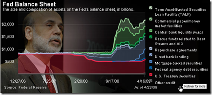
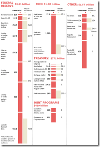
Fed Balance Sheet
24 Apr 2009Still falling…
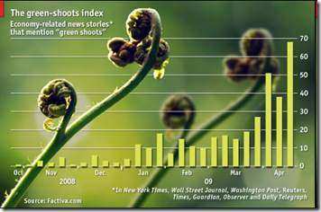
23 Apr 2009Green Shoots
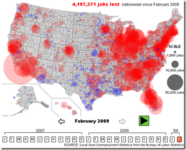
22 Apr 2009US Unemployment 2007-09
20 Apr 2009A nice interactive map showing the changes by month and the nationwide distribution.
(from Slate, via FlowingData)
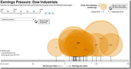
Dow Jones Quarterly Earnings
17 Apr 2009Financial Infographics
15 Apr 2009Some nice presentations from creditloan.com:
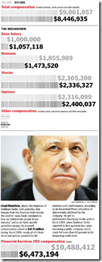
Why everyone hates AIG:
US Stimulus Package breakdown:
Corporate bailouts since 1970:
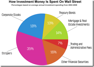
the USA’s credit rating (below left) and How investment money is spent on wall street (below right. and I knew it!)
Tax Day
In: Innovative US Economy
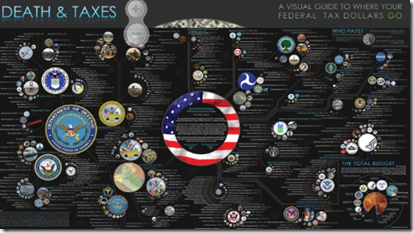
15 Apr 2009Classic infographic, updated with Obama’s 2009 budget request. Item circles are proportional in size to their spending totals.
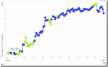
some random tax statistics (below left), and a motion bubble chart (below right) showing increase in tax burden since 1901 (note: you can change the axis to play with different stats; click on a bubble with “trails” on to draw the history)
Global Equity Performance Map
In: Emerging Markets Finance Global Economy Interactive Maps Source: FT Stock Market Updated regularly US Economy
14 Apr 2009Interactive map displays the performance of all the major global equity markets for today, or versus a selection of time periods (5days/10days/1month/etc up to a year). You can also click on any exchange to drill down to more information.
[Note: There is no direct link to the map (silly java), you have to click on the "Market Macromap" window on this page]
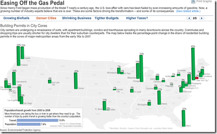
US Gasoline Consumption Falling?
14 Apr 2009Click along the header tabs to view different explanations/indicators of declining gas usage. Related article.
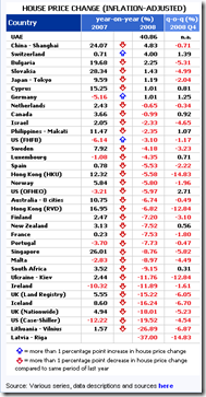
Global Property Prices
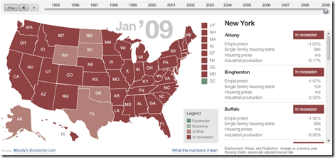
14 Apr 2009US Adversity Index
In: Employment Housing Interactive Maps Updated regularly US Economy
8 Apr 2009For major cities/states, based on employment, housing, and industrial production. Click on the slider to see monthly data back to 1994, click on a state to see cities on the right. (From MSNBC & Moody’s)
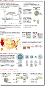
Economic State of the Union
In: Bailout Employment Finance Housing Source: Washington Post US Economy
8 Apr 2009A little dated now, but I didn’t come across the online version of this until today. it’d be nice if they kept it up to date.
Another Bailout Summary
8 Apr 2009What is Chart Porn?
An addictive collection of beautiful charts, graphs, maps, and interactive data visualization toys -- on topics from around the world.
Categories
- Bailout (118)
- Chartporn Related (3)
- Commentary (21)
- Culture (669)
- Emerging Markets (66)
- Employment (245)
- Environment/weather (133)
- Finance (298)
- Food (92)
- Global Economy (373)
- Graphic Design (bad) (26)
- Graphic Design (general) (183)
- Graphic Tools (23)
- History (158)
- Housing (162)
- Humor (204)
- Innovative (183)
- Interactive (545)
- Internet/tech (97)
- Maps (578)
- News Media (34)
- Politics (329)
- Reference (97)
- Science (331)
- Source: Economist (101)
- Source: FT (92)
- Source: NYT (147)
- Source: Ritholtz (76)
- Source: USA Today (27)
- Source: Washington Post (90)
- Source: WSJ (135)
- Sports (58)
- Stock Market (74)
- Uncategorized (2)
- Updated regularly (76)
- US Economy (553)
- Video (22)
- Aram Korevaar: This chart is now being used as a projection in which countries such as China see themselves as in a [...]
- David: Welcome back Chart Porn! [...]
- J S: Thanks for the great story. Miss reading this blog. Hope to see you more active again. [...]
- jake: I lived in a DC row house for 6 years, and I'm writing this comment from my tiny 1 bedroom apartment [...]
- ronny pettersen: Hilarious and unfortunately accurate... ;-) [...]

