US Economy Archive:
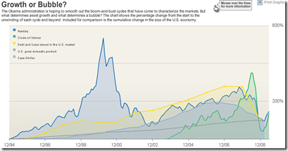
Bubbles 1994-2009
In: Bailout Finance Housing Reference Source: WSJ Stock Market US Economy
18 Jun 2009A good chart of US bubbles. The print version (p.A8, 6/18/09) had much better aesthetics. but the data are the same. Related article.
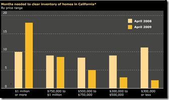
California Housing Inventory
In: Housing US Economy
18 Jun 2009Not too bad. of course, these numbers are affected by all kinds of factors (people not listing because they’re underwater, etc). Source: Infectious Greed.
More Auto Data
In: Bailout Maps US Economy
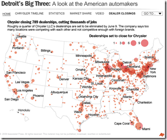
16 Jun 2009Ok, I know we’ve all about had it with visualizations of the history, market share, sales, brands, blah blah blah, concerning the US automotive industry — but here’s one last one from NPR. In addition to the map of Chrysler dealership closings shown below, there are several others of moderate interest if you click on the drop down menu in the upper right.
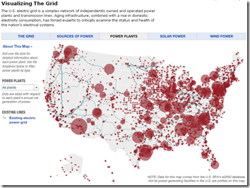
The Grid
16 Jun 2009This interactive map provides obscene amount of information on the structure and composition of the United States electrical grid, including breakdowns by type of power (wind, solar, etc), info roll-overs, potential alternative capacity, and proposed upgrades. Related article(s).
US Economic Stress Index (April 09 data)
In: Employment Finance Housing Interactive Maps Updated regularly US Economy
16 Jun 2009AP added to an already good interactive chart this month – you can now click through different periods with the slider at the bottom. The map displays unemployment, foreclosures, bankruptcy, or a composite “stress index”, by county. In the upper right you can change the period the %-change is calculated for. Double click on a region to zoom in; click&hold to move around.
Automotive Family Tree
In: Bailout US Economy
16 Jun 2009Trying to keep track of who owns what auto brands? Check out this interactive chart. (read the legend in the upper right to avoid confusion). Last updated 3/1/09, so it’s missing some recent changes, but you can read the site’s blog if you want the latest news.
Future Government Debt
15 Jun 2009These numbers have been making the rounds. the interesting part is the “fiscal adjustment required” to get debt to sustainable levels.
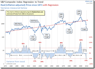
Regression to the Trend
14 Jun 2009Dshort’s June update of one of my favorite charts (inflation adjusted bullish version). Makes me wonder if we’re just going to re-inflate the bubble without any real correction.
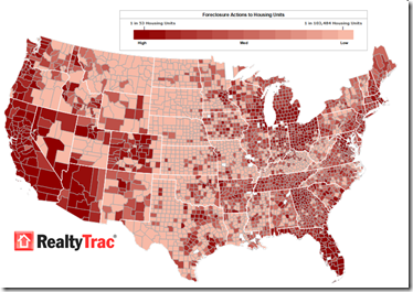
Foreclosures Continue to Rise
14 Jun 2009Click on the image below to see RealtyTracs full report. For discussion I’d recommend the comments over at Ritholtz (some of them – they tend to wander a bit there nowadays).
Visual Guide to Social Security
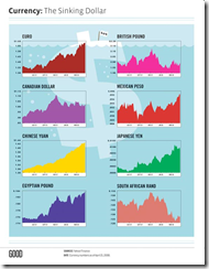
14 Jun 2009The Sinking Dollar
14 Jun 2009I generally like their simple designs, but would it kill Good to label their charts properly? (it’s national currency per dollar)
US Household Wealth Down Another $1.3 Trillion
14 Jun 2009Wealth continues to evaporate in Q109. Related article. WSJ analysis.
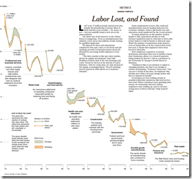
Deeper Look at (Un)Employment
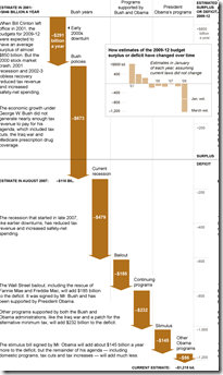
14 Jun 2009US Deficit Creation
14 Jun 2009Infographic on the expansion of the US fiscal deficit since 2000. Related article.
What is Chart Porn?
An addictive collection of beautiful charts, graphs, maps, and interactive data visualization toys -- on topics from around the world.
Categories
- Bailout (118)
- Chartporn Related (3)
- Commentary (21)
- Culture (669)
- Emerging Markets (66)
- Employment (245)
- Environment/weather (133)
- Finance (298)
- Food (92)
- Global Economy (373)
- Graphic Design (bad) (26)
- Graphic Design (general) (183)
- Graphic Tools (23)
- History (158)
- Housing (162)
- Humor (204)
- Innovative (183)
- Interactive (545)
- Internet/tech (97)
- Maps (578)
- News Media (34)
- Politics (329)
- Reference (97)
- Science (331)
- Source: Economist (101)
- Source: FT (92)
- Source: NYT (147)
- Source: Ritholtz (76)
- Source: USA Today (27)
- Source: Washington Post (90)
- Source: WSJ (135)
- Sports (58)
- Stock Market (74)
- Uncategorized (2)
- Updated regularly (76)
- US Economy (553)
- Video (22)
- Aram Korevaar: This chart is now being used as a projection in which countries such as China see themselves as in a [...]
- David: Welcome back Chart Porn! [...]
- J S: Thanks for the great story. Miss reading this blog. Hope to see you more active again. [...]
- jake: I lived in a DC row house for 6 years, and I'm writing this comment from my tiny 1 bedroom apartment [...]
- ronny pettersen: Hilarious and unfortunately accurate... ;-) [...]


