US Economy Archive:
Related article. Via Ritholtz (again. read The Big Picture!)
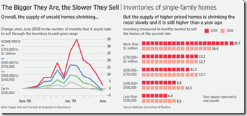
Housing Volume by Size
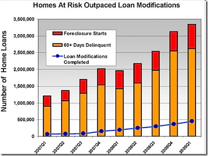
3 Aug 2009Foreclosures and Modifications
In: Housing US Economy
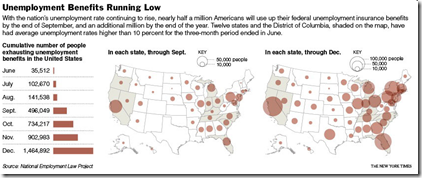
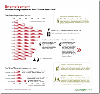
29 Jul 2009Not good. Is unemployment still a lagging indicator when housing and credit are at the center of a recession?
Housing Fraud in Florida
In: Housing Maps US Economy
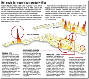
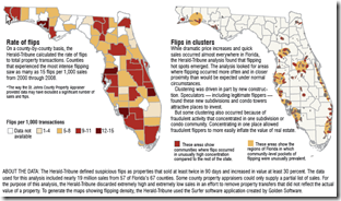
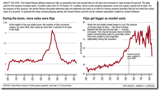
27 Jul 2009The Herald-Tribune is running a five-day investigative series on the rampant housing fraud in Florida. “Since 2000, more than 50,000 Florida properties flipped under circumstances that fraud investigators identify as suspicious — where homes, vacant land or commercial properties were bought and resold in 90 days or less and increased in value by at least 30 percent.” Wow!
From Catherine over at Visualizing Economics.
Health Care Reform Lobbying
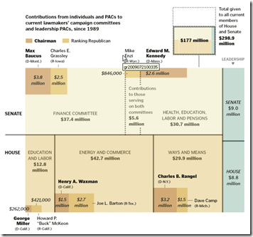
27 Jul 2009A tree map of where the money is flowing. Related article.
(from Kelso’s Corner)
The End is Near?
27 Jul 2009The index of leading indicators, which signals turning points in the economy, is rising at a rate that has accurately indicated the end of every recession since the index began to be compiled in 1959.
Spotted by The Big Picture. Original article.
How Much is College Worth?
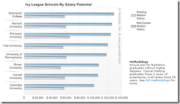
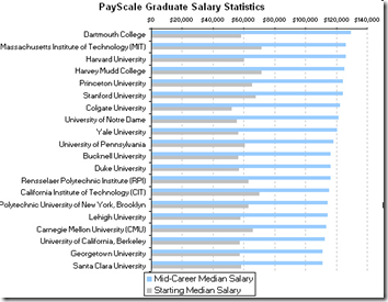
23 Jul 2009NYT’s Economix blog noticed payscale.com’s dataset of college grad salaries. Some interesting charts there, and since they make the raw data available, we’ll probably see more.
Gas Prices
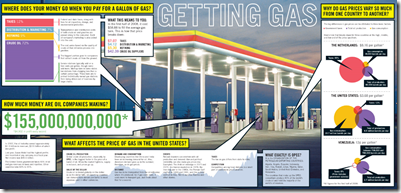
23 Jul 2009Not bad as an overview, but still doesn’t explain why the supply/demand/price relationships are such a mess in the US.
Death and Taxes
In: US Economy
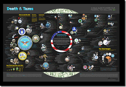
23 Jul 2009Wallstats has released it’s latest Death and Taxes Infographic, updated for 2010. Order a poster so you can get depressed by it every day! 🙂
US States’ Fiscal Problem
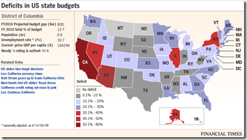
13 Jul 2009As of 5/15/09. Roll-overs provide detailed data. Related article.
WSJ Economist Survey (July 09 edition)
In: Bailout Employment Finance Housing Interactive Source: WSJ Updated regularly US Economy
12 Jul 2009Interactive results of a survey of 54 economists, on a number of indicators and issues. Updated Monthly. Related article.
What is Chart Porn?
An addictive collection of beautiful charts, graphs, maps, and interactive data visualization toys -- on topics from around the world.
Categories
- Bailout (118)
- Chartporn Related (3)
- Commentary (21)
- Culture (669)
- Emerging Markets (66)
- Employment (245)
- Environment/weather (133)
- Finance (298)
- Food (92)
- Global Economy (373)
- Graphic Design (bad) (26)
- Graphic Design (general) (183)
- Graphic Tools (23)
- History (158)
- Housing (162)
- Humor (204)
- Innovative (183)
- Interactive (545)
- Internet/tech (97)
- Maps (578)
- News Media (34)
- Politics (329)
- Reference (97)
- Science (331)
- Source: Economist (101)
- Source: FT (92)
- Source: NYT (147)
- Source: Ritholtz (76)
- Source: USA Today (27)
- Source: Washington Post (90)
- Source: WSJ (135)
- Sports (58)
- Stock Market (74)
- Uncategorized (2)
- Updated regularly (76)
- US Economy (553)
- Video (22)
- Aram Korevaar: This chart is now being used as a projection in which countries such as China see themselves as in a [...]
- David: Welcome back Chart Porn! [...]
- J S: Thanks for the great story. Miss reading this blog. Hope to see you more active again. [...]
- jake: I lived in a DC row house for 6 years, and I'm writing this comment from my tiny 1 bedroom apartment [...]
- ronny pettersen: Hilarious and unfortunately accurate... ;-) [...]






Poor Design as Scare Tactic?
In: Commentary Graphic Design (general) Innovative US Economy
23 Jul 2009The Good blog discusses the Republican/Democratic scuffle about the below graphic and health care reform issues. (note: clicking on the below brings up a larger version on another blog).
Here is a better designed graphic (with some chart junk of it’s own, admittedly) from Good showing problems with the existing heath care system: