US Economy Archive:
Best City to be Unemployed?
18 Oct 2009Major U.S. cities ranked by their ratio of job postings to unemployed people. Looks like they update this regularly. Spotted over at SimpleComplexity.
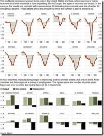
Recovery?
16 Oct 2009Global recovery based on manufacturing output. Related NYT article.
Stimulate Those Jobs
In: Bailout Employment Innovative Interactive Maps Source: USA Today US Economy
16 Oct 2009A funky little interactive map from USA Today. Click on a state on the map and the appropriate little dot on the sorted chart on the right will highlight to show you it’s ranking. When you change the indicator using the drop down box at the top (jobs created/total funds awarded/total funds received/unemployment rate) the dots in the chart all bounce around and resort themselves.
Pay Ratios
16 Oct 2009How long would you have to work to earn as much as a top CEO. This infographic uses three different salaries for comparison (minimum wage, average worker, POTUS).
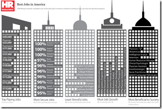
Best Jobs in America
In: Employment US Economy
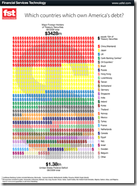
14 Oct 2009US Debt
13 Oct 2009Currency Trends
In: Emerging Markets Finance Global Economy Interactive Source: FT US Economy
13 Oct 2009The FT takes a graphic look at a number of currency trends (dollar/euro, carry trade, commodity currencies, the renminbi, and a trade weighted exchange index). [the links on the below images all go to the same interactive tool]
Income Inequality
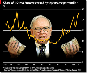
8 Oct 2009As usual, Michael Moore isn’t completely right, but the distribution of income growth isn’t what it used to be.
Two-thirds of the country’s total gains in the five years to 2007 accrued to the top 1%, whereas the bottom 90th percentile saw only 12% of the extra income.
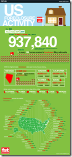
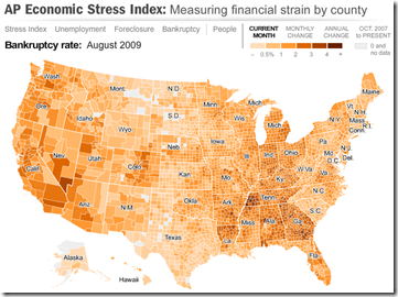
The well designed map displays unemployment, foreclosures, bankruptcy, or a composite “stress index”, by county. In the upper right you can change the period the %-change is calculated for (try it, it’s pretty nifty). To look at data over time, click on the “Oct.2007 to present” option and a historical slider will appear at the bottom (very slick to play with). Double click on a region to zoom in; click & hold to move around.
G20 Financial Support
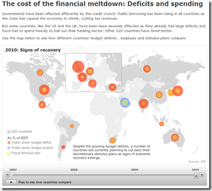
5 Oct 2009It’s unclear what the vintage of the data is, but the below map shows G20 crisis spending. Thanks to Silona for the heads up.
Historical Unemployment (updated)
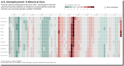
5 Oct 2009Historical Unemployment
2 Oct 2009A nice change from the usual line chart, from the WSJ.
What is Chart Porn?
An addictive collection of beautiful charts, graphs, maps, and interactive data visualization toys -- on topics from around the world.
Categories
- Bailout (118)
- Chartporn Related (3)
- Commentary (21)
- Culture (669)
- Emerging Markets (66)
- Employment (245)
- Environment/weather (133)
- Finance (298)
- Food (92)
- Global Economy (373)
- Graphic Design (bad) (26)
- Graphic Design (general) (183)
- Graphic Tools (23)
- History (158)
- Housing (162)
- Humor (204)
- Innovative (183)
- Interactive (545)
- Internet/tech (97)
- Maps (578)
- News Media (34)
- Politics (329)
- Reference (97)
- Science (331)
- Source: Economist (101)
- Source: FT (92)
- Source: NYT (147)
- Source: Ritholtz (76)
- Source: USA Today (27)
- Source: Washington Post (90)
- Source: WSJ (135)
- Sports (58)
- Stock Market (74)
- Uncategorized (2)
- Updated regularly (76)
- US Economy (553)
- Video (22)
- Aram Korevaar: This chart is now being used as a projection in which countries such as China see themselves as in a [...]
- David: Welcome back Chart Porn! [...]
- J S: Thanks for the great story. Miss reading this blog. Hope to see you more active again. [...]
- jake: I lived in a DC row house for 6 years, and I'm writing this comment from my tiny 1 bedroom apartment [...]
- ronny pettersen: Hilarious and unfortunately accurate... ;-) [...]









Blame the Smart People?
In: Bailout Commentary Finance Humor Source: WSJ US Economy
18 Oct 2009A WSJ op-ed that presents a convincing argument that we can’t blame stupid people for the financial crisis (though they certainly helped).