US Economy Archive:
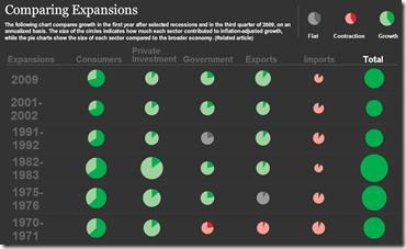
GDP Recovery Trends
30 Oct 2009Lots of information here. What drew my eye was the size of the circles, which indicate how much each sector contributed to growth/contraction. I’m not sure what the sizes of the circles in the total column are supposed to be. Related WSJ article.
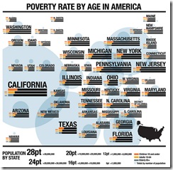
Poverty in America
30 Oct 2009An interesting way to show geographic data that is obviously weighted by population – the author created a cloud of rough geographic position, but varied the size of the graphs by population.
It’s Alive!!!
In: Humor US Economy
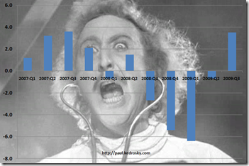
29 Oct 2009I couldn’t help but laugh at Infectious Greed’s response to today’s Q3 GDP numbers.
Turns out coursing a few gigavolts of financial stimulus current through even an economy the size of the U.S. will still get Frankenstein off the slab, however briefly.
Fun with Weekly Data
In: Graphic Design (general) Innovative Reference US Economy
29 Oct 2009This is a bit old (the data ends in July ’08), but I like this animated approach to displaying high frequency data over time. Something like this might be interesting to do for cross-country financial data-series.
Impressively, Jon Peltier came up with a way to do this in excel (and check out his blog for other really cool excel chart tricks and solutions)
Going for Broke
In: Culture Finance US Economy
28 Oct 2009Timeline of recession and recovery (the Adversity Index) from Moodys/MSNBC (1995-2009). You can drill down to individual metro areas by clicking on a state. The Adversity Index page has a number of related articles.
There’s also a map of “recession resistant areas” (has had no more than 9 months of recession over the past 15 years).
Who Owns Mortgages?
In: Finance Housing US Economy
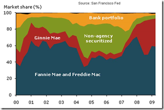
26 Oct 2009Fannie Mae and Freddie Mac combined have consistently been the largest players in the market, owning or guaranteeing about half or more of the mortgages in the sample at any given time. Non-agency securitization peaked in the first quarter of 2006, when it accounted for nearly 40% of new originations. Finally, the share of mortgages retained in the originating institution’s portfolio averaged about 15% throughout the boom, but has fallen considerably since. (from SF Fed via Calculated Risk)
Visual History of The Federal Reserve
26 Oct 2009Available as a print or free PDF file, from Financial Graph and Art. (via Ritholtz)
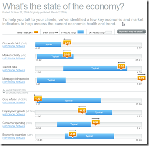
Economic Recovery Dashboard (Oct 09 ver)
24 Oct 2009October update of one of my favorite summaries of economic indicators. If you normally find this stuff confusing you should check it out — click on any of the “historical details” to see what each indicator means and why it’s important.
Russia vs USA
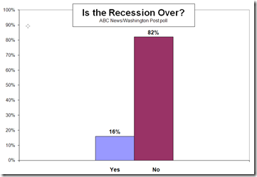
23 Oct 2009Economists vs Everyone Else
23 Oct 2009From an ABC/WashingtonPost survey.
2008 Executive Compensation
In: Bailout Finance Interactive Source: USA Today US Economy
23 Oct 2009Health Spending Map
In: Maps Politics US Economy
20 Oct 2009BBC G20
In: Bailout Emerging Markets Finance Global Economy Interactive Maps Politics US Economy
19 Oct 2009A bit dated as these were prepared in the lead up to the Pittsburgh summit a few weeks ago. Worth passing on nonetheless.
A checklist of the G20’s April London Summit pledges and whether they’ve been fulfilled. Included some nice graphics on IMF and tax reforms.
G20 Stimulus and Fiscal Deficit map. Use the slider to look at the changes 2007-2010. Mouse over a country to view popup data details.
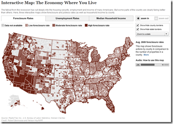
NPR Economy Map
18 Oct 2009Foreclosures, unemployment, and median household income. The scales are a little vague on two of the maps — but it’s ok for broad comparative purposes.
What is Chart Porn?
An addictive collection of beautiful charts, graphs, maps, and interactive data visualization toys -- on topics from around the world.
Categories
- Bailout (118)
- Chartporn Related (3)
- Commentary (21)
- Culture (669)
- Emerging Markets (66)
- Employment (245)
- Environment/weather (133)
- Finance (298)
- Food (92)
- Global Economy (373)
- Graphic Design (bad) (26)
- Graphic Design (general) (183)
- Graphic Tools (23)
- History (158)
- Housing (162)
- Humor (204)
- Innovative (183)
- Interactive (545)
- Internet/tech (97)
- Maps (578)
- News Media (34)
- Politics (329)
- Reference (97)
- Science (331)
- Source: Economist (101)
- Source: FT (92)
- Source: NYT (147)
- Source: Ritholtz (76)
- Source: USA Today (27)
- Source: Washington Post (90)
- Source: WSJ (135)
- Sports (58)
- Stock Market (74)
- Uncategorized (2)
- Updated regularly (76)
- US Economy (553)
- Video (22)
- Aram Korevaar: This chart is now being used as a projection in which countries such as China see themselves as in a [...]
- David: Welcome back Chart Porn! [...]
- J S: Thanks for the great story. Miss reading this blog. Hope to see you more active again. [...]
- jake: I lived in a DC row house for 6 years, and I'm writing this comment from my tiny 1 bedroom apartment [...]
- ronny pettersen: Hilarious and unfortunately accurate... ;-) [...]

