US Economy Archive:
Race and Recession
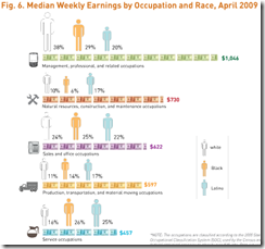
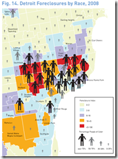
9 Nov 2009The Applied Research Center has a report on race and the recession that includes a number of charts examining the breakdown of unemployment, earnings, and foreclosures, by race. (via)
Personalized Unemployment
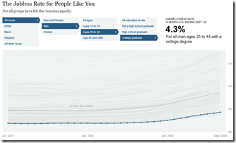
9 Nov 2009How bad would it be for you if you lost your job? This NYT graphic lets you filter the unemployment statistics on several variables.
Unemployment
8 Nov 2009Wall Street Stock Options
8 Nov 2009Unemployment
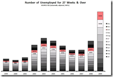
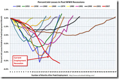
6 Nov 2009All new and depressing ways of looking at unemployment statistics, from Ritzholtz/The Big Picture.
Where to Work
In: Employment US Economy
5 Nov 2009Unemployment
In: Employment Maps US Economy
5 Nov 2009Flowingdata takes a look at unemployment 2004-09
Recovery Mapping
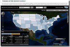
5 Nov 2009Recovery.org has an interactive map that lets you track where the spending is going (down to the street level).
The Fed’s Changing Assets
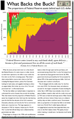
3 Nov 2009How the composition of the Fed’s balance sheet has changed over time. I would like to have seen the past two years blown up in detail. (via Ritzholtz).
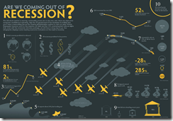
Recession Infographic
In: Finance US Economy
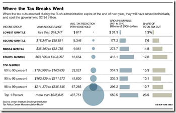
3 Nov 2009The Breaks
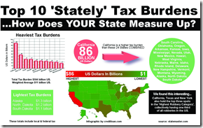
2 Nov 2009Bush’s tax breaks (which expire next year). It’s in dollar terms, so a little misleading, but still interesting. Related article. (via Sociological Images)
AP Economic Stress Map (November update)
In: Employment Finance Housing Interactive Maps Updated regularly US Economy
2 Nov 2009Updated November 2nd. The map displays unemployment, foreclosures, bankruptcy, or a composite “stress index”, by county. In the upper right you can change the period the %-change is calculated for. To look at data over time, click on the “Oct.2007 to present” option and a historical slider will appear at the bottomDouble click on a region to zoom in; click & hold to move around.
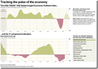
USA Today Economic Outlook Index (October edition)
In: Employment Finance Housing Interactive Stock Market US Economy
2 Nov 2009Updated October 28th. The best part is the lower chart showing the latest data for each of the 11 “leading indicators”.
What is Chart Porn?
An addictive collection of beautiful charts, graphs, maps, and interactive data visualization toys -- on topics from around the world.
Categories
- Bailout (118)
- Chartporn Related (3)
- Commentary (21)
- Culture (669)
- Emerging Markets (66)
- Employment (245)
- Environment/weather (133)
- Finance (298)
- Food (92)
- Global Economy (373)
- Graphic Design (bad) (26)
- Graphic Design (general) (183)
- Graphic Tools (23)
- History (158)
- Housing (162)
- Humor (204)
- Innovative (183)
- Interactive (545)
- Internet/tech (97)
- Maps (578)
- News Media (34)
- Politics (329)
- Reference (97)
- Science (331)
- Source: Economist (101)
- Source: FT (92)
- Source: NYT (147)
- Source: Ritholtz (76)
- Source: USA Today (27)
- Source: Washington Post (90)
- Source: WSJ (135)
- Sports (58)
- Stock Market (74)
- Uncategorized (2)
- Updated regularly (76)
- US Economy (553)
- Video (22)
- Aram Korevaar: This chart is now being used as a projection in which countries such as China see themselves as in a [...]
- David: Welcome back Chart Porn! [...]
- J S: Thanks for the great story. Miss reading this blog. Hope to see you more active again. [...]
- jake: I lived in a DC row house for 6 years, and I'm writing this comment from my tiny 1 bedroom apartment [...]
- ronny pettersen: Hilarious and unfortunately accurate... ;-) [...]


