US Economy Archive:
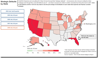
Strategic Defaults
14 Dec 2009Credit
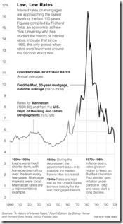
14 Dec 2009Historical Interest Rates
14 Dec 2009Falling Dollar
In: Emerging Markets Finance Global Economy Source: NYT Source: Ritholtz US Economy
8 Dec 2009Who are the winners and losers? (via The Big Picture)
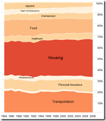
Consumer Spending
2 Dec 2009Click on a category to blow it up. From Flowingdata.
USA Today Economic Outlook Index (November edition)
In: Employment Finance Housing Source: USA Today Updated regularly US Economy
1 Dec 2009Updated November 24th. The best part is the lower chart showing the latest data for each of the 11 “leading indicators”.
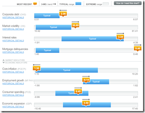
Economic Recovery Dashboard (Nov 09 ver)
In: Employment Finance Global Economy Housing Interactive US Economy
23 Nov 2009November update of one of my favorite summaries of economic indicators. If you normally find this stuff confusing you should check it out – click on any of the “historical details” to see what each indicator means and why it’s important.
Interactive Investing
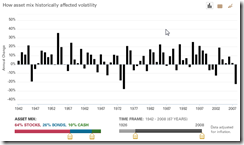
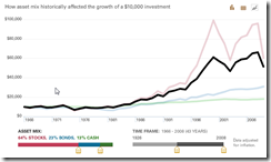
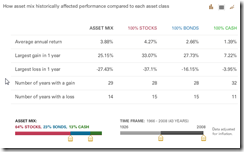
18 Nov 2009Vanguard has several interesting interactive tools for visualizing investment decisions. The first concerns investment composition. Use the sliders at the bottom to choose between stocks, bonds, and cash – and to show how your investments would have performed over any date range since 1928. Click on the little graph icons in the upper right corner to view it as data or a line chart. Thanks to Diane Fitzer for pointing them out.
“Good” Jobs
In: Employment US Economy
17 Nov 2009The Economic Policy Institute defines a “good” job as “one that pays at least 60% of the median household income and also provides health care and retirement benefits.” – Sociological Images
Would have been more interesting to see 2007 data as well – I imagine 2008 is a bad comparator.
Who is Paying Taxes
In: Politics US Economy
17 Nov 2009You always see these stats chopped apart to make one side or other happy – it’s nice to see it just laid out clearly.
China vs United States
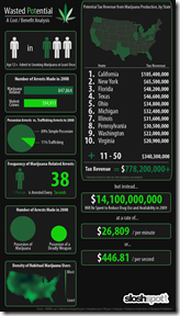
16 Nov 2009Marijuana Legalization
16 Nov 2009Infographic on potential tax receipts and savings. (via)
What is Chart Porn?
An addictive collection of beautiful charts, graphs, maps, and interactive data visualization toys -- on topics from around the world.
Categories
- Bailout (118)
- Chartporn Related (3)
- Commentary (21)
- Culture (669)
- Emerging Markets (66)
- Employment (245)
- Environment/weather (133)
- Finance (298)
- Food (92)
- Global Economy (373)
- Graphic Design (bad) (26)
- Graphic Design (general) (183)
- Graphic Tools (23)
- History (158)
- Housing (162)
- Humor (204)
- Innovative (183)
- Interactive (545)
- Internet/tech (97)
- Maps (578)
- News Media (34)
- Politics (329)
- Reference (97)
- Science (331)
- Source: Economist (101)
- Source: FT (92)
- Source: NYT (147)
- Source: Ritholtz (76)
- Source: USA Today (27)
- Source: Washington Post (90)
- Source: WSJ (135)
- Sports (58)
- Stock Market (74)
- Uncategorized (2)
- Updated regularly (76)
- US Economy (553)
- Video (22)
- Aram Korevaar: This chart is now being used as a projection in which countries such as China see themselves as in a [...]
- David: Welcome back Chart Porn! [...]
- J S: Thanks for the great story. Miss reading this blog. Hope to see you more active again. [...]
- jake: I lived in a DC row house for 6 years, and I'm writing this comment from my tiny 1 bedroom apartment [...]
- ronny pettersen: Hilarious and unfortunately accurate... ;-) [...]

