US Economy Archive:
Stocks
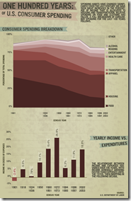
7 Jan 2010100 Years of Consumer Spending
In: Culture Food US Economy
6 Jan 2010I really don’t like area charts much. They should at least show the beginning and ending percentages for each section. I’m a little surprised food has declined so much.
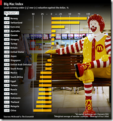
The Economist Big Mac Index
6 Jan 2010THE Big Mac index is based on the theory of purchasing-power parity (PPP)-exchange rates should equalise the price of a basket of goods in different countries. The exchange rate that leaves a Big Mac costing the same in dollars everywhere is our fair-value benchmark. So our light-hearted index shows which countries the foreign-exchange market has blessed with a cheap currency, and which has it burdened with a dear one.
Global Housing Prices
5 Jan 2010Jobs Forecast
5 Jan 2010Is College Worth the Money?
In: Culture US Economy
5 Jan 2010Job growth, GDP and household net worth all did poorly. Related Washington Post article. (via The Big Picture).
Housing Recovery?
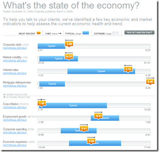
28 Dec 2009Economic Recovery Dashboard (Dec 09 ver)
In: Employment Finance Global Economy Housing Interactive US Economy
22 Dec 2009December update of one of my favorite summaries of economic indicators. If you normally find this stuff confusing you should check it out – click on any of the “historical details” to see what each indicator means and why it’s important.
Market Decade
In: Finance Global Economy Interactive Source: FT Stock Market US Economy
22 Dec 2009An interactive look at 10 years of global indices, bonds, interest rates, commodities, and a few key stocks.
Jail Birds
22 Dec 2009Some basic facts about prisons in the United States. (via VizWorld)
Vegas Hotels
In: Culture Housing US Economy
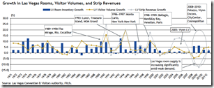
21 Dec 2009The ebbs and flows of hotels in Vegas is an interesting supply and demand demonstration (of course real estate in Vegas generally ignores those laws). (via Infectious Greed)
Recovery?
14 Dec 2009What is Chart Porn?
An addictive collection of beautiful charts, graphs, maps, and interactive data visualization toys -- on topics from around the world.
Categories
- Bailout (118)
- Chartporn Related (3)
- Commentary (21)
- Culture (669)
- Emerging Markets (66)
- Employment (245)
- Environment/weather (133)
- Finance (298)
- Food (92)
- Global Economy (373)
- Graphic Design (bad) (26)
- Graphic Design (general) (183)
- Graphic Tools (23)
- History (158)
- Housing (162)
- Humor (204)
- Innovative (183)
- Interactive (545)
- Internet/tech (97)
- Maps (578)
- News Media (34)
- Politics (329)
- Reference (97)
- Science (331)
- Source: Economist (101)
- Source: FT (92)
- Source: NYT (147)
- Source: Ritholtz (76)
- Source: USA Today (27)
- Source: Washington Post (90)
- Source: WSJ (135)
- Sports (58)
- Stock Market (74)
- Uncategorized (2)
- Updated regularly (76)
- US Economy (553)
- Video (22)
- Aram Korevaar: This chart is now being used as a projection in which countries such as China see themselves as in a [...]
- David: Welcome back Chart Porn! [...]
- J S: Thanks for the great story. Miss reading this blog. Hope to see you more active again. [...]
- jake: I lived in a DC row house for 6 years, and I'm writing this comment from my tiny 1 bedroom apartment [...]
- ronny pettersen: Hilarious and unfortunately accurate... ;-) [...]


