US Economy Archive:
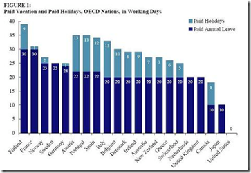
Required Vacation
In: Employment US Economy
31 Jan 2010USA Today Economic Outlook Index (Jan ‘10 version)
In: Employment Finance Housing Interactive Source: USA Today Stock Market US Economy
29 Jan 2010The best part is the lower chart showing the latest data for each of the 11 “leading indicators”. Updated 1/27/09.
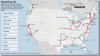
High Speed Rail in the USA
29 Jan 2010Interactive map of major projects (new funding was announce 1/28/10), with popup details. Related article.
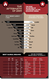
Crisis Winners and Losers
In: Finance US Economy
27 Jan 2010World Bailouts and Stimulus
In: Bailout Finance Global Economy Maps Source: Ritholtz US Economy
27 Jan 2010Powerful summary from the Harvard Business Review (hardcopy apparently) via The Big Picture.
How Far Have We Fallen?
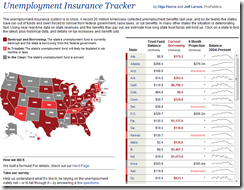
26 Jan 2010Unemployment Insurance Tracker
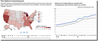
25 Jan 2010Unemployment
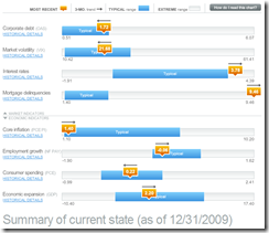
25 Jan 2010Economic Recovery Dashboard (Jan 10 ver)
25 Jan 2010One of my favorite summaries of economic indicators. If you normally find this stuff confusing you should check it out – click on any of the “historical details” to see what each indicator means and why it’s important.
Wall Street Compensation 2006-09
In: Bailout Finance Interactive Source: WSJ Stock Market US Economy
17 Jan 2010A very nice treemap presentation — you can drill down by year and company level. Clicking on a company box will bring up their own comments on compensation policies. Well done WSJ!
BRICs 2007-14
In: Emerging Markets Global Economy Interactive Maps Source: FT US Economy
17 Jan 2010House Prices to Income
In: Housing US Economy
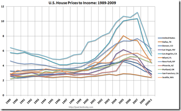
13 Jan 2010The following chart shows the ratio of U.S. housing prices to income for various major cities from 1989-2009. If we say bubbles exists in cities where that ratio is more than two standard deviations outside its long-run average, we still have residential real estate bubbles in Seattle, Portland, New York and Miami. On the other hand, bubble condition no longer exist in Dallas, Denver, Las Vegas, Los Angeles, Phoenix and San Francisco (!).
The New Job Market
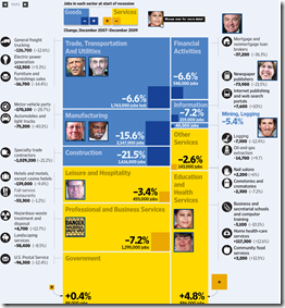
12 Jan 2010From the WSJ, a treemap of the changing US job market (2007-09), with anecdotal popups. Related article.
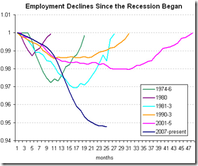
Recession Unemployment
9 Jan 2010What is Chart Porn?
An addictive collection of beautiful charts, graphs, maps, and interactive data visualization toys -- on topics from around the world.
Categories
- Bailout (118)
- Chartporn Related (3)
- Commentary (21)
- Culture (669)
- Emerging Markets (66)
- Employment (245)
- Environment/weather (133)
- Finance (298)
- Food (92)
- Global Economy (373)
- Graphic Design (bad) (26)
- Graphic Design (general) (183)
- Graphic Tools (23)
- History (158)
- Housing (162)
- Humor (204)
- Innovative (183)
- Interactive (545)
- Internet/tech (97)
- Maps (578)
- News Media (34)
- Politics (329)
- Reference (97)
- Science (331)
- Source: Economist (101)
- Source: FT (92)
- Source: NYT (147)
- Source: Ritholtz (76)
- Source: USA Today (27)
- Source: Washington Post (90)
- Source: WSJ (135)
- Sports (58)
- Stock Market (74)
- Uncategorized (2)
- Updated regularly (76)
- US Economy (553)
- Video (22)
- Aram Korevaar: This chart is now being used as a projection in which countries such as China see themselves as in a [...]
- David: Welcome back Chart Porn! [...]
- J S: Thanks for the great story. Miss reading this blog. Hope to see you more active again. [...]
- jake: I lived in a DC row house for 6 years, and I'm writing this comment from my tiny 1 bedroom apartment [...]
- ronny pettersen: Hilarious and unfortunately accurate... ;-) [...]

