US Economy Archive:
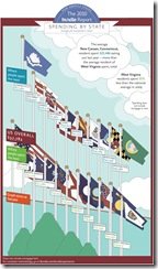
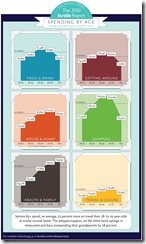
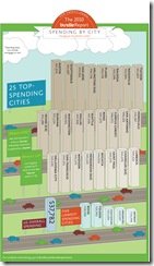
How America Spends its Money
In: Culture Food Housing US Economy
24 Mar 2010From Bundle.com based on data from Citi.
US Booms and Busts (1775-1943)
24 Mar 2010Fascinating time-line of US economic cycles. Someone should make a wall chart out of this – I would buy a copy. (via St Louis Fed and The Big Picture)
A nice companion piece perhaps is Irving Fisher’s 1932 “Booms and Depressions: Some First Principles“:
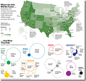
US Job Growth: Where will it Come From?
In: Employment US Economy
23 Mar 2010Banks at Risk
23 Mar 2010Economic Indicators Dashboard (Mar 2010 ver)
22 Mar 2010One of my favorite summaries of economic indicators. Click on any of the “historical details” to see what each indicator means and why it’s important.
Best Cities for Working Mothers
22 Mar 2010Eleven indicator rankings, based on Forbes research.
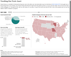
Tracking a Toxic Mortgage Security
19 Mar 2010A fantastic look at what owning one of these assets looks like. NPR’s Planet Money bought a $1000 mortgage bond and is tracking it’s performance. You can view how many payments they’ve received versus how many properties in their portion of the bond have been sold at a loss. Related article. (via Vizworld)
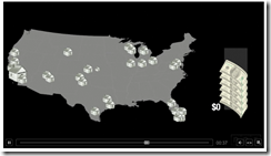
There’s also a cute simple explanation video:
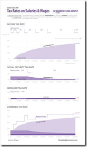
2009 Wage Taxes (Filing Jointly)
In: Politics US Economy
19 Mar 2010A followup to tuesday’s post, which was for single filers.
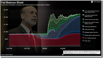
FED Balance Sheet (updated)
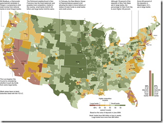
18 Mar 2010Bank Competition Map
16 Mar 2010Big banks vs small. (via)
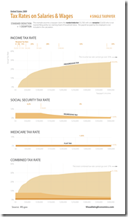
2009 Wage Taxes
In: Politics US Economy
16 Mar 2010Outsourcing is Good For Us(?)
16 Mar 2010I don’t think I buy this argument – it glosses over some significant income distribution and labor mobility issues, which are only partly discussed at the bottom.
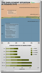
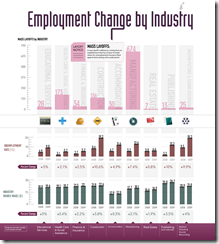
Employment Change by Industry
In: Employment US Economy
15 Mar 2010We’ve seen this data before, but this presentation is clearer in some ways.
What is Chart Porn?
An addictive collection of beautiful charts, graphs, maps, and interactive data visualization toys -- on topics from around the world.
Categories
- Bailout (118)
- Chartporn Related (3)
- Commentary (21)
- Culture (669)
- Emerging Markets (66)
- Employment (245)
- Environment/weather (133)
- Finance (298)
- Food (92)
- Global Economy (373)
- Graphic Design (bad) (26)
- Graphic Design (general) (183)
- Graphic Tools (23)
- History (158)
- Housing (162)
- Humor (204)
- Innovative (183)
- Interactive (545)
- Internet/tech (97)
- Maps (578)
- News Media (34)
- Politics (329)
- Reference (97)
- Science (331)
- Source: Economist (101)
- Source: FT (92)
- Source: NYT (147)
- Source: Ritholtz (76)
- Source: USA Today (27)
- Source: Washington Post (90)
- Source: WSJ (135)
- Sports (58)
- Stock Market (74)
- Uncategorized (2)
- Updated regularly (76)
- US Economy (553)
- Video (22)
- Aram Korevaar: This chart is now being used as a projection in which countries such as China see themselves as in a [...]
- David: Welcome back Chart Porn! [...]
- J S: Thanks for the great story. Miss reading this blog. Hope to see you more active again. [...]
- jake: I lived in a DC row house for 6 years, and I'm writing this comment from my tiny 1 bedroom apartment [...]
- ronny pettersen: Hilarious and unfortunately accurate... ;-) [...]

