US Economy Archive:
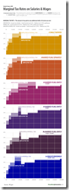
Marginal Tax Rates
In: Politics US Economy
9 Apr 2010AP Economic Stress Map (March ‘10 update)
6 Apr 2010The map displays unemployment, foreclosures, bankruptcy, or a composite “stress index”, by county. Easy to miss: in the upper right you can change the scale of the mapping (rates, m-t-m, y-t-y). To look at data over time, click on the “monthly rates” option and a historical slider will appear at the bottom. Double click on a region to zoom in; click & hold to move around, point at a county for popup detail.
American Households (50s-00s)
5 Apr 2010Would have preferred to see this info in chart form. (via)
Executive Pay 2009
In: Bailout Employment Finance Source: NYT Stock Market US Economy
5 Apr 2010This time from the NYT, covering 200 CEOs. Related article.
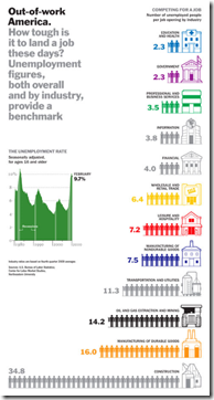
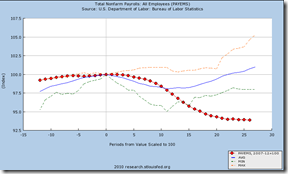
How Bad is Unemployment?
In: Employment US Economy
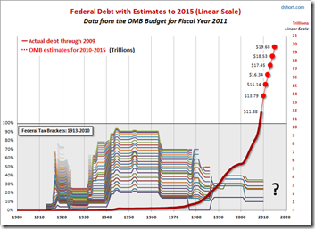
2 Apr 2010Federal Debt and Tax Brackets (1900-2015)
31 Mar 2010Dshort always has interesting medium/long-term analyses. I really like the representation of historic tax brackets in the bottom half of this one (based on data from taxfoundation.org)
Housing Booms and Busts
31 Mar 2010Although this NY FED article is primarily focused on explaining Upstate NY’s immunity from the boom/bust cycle, it includes some interesting analysis of nation wide trends. (via The Big Picture).
They are planning to stop buying them (or maybe not). Updated 3/25.
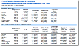
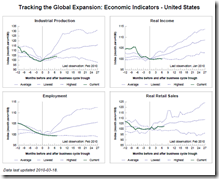
Tracking the Global Economy
29 Mar 2010The St. Louis Fed is maintaining a nice compendium of economic indicators on the G7 & OECD, including comparisons with previous recessions and expansions.
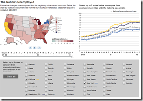
US Unemployment (updated 3/26/10)
28 Mar 2010Unemployment Heatmap (Mar ‘10 ver)
25 Mar 2010What is Chart Porn?
An addictive collection of beautiful charts, graphs, maps, and interactive data visualization toys -- on topics from around the world.
Categories
- Bailout (118)
- Chartporn Related (3)
- Commentary (21)
- Culture (669)
- Emerging Markets (66)
- Employment (245)
- Environment/weather (133)
- Finance (298)
- Food (92)
- Global Economy (373)
- Graphic Design (bad) (26)
- Graphic Design (general) (183)
- Graphic Tools (23)
- History (158)
- Housing (162)
- Humor (204)
- Innovative (183)
- Interactive (545)
- Internet/tech (97)
- Maps (578)
- News Media (34)
- Politics (329)
- Reference (97)
- Science (331)
- Source: Economist (101)
- Source: FT (92)
- Source: NYT (147)
- Source: Ritholtz (76)
- Source: USA Today (27)
- Source: Washington Post (90)
- Source: WSJ (135)
- Sports (58)
- Stock Market (74)
- Uncategorized (2)
- Updated regularly (76)
- US Economy (553)
- Video (22)
- Aram Korevaar: This chart is now being used as a projection in which countries such as China see themselves as in a [...]
- David: Welcome back Chart Porn! [...]
- J S: Thanks for the great story. Miss reading this blog. Hope to see you more active again. [...]
- jake: I lived in a DC row house for 6 years, and I'm writing this comment from my tiny 1 bedroom apartment [...]
- ronny pettersen: Hilarious and unfortunately accurate... ;-) [...]

