US Economy Archive:
Household Debt 1980-2009
18 May 2010Underfunded State Pensions
18 May 2010Yay! Another few trillion dollars to worry about. Related article.
Driving Habits vs Gas Prices
12 May 2010Interesting chart and analysis. I question a bit how accurate the underlying data is (does an unweighted mean of gas prices really reflect a year?; how is miles per capita measured?). Still, nicely done. (via)
Updated: US Unemployment
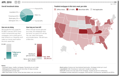
11 May 2010The Planet Money blog at NPR bought their very own mortgage based toxic asset a few months ago (and named it “Toxie”). Not surprisingly, it’s not performing very well. The related articles are worth a read if you want a solid, simple explanation of how this stuff works.
Deficit Busters
4 May 2010Select a UK political party, then choose what programs cuts you would make to lower the deficit – then see the effects of those cuts. Why have we never seen one of these in the United States?
Hmmmm. turns out there have been some attempts in the US.
From the LA Times on the California budget: 
From the Congressional Budget Office: 
Massachusetts budget calculator (from 2008, I think)
Anyone know of better ones?
How We Transport
In: Maps US Economy
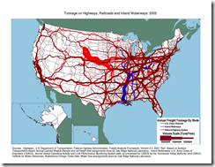
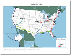
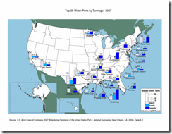
3 May 2010Cool maps of transportation in the USA. (via)
Here are some more from the same DOT site.
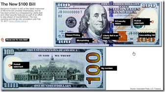
The New Benjamin
26 Apr 2010Anyone else think the 3d ribbon down the middle is butt ugly? And the liberty bell inside an inkwell? Ick.
Global Interest Rate Tracker
In: Finance Global Economy Interactive Maps Politics Source: WSJ Updated regularly US Economy
26 Apr 2010Central bank rates from 2004-present (updated 4/20). See how countries are exiting from their stimulus policies.
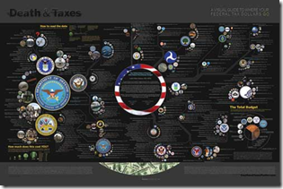
Death and Taxes 2011
In: Politics US Economy
26 Apr 2010Wallstats has released their annual visualization of the President’s discretionary budget. Lots of interesting information and a great example of how good design can get even better over time.
US Income Tax Brackets (1910-10)
In: Politics US Economy
23 Apr 2010Another nice visualization from Stephen over at weathersealed.
Economic Indicators Dashboard (Apr ‘10 ver)
In: Employment Finance Housing Interactive Stock Market US Economy
23 Apr 2010One of my favorite summaries of economic indicators. Click on any of the “historical details” to see what each indicator means and why it’s important.
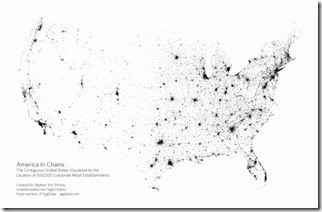
American Chains
In: Culture Food Maps US Economy
12 Apr 2010Another cool proximity map from Weather Sealed. This one of 330 retail chain company locations.
What is Chart Porn?
An addictive collection of beautiful charts, graphs, maps, and interactive data visualization toys -- on topics from around the world.
Categories
- Bailout (118)
- Chartporn Related (3)
- Commentary (21)
- Culture (669)
- Emerging Markets (66)
- Employment (245)
- Environment/weather (133)
- Finance (298)
- Food (92)
- Global Economy (373)
- Graphic Design (bad) (26)
- Graphic Design (general) (183)
- Graphic Tools (23)
- History (158)
- Housing (162)
- Humor (204)
- Innovative (183)
- Interactive (545)
- Internet/tech (97)
- Maps (578)
- News Media (34)
- Politics (329)
- Reference (97)
- Science (331)
- Source: Economist (101)
- Source: FT (92)
- Source: NYT (147)
- Source: Ritholtz (76)
- Source: USA Today (27)
- Source: Washington Post (90)
- Source: WSJ (135)
- Sports (58)
- Stock Market (74)
- Uncategorized (2)
- Updated regularly (76)
- US Economy (553)
- Video (22)
- Aram Korevaar: This chart is now being used as a projection in which countries such as China see themselves as in a [...]
- David: Welcome back Chart Porn! [...]
- J S: Thanks for the great story. Miss reading this blog. Hope to see you more active again. [...]
- jake: I lived in a DC row house for 6 years, and I'm writing this comment from my tiny 1 bedroom apartment [...]
- ronny pettersen: Hilarious and unfortunately accurate... ;-) [...]


