Updated regularly Archive:
US Adversity Index
In: Employment Housing Interactive Maps Updated regularly US Economy
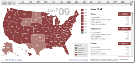
8 Apr 2009For major cities/states, based on employment, housing, and industrial production. Click on the slider to see monthly data back to 1994, click on a state to see cities on the right. (From MSNBC & Moody’s)
Market Tree Map
In: Finance Interactive Maps Reference Stock Market Updated regularly US Economy
2 Apr 2009A tree map of more than 500 stocks, updated every 15 minutes. Click on the roll-over popups to bring up a pretty detailed drill down menu.
State of the Economy (2/28 update)
In: Employment Finance Housing Interactive Source: Ritholtz Updated regularly US Economy
26 Mar 2009A very powerful interactive analytical presentation/tool.
From Russell Investments (via Ritholtz)
Parsing the FED (updated Mar 18)
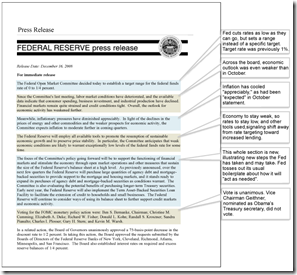
18 Mar 2009The Wall Street Journal provides an "interpretation" of most FED press releases, comparing them to previous statements.
Another Look at Unemployment (3/5 update)
In: Employment Interactive Source: WSJ Updated regularly US Economy
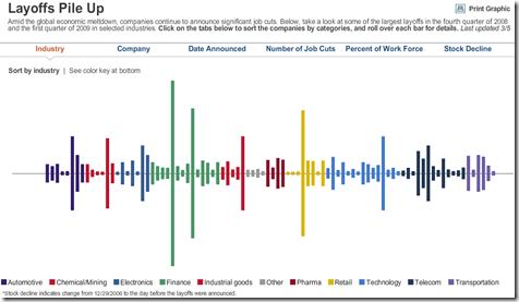
6 Mar 2009A funky look at layoffs that can be sorted in a number of different ways (industry, company, date, etc)
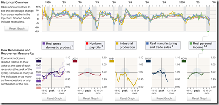
US Recession Comparison
In: Finance Interactive Source: WSJ Stock Market Updated regularly US Economy
2 Mar 2009This is a slightly complicated interactive way of viewing 5 different indicators across different recessions periods. It takes a minute to figure out how to work it, but it’s nifty once you do.
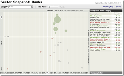
S&P Performance by Sector (updated daily)
In: Finance Interactive Reference Source: NYT Stock Market Updated regularly US Economy
25 Feb 2009Ok, someone obviously spent a lot of time designing this one, and it is very cool.
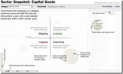
You select a sector (~30 are available) and the bubble chart shows how companies performed versus the short and long-term S&P 500. The bubble size shows market cap. You can easily change change the timeframe of the comparison (day, week, month, quarter, year) and scales, and drill down through company data.
example:
explanation:
Currency Maps
In: Global Economy Interactive Maps Source: FT Updated regularly US Economy
7 Jan 2009From FT: An interactive map that shows the relative performance of a currency against other major currencies for a range of time periods (today, 5day,. up to 1 year)
[Note: There is no direct link to the map (silly java), you have to click on the “Currency Macromap Launch now” window on this page]
A similar heatmap (with more currency coverage) is available at Oanda.com
What is Chart Porn?
An addictive collection of beautiful charts, graphs, maps, and interactive data visualization toys -- on topics from around the world.
Categories
- Bailout (118)
- Chartporn Related (3)
- Commentary (21)
- Culture (669)
- Emerging Markets (66)
- Employment (245)
- Environment/weather (133)
- Finance (298)
- Food (92)
- Global Economy (373)
- Graphic Design (bad) (26)
- Graphic Design (general) (183)
- Graphic Tools (23)
- History (158)
- Housing (162)
- Humor (204)
- Innovative (183)
- Interactive (545)
- Internet/tech (97)
- Maps (578)
- News Media (34)
- Politics (329)
- Reference (97)
- Science (331)
- Source: Economist (101)
- Source: FT (92)
- Source: NYT (147)
- Source: Ritholtz (76)
- Source: USA Today (27)
- Source: Washington Post (90)
- Source: WSJ (135)
- Sports (58)
- Stock Market (74)
- Uncategorized (2)
- Updated regularly (76)
- US Economy (553)
- Video (22)
- Aram Korevaar: This chart is now being used as a projection in which countries such as China see themselves as in a [...]
- David: Welcome back Chart Porn! [...]
- J S: Thanks for the great story. Miss reading this blog. Hope to see you more active again. [...]
- jake: I lived in a DC row house for 6 years, and I'm writing this comment from my tiny 1 bedroom apartment [...]
- ronny pettersen: Hilarious and unfortunately accurate... ;-) [...]

