Stock Market Archive:
Stocks
7 Jan 2010Market Decade
In: Finance Global Economy Interactive Source: FT Stock Market US Economy
22 Dec 2009An interactive look at 10 years of global indices, bonds, interest rates, commodities, and a few key stocks.
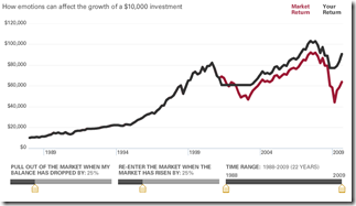
Emotional Investing
19 Nov 2009The second one from Vanguard lets you adjust when you leave and enter the market (based on market crashes/recoveries). Very cool.
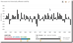
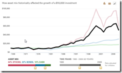
Interactive Investing
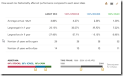
18 Nov 2009Vanguard has several interesting interactive tools for visualizing investment decisions. The first concerns investment composition. Use the sliders at the bottom to choose between stocks, bonds, and cash – and to show how your investments would have performed over any date range since 1928. Click on the little graph icons in the upper right corner to view it as data or a line chart. Thanks to Diane Fitzer for pointing them out.
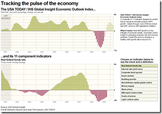
USA Today Economic Outlook Index (October edition)
In: Employment Finance Housing Interactive Stock Market US Economy
2 Nov 2009Updated October 28th. The best part is the lower chart showing the latest data for each of the 11 “leading indicators”.
Bailout Matrices
21 Sep 2009I question the value of “Bold/Weak” as an axis. but it’s still interesting to look at. Related CNNMoney article.
More interesting: Change in stock price one year later, versus level of federal assistance:
One Crisis Later
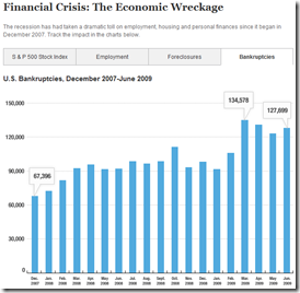
18 Sep 2009So many data releases focus (correctly) on percentage changes m-to-m or y-to-y; but once in a while it’s useful to look at the actual numbers. Below is the S&P, Employment, Foreclosures, and Bankruptcies.
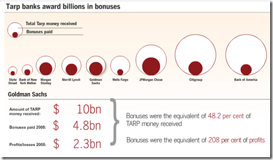
Bank Bonuses
3 Aug 2009Lots of talk last week about Wall Street still paying huge bonuses. Related article.
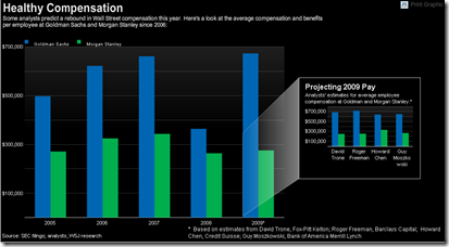
To be fair, 2009 values are analyst “estimates”. Related article.
Financial Reform
In: Finance Global Economy Source: FT Source: NYT Source: Ritholtz Stock Market US Economy
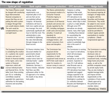
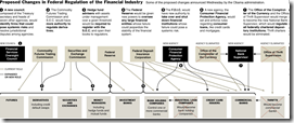
23 Jun 2009Summary of EU and US reforms. The related article is a very good read on the subject.
NYT’s version of just the USA (hat-tip to Ritholtz). Related article.
Bubbles 1994-2009
In: Bailout Finance Housing Reference Source: WSJ Stock Market US Economy
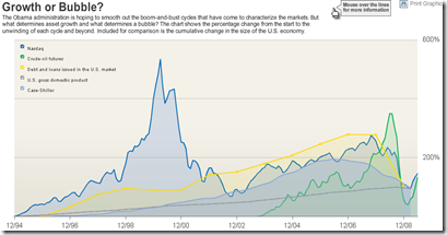
18 Jun 2009A good chart of US bubbles. The print version (p.A8, 6/18/09) had much better aesthetics. but the data are the same. Related article.
US Financial Oversight Proposals
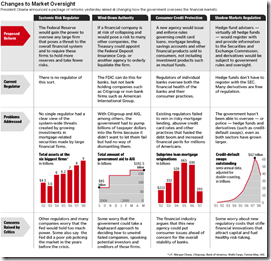
18 Jun 2009A table summarizing the oversight reforms proposed on Wednesday. Related Washpost article.
Regression to the Trend
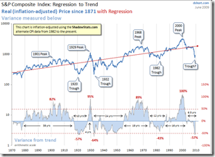
14 Jun 2009Dshort’s June update of one of my favorite charts (inflation adjusted bullish version). Makes me wonder if we’re just going to re-inflate the bubble without any real correction.
The FT 500
In: Finance Global Economy Interactive Source: FT Stock Market US Economy
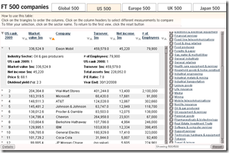
29 May 2009Interactive table of top 500 companies in the world (and for US/EU/UK/Japan) by market cap. You can sort any column, filter by sector, and drill down each company to see stats and historical rankings.
What is Chart Porn?
An addictive collection of beautiful charts, graphs, maps, and interactive data visualization toys -- on topics from around the world.
Categories
- Bailout (118)
- Chartporn Related (3)
- Commentary (21)
- Culture (669)
- Emerging Markets (66)
- Employment (245)
- Environment/weather (133)
- Finance (298)
- Food (92)
- Global Economy (373)
- Graphic Design (bad) (26)
- Graphic Design (general) (183)
- Graphic Tools (23)
- History (158)
- Housing (162)
- Humor (204)
- Innovative (183)
- Interactive (545)
- Internet/tech (97)
- Maps (578)
- News Media (34)
- Politics (329)
- Reference (97)
- Science (331)
- Source: Economist (101)
- Source: FT (92)
- Source: NYT (147)
- Source: Ritholtz (76)
- Source: USA Today (27)
- Source: Washington Post (90)
- Source: WSJ (135)
- Sports (58)
- Stock Market (74)
- Uncategorized (2)
- Updated regularly (76)
- US Economy (553)
- Video (22)
- Aram Korevaar: This chart is now being used as a projection in which countries such as China see themselves as in a [...]
- David: Welcome back Chart Porn! [...]
- J S: Thanks for the great story. Miss reading this blog. Hope to see you more active again. [...]
- jake: I lived in a DC row house for 6 years, and I'm writing this comment from my tiny 1 bedroom apartment [...]
- ronny pettersen: Hilarious and unfortunately accurate... ;-) [...]


