Source: WSJ Archive:
Stressing the Rest
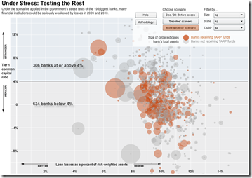
19 May 2009The WSJ stress-tested 900+ smaller banks. Sort by stress scenario, size, state, and tarp-recipients. Related article.
European GDP Map (Q109)
In: Emerging Markets Global Economy Interactive Maps Source: WSJ
17 May 2009Not much information here – just updated GDP data. Related article.
Bad Time to Graduate
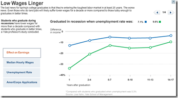
15 May 2009“The bad news for spring’s college graduates is that they’re entering the toughest labor market in at least 25 years. The worse news: Even those who do land jobs will likely suffer lower wages for a decade or more.” Related article. Tab through related stats in the below graphic:
Housing Listings (April)
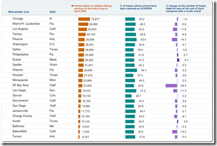
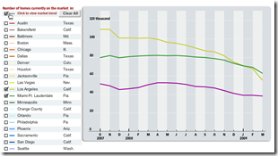
13 May 2009Housing inventory sortable by city, current (April) and over last 18 months (ZipReality data). As usual, the data is clouded by foreclosures. Related WSJ article.
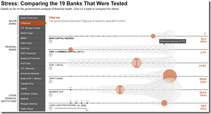
Bank Stress Test Results
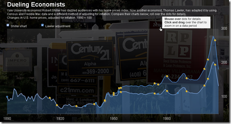
11 May 2009Shiller vs Lawler on housing stats
28 Apr 2009A WSJ article on Lawler’s criticism of Shiller’s data, and the difficulties coming up with good numbers. The chart below contrasts the two methods.
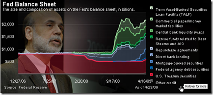
Fed Balance Sheet
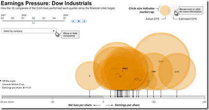
24 Apr 2009Dow Jones Quarterly Earnings
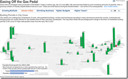
17 Apr 2009US Gasoline Consumption Falling?
14 Apr 2009Click along the header tabs to view different explanations/indicators of declining gas usage. Related article.
Stock Market Heat Map
In: Global Economy Interactive Maps Source: WSJ Stock Market US Economy
1 Apr 2009Interactive map of equity market performance (click on tabs to switch between quarters; click on dots for values)
Housing Continues to Tank (Jan 09 data)
1 Apr 2009What is Chart Porn?
An addictive collection of beautiful charts, graphs, maps, and interactive data visualization toys -- on topics from around the world.
Categories
- Bailout (118)
- Chartporn Related (3)
- Commentary (21)
- Culture (669)
- Emerging Markets (66)
- Employment (245)
- Environment/weather (133)
- Finance (298)
- Food (92)
- Global Economy (373)
- Graphic Design (bad) (26)
- Graphic Design (general) (183)
- Graphic Tools (23)
- History (158)
- Housing (162)
- Humor (204)
- Innovative (183)
- Interactive (545)
- Internet/tech (97)
- Maps (578)
- News Media (34)
- Politics (329)
- Reference (97)
- Science (331)
- Source: Economist (101)
- Source: FT (92)
- Source: NYT (147)
- Source: Ritholtz (76)
- Source: USA Today (27)
- Source: Washington Post (90)
- Source: WSJ (135)
- Sports (58)
- Stock Market (74)
- Uncategorized (2)
- Updated regularly (76)
- US Economy (553)
- Video (22)
- Aram Korevaar: This chart is now being used as a projection in which countries such as China see themselves as in a [...]
- David: Welcome back Chart Porn! [...]
- J S: Thanks for the great story. Miss reading this blog. Hope to see you more active again. [...]
- jake: I lived in a DC row house for 6 years, and I'm writing this comment from my tiny 1 bedroom apartment [...]
- ronny pettersen: Hilarious and unfortunately accurate... ;-) [...]







Bubble, Bubble, Economic Trouble…
In: Commentary Finance Housing Source: Ritholtz Source: WSJ US Economy
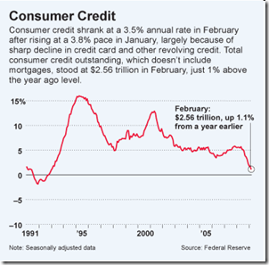
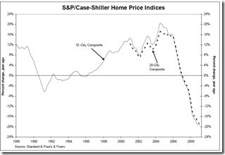
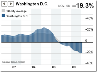
8 Apr 2009Nice WSJ article on bubbles. (via Ritholtz)