Source: WSJ Archive:
Child Obesity
In: Maps Science Source: WSJ
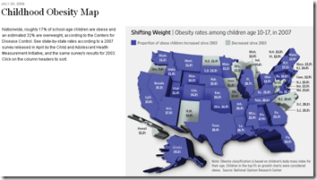
23 Jul 2009Looks like a nice chart. Too bad it’s squished, 3d, and slightly out of focus. I get the impression a lot of graphics people are either on their summer vacations already, or distracted getting ready for them (I know I am).
WSJ Economist Survey (July 09 edition)
In: Bailout Employment Finance Housing Interactive Source: WSJ Updated regularly US Economy
12 Jul 2009Interactive results of a survey of 54 economists, on a number of indicators and issues. Updated Monthly. Related article.
Fed Balance Sheet
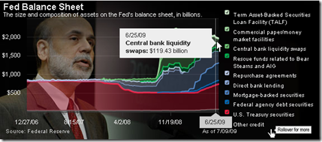
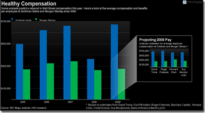
12 Jul 2009To be fair, 2009 values are analyst “estimates”. Related article.
Best State to Be Unemployed?
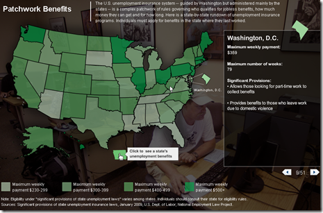
26 Jun 2009Map of each States’ unemployment benefits. Related article.
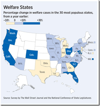
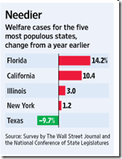
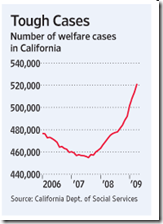
Welfare Rolls Swelling
22 Jun 2009World Refugees
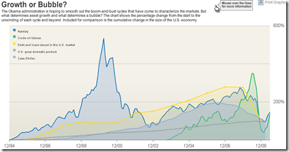
22 Jun 2009Bubbles 1994-2009
In: Bailout Finance Housing Reference Source: WSJ Stock Market US Economy
18 Jun 2009A good chart of US bubbles. The print version (p.A8, 6/18/09) had much better aesthetics. but the data are the same. Related article.
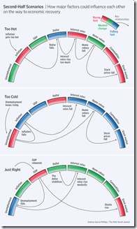
Perfect Landing
In: Bailout Employment Finance Housing Innovative Reference Source: WSJ
15 Jun 2009Ritholtz spotted this nice WSJ graphic on the importance of executing the Fed’s recession exit strategy just right. Related WSJ article.
US Household Wealth Down Another $1.3 Trillion
14 Jun 2009Wealth continues to evaporate in Q109. Related article. WSJ analysis.
The Problems Haven’t Gone Away
29 May 2009Well, the banks are close to being recapitalized, so that brings us roughly back to where we started (minus 5 million jobs and $11 trillion in wealth). But while that is a necessary condition for recovery, many of the other original problems (excessive household debt, for example) just keep chugging along.
“About 5.4 million of the country’s 45 million home loans were delinquent or in some stage of the foreclosure process in the first three months of the year, according to the Mortgage Bankers Association. [.] The figures released Thursday suggested that prime fixed-rate loans were supplanting risky subprime loans and rising adjustable-rate mortgages as the force behind the foreclosure crisis. In the first quarter, a seasonally adjusted 6.06 percent of all prime loans were delinquent.” (WSJ)
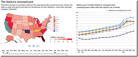
US Unemployment Map
27 May 2009Data from Dec 07- Apr 09. There isn’t too much interesting here, unless you want to compare states using the chart on the right.
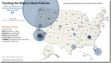
Map of Bank Failures Jan-08 to June 09
26 May 2009The interesting part are the bubble roll-overs: they show who tookover each bank’s assets, and how much each closure cost the FDIC.
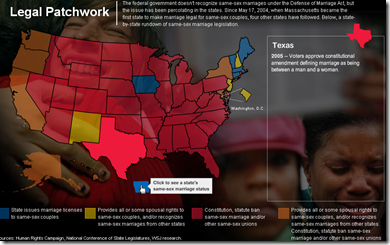
Map Of Same Sex Marriage Laws
19 May 2009What is Chart Porn?
An addictive collection of beautiful charts, graphs, maps, and interactive data visualization toys -- on topics from around the world.
Categories
- Bailout (118)
- Chartporn Related (3)
- Commentary (21)
- Culture (669)
- Emerging Markets (66)
- Employment (245)
- Environment/weather (133)
- Finance (298)
- Food (92)
- Global Economy (373)
- Graphic Design (bad) (26)
- Graphic Design (general) (183)
- Graphic Tools (23)
- History (158)
- Housing (162)
- Humor (204)
- Innovative (183)
- Interactive (545)
- Internet/tech (97)
- Maps (578)
- News Media (34)
- Politics (329)
- Reference (97)
- Science (331)
- Source: Economist (101)
- Source: FT (92)
- Source: NYT (147)
- Source: Ritholtz (76)
- Source: USA Today (27)
- Source: Washington Post (90)
- Source: WSJ (135)
- Sports (58)
- Stock Market (74)
- Uncategorized (2)
- Updated regularly (76)
- US Economy (553)
- Video (22)
- Aram Korevaar: This chart is now being used as a projection in which countries such as China see themselves as in a [...]
- David: Welcome back Chart Porn! [...]
- J S: Thanks for the great story. Miss reading this blog. Hope to see you more active again. [...]
- jake: I lived in a DC row house for 6 years, and I'm writing this comment from my tiny 1 bedroom apartment [...]
- ronny pettersen: Hilarious and unfortunately accurate... ;-) [...]

