Source: WSJ Archive:
Job Openings in Congress
In: Politics Source: WSJ
19 Feb 2010Gender Advantage
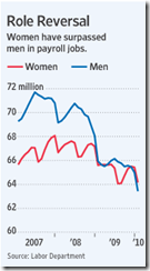
16 Feb 2010Women lost their jobs less than men during the recession, and women outnumber men in the workplace for the first time. Related article.
Israeli Settlements in the West Bank
9 Feb 2010An impressively detailed mapping analysis of settlements in disputed territories over time. Related article.
USA Job Losses by Sector 2008-10
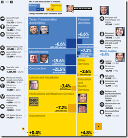
9 Feb 2010Job losses/gains. Use the timeline slider at the top to change the month. The bubbles at the bottom showing the overall size of the sectors are a nice touch.
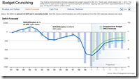
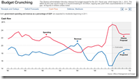
Obama 2011 Budget
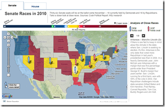
1 Feb 2010Election 2010
In: Maps Politics Source: WSJ
31 Jan 2010High Speed Rail in the USA
29 Jan 2010Interactive map of major projects (new funding was announce 1/28/10), with popup details. Related article.
Why I Don’t Watch Football
In: Culture Source: WSJ
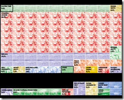
20 Jan 2010The Wall Street Journal did an analysis of what actually takes place onscreen while watching a football game. Even excluding commercials it still looks like a huge waste of time. Related article. (via Sociological Images)
Wall Street Compensation 2006-09
In: Bailout Finance Interactive Source: WSJ Stock Market US Economy
17 Jan 2010A very nice treemap presentation — you can drill down by year and company level. Clicking on a company box will bring up their own comments on compensation policies. Well done WSJ!
Haiti
In: Culture Environment/weather Global Economy Maps Science Source: NYT Source: USA Today Source: Washington Post Source: WSJ
15 Jan 2010Crazy amount of damage. and Haiti wasn’t in very good shape to start with. I’ll keep adding finds to this same post as I come across them.
I kept hearing that the shipping port was out of commission and was wondering what exactly that meant. Here it is. (via Washington Post print edition) 
Damage zone and location of aftershocks : 
Faultlines, cities, population density, shaking: 
Zoomable satellite map of Port-au-Prince from 10:30 Wednesday:
NYT side-by-side before and after satellite pictures: 
The New Job Market
12 Jan 2010From the WSJ, a treemap of the changing US job market (2007-09), with anecdotal popups. Related article.
Strategic Defaults
14 Dec 2009WSJ Shopping Guide
In: Culture Source: WSJ
1 Dec 2009A novel interactive shopping guide. Roll over items for names, sort using the options at the top. I don’t think I’ll do much shopping using this (the pictures are too small and having to roll over them to see what they are takes too long) – but it’s somewhat aesthetically pleasing.
GDP Recovery Trends
30 Oct 2009Lots of information here. What drew my eye was the size of the circles, which indicate how much each sector contributed to growth/contraction. I’m not sure what the sizes of the circles in the total column are supposed to be. Related WSJ article.
What is Chart Porn?
An addictive collection of beautiful charts, graphs, maps, and interactive data visualization toys -- on topics from around the world.
Categories
- Bailout (118)
- Chartporn Related (3)
- Commentary (21)
- Culture (669)
- Emerging Markets (66)
- Employment (245)
- Environment/weather (133)
- Finance (298)
- Food (92)
- Global Economy (373)
- Graphic Design (bad) (26)
- Graphic Design (general) (183)
- Graphic Tools (23)
- History (158)
- Housing (162)
- Humor (204)
- Innovative (183)
- Interactive (545)
- Internet/tech (97)
- Maps (578)
- News Media (34)
- Politics (329)
- Reference (97)
- Science (331)
- Source: Economist (101)
- Source: FT (92)
- Source: NYT (147)
- Source: Ritholtz (76)
- Source: USA Today (27)
- Source: Washington Post (90)
- Source: WSJ (135)
- Sports (58)
- Stock Market (74)
- Uncategorized (2)
- Updated regularly (76)
- US Economy (553)
- Video (22)
- Aram Korevaar: This chart is now being used as a projection in which countries such as China see themselves as in a [...]
- David: Welcome back Chart Porn! [...]
- J S: Thanks for the great story. Miss reading this blog. Hope to see you more active again. [...]
- jake: I lived in a DC row house for 6 years, and I'm writing this comment from my tiny 1 bedroom apartment [...]
- ronny pettersen: Hilarious and unfortunately accurate... ;-) [...]


