Source: WSJ Archive:
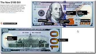
The New Benjamin
26 Apr 2010Anyone else think the 3d ribbon down the middle is butt ugly? And the liberty bell inside an inkwell? Ick.
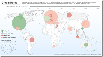
Global Interest Rate Tracker
In: Finance Global Economy Interactive Maps Politics Source: WSJ Updated regularly US Economy
26 Apr 2010Central bank rates from 2004-present (updated 4/20). See how countries are exiting from their stimulus policies.
European Airport Status Map
19 Apr 2010Looks like they might be updating this periodically (was showing 9:50am Monday when I posted). Related article.
Here’s another one from the Guardian that also shows the spread of the ash over time:
Banks Still Hiding Risk
9 Apr 2010Interactive from the WSJ showing how banks reduce short term borrowing each quarter before releasing info to the public. Related article. (via)
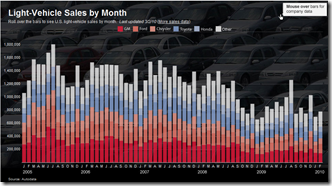
They are planning to stop buying them (or maybe not). Updated 3/25.
March Madness Twitter Feed
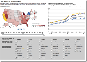
28 Mar 2010US Unemployment (updated 3/26/10)
28 Mar 2010Unemployment Heatmap (Mar ‘10 ver)
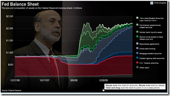
25 Mar 2010FED Balance Sheet (updated)
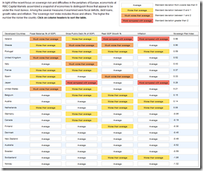
18 Mar 2010Sovereign Debt Hot Spots
8 Mar 2010Among the several measures it examined were fiscal deficits, debt loans, growth rates and inflation. The ‘sovereign risk’ index includes those and others. The higher the number the riskier the country.
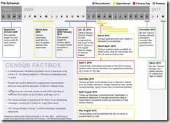
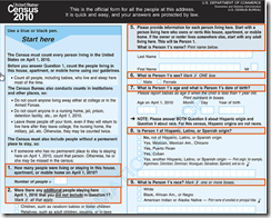
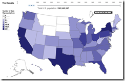
The Census
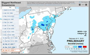
8 Mar 2010Northeast Snowpocalypses
28 Feb 2010Biggest NE storms of all time. Strangely, excludes the Blizzard of ’77, which I remember in upstate NY.
How Inventory Affects GDP
26 Feb 2010A nice annotated table. Related article.
What is Chart Porn?
An addictive collection of beautiful charts, graphs, maps, and interactive data visualization toys -- on topics from around the world.
Categories
- Bailout (118)
- Chartporn Related (3)
- Commentary (21)
- Culture (669)
- Emerging Markets (66)
- Employment (245)
- Environment/weather (133)
- Finance (298)
- Food (92)
- Global Economy (373)
- Graphic Design (bad) (26)
- Graphic Design (general) (183)
- Graphic Tools (23)
- History (158)
- Housing (162)
- Humor (204)
- Innovative (183)
- Interactive (545)
- Internet/tech (97)
- Maps (578)
- News Media (34)
- Politics (329)
- Reference (97)
- Science (331)
- Source: Economist (101)
- Source: FT (92)
- Source: NYT (147)
- Source: Ritholtz (76)
- Source: USA Today (27)
- Source: Washington Post (90)
- Source: WSJ (135)
- Sports (58)
- Stock Market (74)
- Uncategorized (2)
- Updated regularly (76)
- US Economy (553)
- Video (22)
- Aram Korevaar: This chart is now being used as a projection in which countries such as China see themselves as in a [...]
- David: Welcome back Chart Porn! [...]
- J S: Thanks for the great story. Miss reading this blog. Hope to see you more active again. [...]
- jake: I lived in a DC row house for 6 years, and I'm writing this comment from my tiny 1 bedroom apartment [...]
- ronny pettersen: Hilarious and unfortunately accurate... ;-) [...]

