Source: Washington Post Archive:
Potus Maximus
In: Interactive Politics Source: Washington Post Updated regularly
10 Sep 2009A treemap of how Obama has spent his time in office, by topic (apparently based on his official schedule). Updated daily by the Washington Post.
Helicopter Crashes
In: Interactive Maps News Media Science Source: Washington Post
21 Aug 2009From a Washington Post article on fatal helicopter accidents. What first looked like just one kind of interesting chart turned out to be three solid ones once you started clicking around. (Thanks to Jane An for pointing them out).
Kennedy Family Tree
12 Aug 2009Nice piece of genealogy from the Washington Post. Related article.
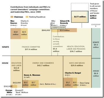
Health Care Reform Lobbying
27 Jul 2009A tree map of where the money is flowing. Related article.
(from Kelso’s Corner)
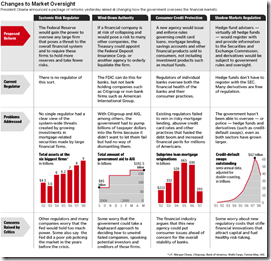
US Financial Oversight Proposals
18 Jun 2009A table summarizing the oversight reforms proposed on Wednesday. Related Washpost article.
US Health Care
14 Jun 2009A series of 10 charts and infographics on the history and proposals for health care reform, from the Washington Post, (includes an audio narrative).
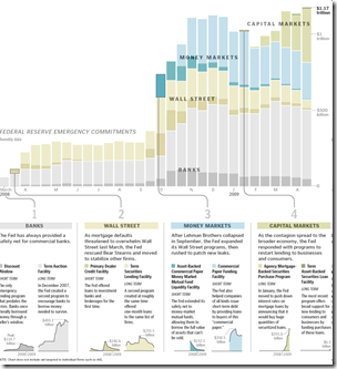
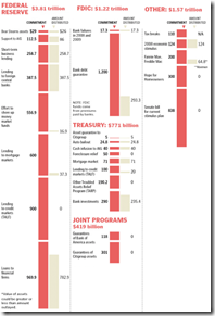
The Fed’s Trillion
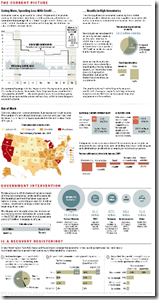
5 May 2009Economic State of the Union
In: Bailout Employment Finance Housing Source: Washington Post US Economy
8 Apr 2009A little dated now, but I didn’t come across the online version of this until today. it’d be nice if they kept it up to date.
Another Bailout Summary
8 Apr 2009That Horse Has Left the Barn
21 Dec 2008An interesting article on why nothing was done before the crisis exploded:
http://www.washingtonpost.com/wp-dyn/content/article/2008/12/09/AR2008120902816_pf.html
and a related online discussion:
http://www.washingtonpost.com/wp-dyn/content/discussion/2008/12/09/DI2008120901766.html?sid=ST2008120903238&s_pos=list
What is Chart Porn?
An addictive collection of beautiful charts, graphs, maps, and interactive data visualization toys -- on topics from around the world.
Categories
- Bailout (118)
- Chartporn Related (3)
- Commentary (21)
- Culture (669)
- Emerging Markets (66)
- Employment (245)
- Environment/weather (133)
- Finance (298)
- Food (92)
- Global Economy (373)
- Graphic Design (bad) (26)
- Graphic Design (general) (183)
- Graphic Tools (23)
- History (158)
- Housing (162)
- Humor (204)
- Innovative (183)
- Interactive (545)
- Internet/tech (97)
- Maps (578)
- News Media (34)
- Politics (329)
- Reference (97)
- Science (331)
- Source: Economist (101)
- Source: FT (92)
- Source: NYT (147)
- Source: Ritholtz (76)
- Source: USA Today (27)
- Source: Washington Post (90)
- Source: WSJ (135)
- Sports (58)
- Stock Market (74)
- Uncategorized (2)
- Updated regularly (76)
- US Economy (553)
- Video (22)
- Aram Korevaar: This chart is now being used as a projection in which countries such as China see themselves as in a [...]
- David: Welcome back Chart Porn! [...]
- J S: Thanks for the great story. Miss reading this blog. Hope to see you more active again. [...]
- jake: I lived in a DC row house for 6 years, and I'm writing this comment from my tiny 1 bedroom apartment [...]
- ronny pettersen: Hilarious and unfortunately accurate... ;-) [...]





G-20 Stimulus Spending
In: Bailout Commentary Finance Global Economy Interactive Maps Source: Washington Post US Economy
30 Mar 2009Related Washington Post article.
Of course, not being in terms of GDP, that isn’t the best perspective.
Here’s the original data from Brookings:
And here’s a nice interactive heatmap of the plans (roll-over for country details):