Source: Ritholtz Archive:
Still falling…
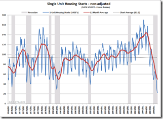
23 Apr 2009Housing Continues to Tank (Jan 09 data)
1 Apr 2009State of the Economy (2/28 update)
In: Employment Finance Housing Interactive Source: Ritholtz Updated regularly US Economy
26 Mar 2009A very powerful interactive analytical presentation/tool.
From Russell Investments (via Ritholtz)
US Debt
13 Mar 2009Ritholtz via option ARMageddon.
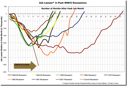
US Job losses (Feb data)
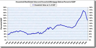
7 Mar 2009Housing prices still too high
23 Feb 2009Related Big Picture post.
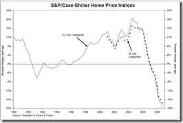
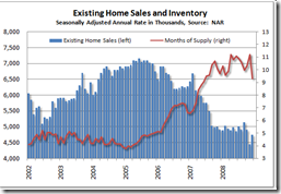
Some Housing charts
19 Feb 2009From The Big Picture.
What is Chart Porn?
An addictive collection of beautiful charts, graphs, maps, and interactive data visualization toys -- on topics from around the world.
Categories
- Bailout (118)
- Chartporn Related (3)
- Commentary (21)
- Culture (669)
- Emerging Markets (66)
- Employment (245)
- Environment/weather (133)
- Finance (298)
- Food (92)
- Global Economy (373)
- Graphic Design (bad) (26)
- Graphic Design (general) (183)
- Graphic Tools (23)
- History (158)
- Housing (162)
- Humor (204)
- Innovative (183)
- Interactive (545)
- Internet/tech (97)
- Maps (578)
- News Media (34)
- Politics (329)
- Reference (97)
- Science (331)
- Source: Economist (101)
- Source: FT (92)
- Source: NYT (147)
- Source: Ritholtz (76)
- Source: USA Today (27)
- Source: Washington Post (90)
- Source: WSJ (135)
- Sports (58)
- Stock Market (74)
- Uncategorized (2)
- Updated regularly (76)
- US Economy (553)
- Video (22)
- Aram Korevaar: This chart is now being used as a projection in which countries such as China see themselves as in a [...]
- David: Welcome back Chart Porn! [...]
- J S: Thanks for the great story. Miss reading this blog. Hope to see you more active again. [...]
- jake: I lived in a DC row house for 6 years, and I'm writing this comment from my tiny 1 bedroom apartment [...]
- ronny pettersen: Hilarious and unfortunately accurate... ;-) [...]

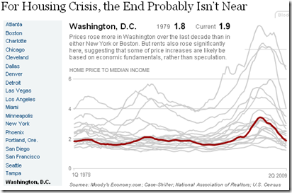
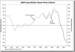
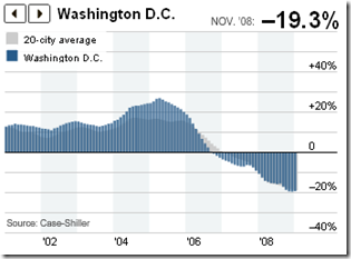

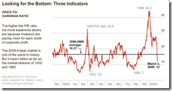


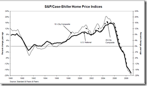
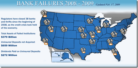
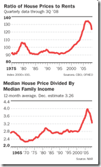
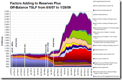




Bubble, Bubble, Economic Trouble…
In: Commentary Finance Housing Source: Ritholtz Source: WSJ US Economy
8 Apr 2009Nice WSJ article on bubbles. (via Ritholtz)