Source: Ritholtz Archive:
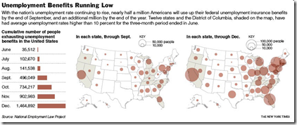
Unemployment
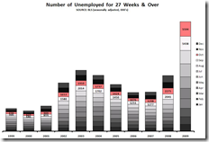
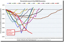
6 Nov 2009All new and depressing ways of looking at unemployment statistics, from Ritzholtz/The Big Picture.
The Fed’s Changing Assets
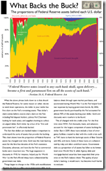
3 Nov 2009How the composition of the Fed’s balance sheet has changed over time. I would like to have seen the past two years blown up in detail. (via Ritzholtz).
From Ritholtz. more of a timeline quiz than a chart.
1. Tulip Mania
2. South Sea /Mississippi Company Bubbles
3. Railway Mania
4. Florida Speculative Building Mania
5. Roaring 1920s/1929
6. Poseidon Bubble
7. Gold
8. Japanese Asset Bubble
9. Dot Com/Tech/Telecoms
10. Global Real Estate/Credit Bubble
11. China/Shanghai Index Stock Bubble
12. Commodity Bubble
13. Oil Bubble
14. Leverage/Derivative/Financial Bubble
Foreclosure Breakdown
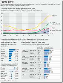
21 Aug 2009Excellent data from the WSJ, via The Big Picture.
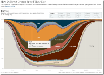
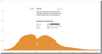
An American Day
3 Aug 2009Related article. Via Ritholtz (again. read The Big Picture!)
Housing Volume by Size
3 Aug 2009The End is Near?
27 Jul 2009The index of leading indicators, which signals turning points in the economy, is rising at a rate that has accurately indicated the end of every recession since the index began to be compiled in 1959.
Spotted by The Big Picture. Original article.
Credit Card Hell
28 Jun 2009Anyone else think the recent “reforms” didn’t address the problem of many people’s credit cards, namely the usurious interest rates? Spotted over at Ritzholtz.
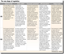
Financial Reform
In: Finance Global Economy Source: FT Source: NYT Source: Ritholtz Stock Market US Economy
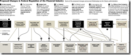
23 Jun 2009Summary of EU and US reforms. The related article is a very good read on the subject.
NYT’s version of just the USA (hat-tip to Ritholtz). Related article.
Foreclosures Continue to Rise
14 Jun 2009Click on the image below to see RealtyTracs full report. For discussion I’d recommend the comments over at Ritholtz (some of them – they tend to wander a bit there nowadays).
Anatomy of the Crash
In: Bailout Finance Innovative Reference Source: Ritholtz US Economy
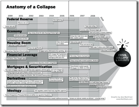
10 Jun 2009(Sorry there haven’t been many updates lately – I’m on vacation in the Colorado mountains.) Here is a infographic from Barry Ritholtz’s book Bailout Nation that does a great job showing the different causes of the crash, and how they developed over time:
Home Prices Continue Down (Mar 09)
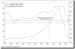
26 May 2009Charts from Ritholtz below. An amusing article on how they’re trying to spin them as not that bad: “Case-Shiller Sucks. But Who Cares, That’s Just Backwards Looking” by Joe Weisenthal.
New York Foreclosures
17 May 2009Very detailed interactive map of NY area foreclosures – over time, zoom in, even just type in an address. Related article. (Hat tip to Ritholtz for the find)
Green Shoots Nonsense?
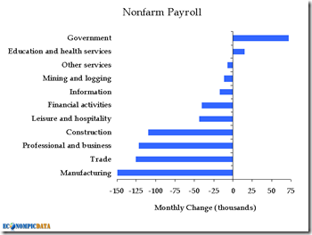
11 May 2009More statistical games with April’s employment numbers. The mainstream media have focused on the numbers being “good” because they aren’t falling as fast as previous months (a bit of a reach, IMHO). But several bloggers have pointed out that the 539,000 job losses only look good because of government hiring for the census. otherwise the losses are 611,000. Here is EconomPic’s graph:
What is Chart Porn?
An addictive collection of beautiful charts, graphs, maps, and interactive data visualization toys -- on topics from around the world.
Categories
- Bailout (118)
- Chartporn Related (3)
- Commentary (21)
- Culture (669)
- Emerging Markets (66)
- Employment (245)
- Environment/weather (133)
- Finance (298)
- Food (92)
- Global Economy (373)
- Graphic Design (bad) (26)
- Graphic Design (general) (183)
- Graphic Tools (23)
- History (158)
- Housing (162)
- Humor (204)
- Innovative (183)
- Interactive (545)
- Internet/tech (97)
- Maps (578)
- News Media (34)
- Politics (329)
- Reference (97)
- Science (331)
- Source: Economist (101)
- Source: FT (92)
- Source: NYT (147)
- Source: Ritholtz (76)
- Source: USA Today (27)
- Source: Washington Post (90)
- Source: WSJ (135)
- Sports (58)
- Stock Market (74)
- Uncategorized (2)
- Updated regularly (76)
- US Economy (553)
- Video (22)
- Aram Korevaar: This chart is now being used as a projection in which countries such as China see themselves as in a [...]
- David: Welcome back Chart Porn! [...]
- J S: Thanks for the great story. Miss reading this blog. Hope to see you more active again. [...]
- jake: I lived in a DC row house for 6 years, and I'm writing this comment from my tiny 1 bedroom apartment [...]
- ronny pettersen: Hilarious and unfortunately accurate... ;-) [...]

