Source: Ritholtz Archive:
Europe: How Bad is it?
13 May 2010Psychological Cycles of Recessions
In: Finance Global Economy Reference Source: Ritholtz Stock Market
15 Apr 2010Barry Ritholtz has pulled together a great collection of charts mapping out how we tend to view economic cycles. Check out his post for an interesting related discussion.
Banks Still Hiding Risk
9 Apr 2010Interactive from the WSJ showing how banks reduce short term borrowing each quarter before releasing info to the public. Related article. (via)
Housing Booms and Busts
31 Mar 2010Although this NY FED article is primarily focused on explaining Upstate NY’s immunity from the boom/bust cycle, it includes some interesting analysis of nation wide trends. (via The Big Picture).
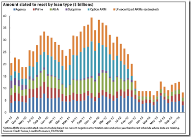
ARMS: $1 Trillion Still to Reset
9 Mar 2010Borrowers who already have seen their ARMs reset might be sitting on their hands and not refinancing into fixed-rate products, McBride said. Because mortgage rates have been so low recently, resets can actually lower, not raise, monthly payments. When that happens, borrowers might feel little urge to refinance into a fixed-rate product that would cost more per month. Alternatively, ARM borrowers might simply struggle to qualify for a refinance because of low or negative equity.
The problem, McBride said, is that when interest rates increase – which many analysts expect to happen over the next year – borrowers’ monthly payments might increase beyond what is affordable for them. And at that point, the fixed-rate products will no longer be attractive, or even financially viable, options.
(via)
Economic Normalcy?
8 Mar 2010A bit of data cherry picking, perhaps (announced job cuts?). Related article. (via Barry Ritholtz)
World Bailouts and Stimulus
In: Bailout Finance Global Economy Maps Source: Ritholtz US Economy
27 Jan 2010Powerful summary from the Harvard Business Review (hardcopy apparently) via The Big Picture.
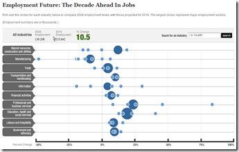
Future Jobs
17 Jan 2010Projected 2018 change in US employment levels by sector. A questionable analysis at best. nobody has a clue. (via The Big Picture)
Visual Dictionary
4 Jan 2010Visuwords: An interactive visual representation of the relationships between words. (via The Big Picture)
Job growth, GDP and household net worth all did poorly. Related Washington Post article. (via The Big Picture).
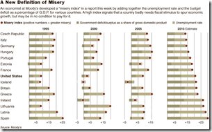
The Misery Index
In: Employment Finance Global Economy Source: NYT Source: Ritholtz
21 Dec 2009The index adds together a country’s budget deficit, as a percentage of gross domestic product, and its unemployment rate.
Credit
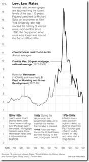
14 Dec 2009Historical Interest Rates
14 Dec 2009Falling Dollar
In: Emerging Markets Finance Global Economy Source: NYT Source: Ritholtz US Economy
8 Dec 2009Who are the winners and losers? (via The Big Picture)
What is Chart Porn?
An addictive collection of beautiful charts, graphs, maps, and interactive data visualization toys -- on topics from around the world.
Categories
- Bailout (118)
- Chartporn Related (3)
- Commentary (21)
- Culture (669)
- Emerging Markets (66)
- Employment (245)
- Environment/weather (133)
- Finance (298)
- Food (92)
- Global Economy (373)
- Graphic Design (bad) (26)
- Graphic Design (general) (183)
- Graphic Tools (23)
- History (158)
- Housing (162)
- Humor (204)
- Innovative (183)
- Interactive (545)
- Internet/tech (97)
- Maps (578)
- News Media (34)
- Politics (329)
- Reference (97)
- Science (331)
- Source: Economist (101)
- Source: FT (92)
- Source: NYT (147)
- Source: Ritholtz (76)
- Source: USA Today (27)
- Source: Washington Post (90)
- Source: WSJ (135)
- Sports (58)
- Stock Market (74)
- Uncategorized (2)
- Updated regularly (76)
- US Economy (553)
- Video (22)
- Aram Korevaar: This chart is now being used as a projection in which countries such as China see themselves as in a [...]
- David: Welcome back Chart Porn! [...]
- J S: Thanks for the great story. Miss reading this blog. Hope to see you more active again. [...]
- jake: I lived in a DC row house for 6 years, and I'm writing this comment from my tiny 1 bedroom apartment [...]
- ronny pettersen: Hilarious and unfortunately accurate... ;-) [...]


