Source: NYT Archive:
Unemployment Reform
22 Jun 2009Many states are modifying their unemployment benefit laws, some in connection to the recession and some to take advantage of federal stimulus money. Related NYT blog post.

NYC Murder Map
19 Jun 2009Homicide data cut, chopped, sorted, and mapped in all kinds of interesting ways (especially if you live in NYC). Supposedly will be updated regularly. Related article. Hat-tip to Information aesthetics for the find.

Deeper Look at (Un)Employment
14 Jun 2009A very nice look at sector specific hiring and firing. I wish it included 2009 data.

US Deficit Creation
14 Jun 2009Infographic on the expansion of the US fiscal deficit since 2000. Related article.

Nationwide Rent to Buy Ratios
In: Housing Maps Source: NYT
31 May 2009This data is from a year ago. but I’ve always been fascinated by it. Anyone know where to find more recent data? (yes, I know the source says “Moody’s”)

Credit Crisis Indicators
In: Global Economy Reference Source: NYT Updated regularly US Economy
27 May 2009The NYT maintains a tool showing the latest updates for five credit market indicators (3mo Treasuries, Libor, Ted spread, 30-day commercial paper, and high yield bond yields). Sometimes I just want a quick look at the latest numbers.
Note: Similarly, their Markets page and Economy pages provide clean up-to-date presentations on a variety of indicators.

Case-Shiller (mar 09 data)
27 May 2009The NYT has updated one of my favorite interactive presentations of Case-Shiller’s 20 city housing index. It shows how each cities’ performance versus the national index (the light grey bars in the background).

New York Foreclosures
17 May 2009Very detailed interactive map of NY area foreclosures – over time, zoom in, even just type in an address. Related article. (Hat tip to Ritholtz for the find)

Red tape and guidelines vary widely across the US. Related article.


GDP for Beginners
5 May 2009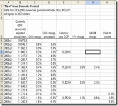 Joseph Kwak over at The Baseline Scenario has a nice explanation of how GDP is calculated, and what all those different growth rates you read in the paper mean. Of course, you could go to wikipedia for more wonk.

Coincident and Leading Indicators
27 Apr 2009From the Conference Board via NYT. “Unlike the more widely followed Index of Leading Indicators, which is supposed to help forecast changes in the economy, the coincident index is aimed at simply recording how the economy is doing now.”


To Rent or Buy
23 Apr 2009For those who want to do the math on this questions, here is a nice calculator from the New York Times. Of course, most economists think prices are going to keep dropping until late 2010.

Still falling…
23 Apr 2009


What is Chart Porn?
An addictive collection of beautiful charts, graphs, maps, and interactive data visualization toys -- on topics from around the world.
Categories
- Bailout (118)
- Chartporn Related (3)
- Commentary (21)
- Culture (669)
- Emerging Markets (66)
- Employment (245)
- Environment/weather (133)
- Finance (298)
- Food (92)
- Global Economy (373)
- Graphic Design (bad) (26)
- Graphic Design (general) (183)
- Graphic Tools (23)
- History (158)
- Housing (162)
- Humor (204)
- Innovative (183)
- Interactive (545)
- Internet/tech (97)
- Maps (578)
- News Media (34)
- Politics (329)
- Reference (97)
- Science (331)
- Source: Economist (101)
- Source: FT (92)
- Source: NYT (147)
- Source: Ritholtz (76)
- Source: USA Today (27)
- Source: Washington Post (90)
- Source: WSJ (135)
- Sports (58)
- Stock Market (74)
- Uncategorized (2)
- Updated regularly (76)
- US Economy (553)
- Video (22)
- Aram Korevaar: This chart is now being used as a projection in which countries such as China see themselves as in a [...]
- David: Welcome back Chart Porn! [...]
- J S: Thanks for the great story. Miss reading this blog. Hope to see you more active again. [...]
- jake: I lived in a DC row house for 6 years, and I'm writing this comment from my tiny 1 bedroom apartment [...]
- ronny pettersen: Hilarious and unfortunately accurate... ;-) [...]