Source: NYT Archive:
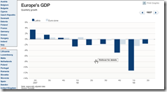
European GDP
16 Aug 2009Interactive bar chart of EU country GDP. Unfortunately, they resize the scale on every chart, making it tough to do cross-country comparisons (though they do put the euro-zone average on each chart).
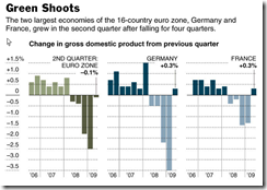
From the NYT:
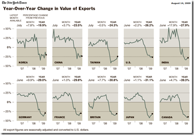
World Exports
14 Aug 2009A mixed story on trade – I think people are still reaching pretty hard for green shoot, especially in this data. Related article.
Music Sales?
In: Culture Source: NYT
3 Aug 2009This chart doesn’t quite look right to me. But it’s from the RIAA, so no surprise there. They try to make it look like it’s volume, but it’s not.
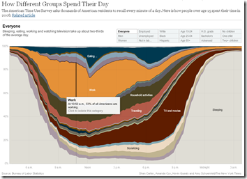
An American Day
3 Aug 2009Related article. Via Ritholtz (again. read The Big Picture!)
The End is Near?
27 Jul 2009The index of leading indicators, which signals turning points in the economy, is rising at a rate that has accurately indicated the end of every recession since the index began to be compiled in 1959.
Spotted by The Big Picture. Original article.
How Much is College Worth?
23 Jul 2009NYT’s Economix blog noticed payscale.com’s dataset of college grad salaries. Some interesting charts there, and since they make the raw data available, we’ll probably see more.
Retail Sales
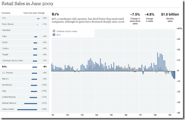
12 Jul 2009Sales by retailer compared to Goldman Sachs index. Not sure that this data is worth the trouble, but well done.
(another) US Unemployment Map
In: Employment Maps Source: NYT Updated regularly US Economy
9 Jul 2009Quite similar to the AP map I mentioned last month, the NYT has created a map of national unemployment (with data through May09). Some of the filters are interesting in this version:
Recovery Trends
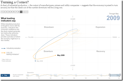
6 Jul 2009The NYT has made a slide presentation of several interesting animations on the recovery. It’s basically a variation of the OECD Business Cycle Clock that I posted about in May, but with a step-through explanation attached. FlowingData points to several similar efforts as well.
Casualties of War
In: Culture Graphic Design (general) Innovative Interactive Maps Politics Source: NYT
2 Jul 2009The breakdown by age, race, branch, and type of duty is fascinations, and the adjustable time scale is a nice touch.
Housing is in Poor Shape
28 Jun 2009Despite what the NARs talking heads spout to the MSM at every data release, housing has not turned a corner. The related article includes a good explanation of what the charts show. For discussion check out Ritholtz’s post on the same article.
Where Are We From?
28 Jun 2009I missed this back in march but just spotted a reference at Infographics. The NYT took 120 years of immigration data and threw it perfectly at a map – you can filter by country of origin, then move through time with the slider.
Financial Reform
In: Finance Global Economy Source: FT Source: NYT Source: Ritholtz Stock Market US Economy
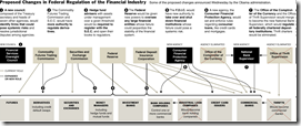
23 Jun 2009Summary of EU and US reforms. The related article is a very good read on the subject.
NYT’s version of just the USA (hat-tip to Ritholtz). Related article.
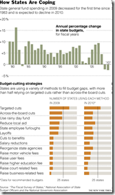
States Facing Budget Crisis
22 Jun 2009The article is more interesting than the graphic.
What is Chart Porn?
An addictive collection of beautiful charts, graphs, maps, and interactive data visualization toys -- on topics from around the world.
Categories
- Bailout (118)
- Chartporn Related (3)
- Commentary (21)
- Culture (669)
- Emerging Markets (66)
- Employment (245)
- Environment/weather (133)
- Finance (298)
- Food (92)
- Global Economy (373)
- Graphic Design (bad) (26)
- Graphic Design (general) (183)
- Graphic Tools (23)
- History (158)
- Housing (162)
- Humor (204)
- Innovative (183)
- Interactive (545)
- Internet/tech (97)
- Maps (578)
- News Media (34)
- Politics (329)
- Reference (97)
- Science (331)
- Source: Economist (101)
- Source: FT (92)
- Source: NYT (147)
- Source: Ritholtz (76)
- Source: USA Today (27)
- Source: Washington Post (90)
- Source: WSJ (135)
- Sports (58)
- Stock Market (74)
- Uncategorized (2)
- Updated regularly (76)
- US Economy (553)
- Video (22)
- Aram Korevaar: This chart is now being used as a projection in which countries such as China see themselves as in a [...]
- David: Welcome back Chart Porn! [...]
- J S: Thanks for the great story. Miss reading this blog. Hope to see you more active again. [...]
- jake: I lived in a DC row house for 6 years, and I'm writing this comment from my tiny 1 bedroom apartment [...]
- ronny pettersen: Hilarious and unfortunately accurate... ;-) [...]

