Source: NYT Archive:
China vs United States
16 Nov 2009Personalized Unemployment
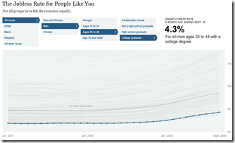
9 Nov 2009How bad would it be for you if you lost your job? This NYT graphic lets you filter the unemployment statistics on several variables.
Wall Street Stock Options
8 Nov 2009The Breaks
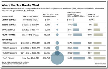
2 Nov 2009Bush’s tax breaks (which expire next year). It’s in dollar terms, so a little misleading, but still interesting. Related article. (via Sociological Images)
Marriage
In: Culture Source: NYT
18 Oct 2009Changing trends in overall age and older/younger trends. Related article. (via)
Recovery?
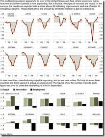
16 Oct 2009Global recovery based on manufacturing output. Related NYT article.
Health Care Bill Comparison
14 Oct 2009An interactive descriptive comparison of the provisions of the different health care bills in congress, with additional info on the White House’s preferences.
This Time is Different
2 Oct 2009NYT Economic Indicators
In: Employment Finance Housing Reference Source: NYT US Economy
2 Oct 2009The NYT has a nice tiny tool that provides the most recent data for 25 economic indicators (housing, employment, production, confidence, etc). It appears at the top of their “Economy” page, and an ugly version of the flash tool can be viewed directly here.
No Loans for You
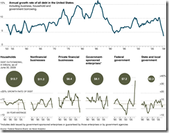
28 Sep 2009A chart from the NYT illustrating lending has not begun to recover much at all. Related article.
Gadget Impact
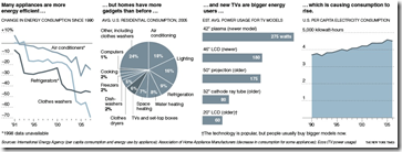
22 Sep 2009While toys and appliances are getting more efficient – we are using more of them. Related NYT article. Again, hat tip to the keen eye of Paul Kedrosky.
Bailout Update
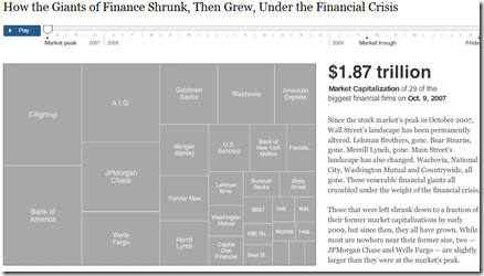
22 Sep 2009Winners and Losers
13 Sep 2009Fun with NYT Trends
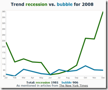
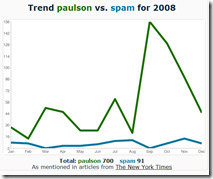
18 Aug 2009Enter any two words into this tool and see a quick comparison graph of mentions in the New York Times. Unfortunately it only goes through 2008 at the moment.
What is Chart Porn?
An addictive collection of beautiful charts, graphs, maps, and interactive data visualization toys -- on topics from around the world.
Categories
- Bailout (118)
- Chartporn Related (3)
- Commentary (21)
- Culture (669)
- Emerging Markets (66)
- Employment (245)
- Environment/weather (133)
- Finance (298)
- Food (92)
- Global Economy (373)
- Graphic Design (bad) (26)
- Graphic Design (general) (183)
- Graphic Tools (23)
- History (158)
- Housing (162)
- Humor (204)
- Innovative (183)
- Interactive (545)
- Internet/tech (97)
- Maps (578)
- News Media (34)
- Politics (329)
- Reference (97)
- Science (331)
- Source: Economist (101)
- Source: FT (92)
- Source: NYT (147)
- Source: Ritholtz (76)
- Source: USA Today (27)
- Source: Washington Post (90)
- Source: WSJ (135)
- Sports (58)
- Stock Market (74)
- Uncategorized (2)
- Updated regularly (76)
- US Economy (553)
- Video (22)
- Aram Korevaar: This chart is now being used as a projection in which countries such as China see themselves as in a [...]
- David: Welcome back Chart Porn! [...]
- J S: Thanks for the great story. Miss reading this blog. Hope to see you more active again. [...]
- jake: I lived in a DC row house for 6 years, and I'm writing this comment from my tiny 1 bedroom apartment [...]
- ronny pettersen: Hilarious and unfortunately accurate... ;-) [...]

