Source: NYT Archive:
NYC’s Best Coffee
14 Mar 2010I don’t know what standard they used, but the NYT has mapped out NYC’s “outstanding coffee bars.” (I hate coffee so didn’t bother to read the related article)
Economic Normalcy?
8 Mar 2010A bit of data cherry picking, perhaps (announced job cuts?). Related article. (via Barry Ritholtz)
How Fast Can You Lose an Olympic Medal?
In: Culture Source: NYT Sports
28 Feb 2010For most, less than half a second. The NYT has graphed the finishing times of many Olympic events – and if you hit the play button at the left of the race it will play a tone-sound in real time for each finisher, illustrating just how little separated the medal winners from everyone else. Very cool! (via)
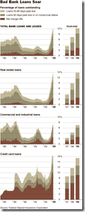
Bad Loans
28 Feb 2010More Obama Budget
1 Feb 2010Interactive treemap from the NYT – you can zoom/drill into the details, “hide” mandatory spending, and rollovers popup the 2010-11 values and change. Thanks to Andrea Noble for the heads up!
Haiti
In: Culture Environment/weather Global Economy Maps Science Source: NYT Source: USA Today Source: Washington Post Source: WSJ
15 Jan 2010Crazy amount of damage. and Haiti wasn’t in very good shape to start with. I’ll keep adding finds to this same post as I come across them.
I kept hearing that the shipping port was out of commission and was wondering what exactly that meant. Here it is. (via Washington Post print edition) 
Damage zone and location of aftershocks : 
Faultlines, cities, population density, shaking: 
Zoomable satellite map of Port-au-Prince from 10:30 Wednesday:
NYT side-by-side before and after satellite pictures: 
Netflix Map
10 Jan 2010Most rented and least rented movies in major metro areas. Roll over to view details by zipcode. Clearly contains some errors though. Benjamin Button was No1 and True Blood season 1 was 47? Thanks to Jack Lucky for pointing it out.
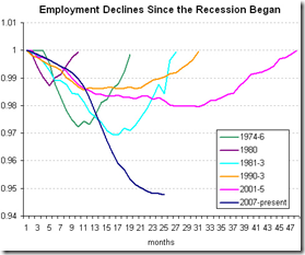
Recession Unemployment
9 Jan 2010More Naughts
In: Culture Source: NYT
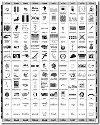
4 Jan 2010A logo and meme chart of 2000-09. I like it. It’s a reminder of powerful subtle visual triggers can be for memories and feelings. (via FlowingData)
Health Reform
28 Dec 2009The Misery Index
In: Employment Finance Global Economy Source: NYT Source: Ritholtz
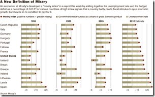
21 Dec 2009The index adds together a country’s budget deficit, as a percentage of gross domestic product, and its unemployment rate.
Credit
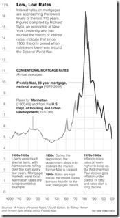
14 Dec 2009Historical Interest Rates
14 Dec 2009Copenhagen
In: Environment/weather Interactive Maps Science Source: NYT
9 Dec 2009Falling Dollar
In: Emerging Markets Finance Global Economy Source: NYT Source: Ritholtz US Economy
8 Dec 2009Who are the winners and losers? (via The Big Picture)
What is Chart Porn?
An addictive collection of beautiful charts, graphs, maps, and interactive data visualization toys -- on topics from around the world.
Categories
- Bailout (118)
- Chartporn Related (3)
- Commentary (21)
- Culture (669)
- Emerging Markets (66)
- Employment (245)
- Environment/weather (133)
- Finance (298)
- Food (92)
- Global Economy (373)
- Graphic Design (bad) (26)
- Graphic Design (general) (183)
- Graphic Tools (23)
- History (158)
- Housing (162)
- Humor (204)
- Innovative (183)
- Interactive (545)
- Internet/tech (97)
- Maps (578)
- News Media (34)
- Politics (329)
- Reference (97)
- Science (331)
- Source: Economist (101)
- Source: FT (92)
- Source: NYT (147)
- Source: Ritholtz (76)
- Source: USA Today (27)
- Source: Washington Post (90)
- Source: WSJ (135)
- Sports (58)
- Stock Market (74)
- Uncategorized (2)
- Updated regularly (76)
- US Economy (553)
- Video (22)
- Aram Korevaar: This chart is now being used as a projection in which countries such as China see themselves as in a [...]
- David: Welcome back Chart Porn! [...]
- J S: Thanks for the great story. Miss reading this blog. Hope to see you more active again. [...]
- jake: I lived in a DC row house for 6 years, and I'm writing this comment from my tiny 1 bedroom apartment [...]
- ronny pettersen: Hilarious and unfortunately accurate... ;-) [...]

