Source: NYT Archive:
Your Coming Tax Cut (or not)
20 Sep 2010A very nice analysis from the New York Times – as usual. (via)
Personal Finance Advice on Napkins
10 Aug 2010Napkins are not where you would expect to find good financial advice, but when they come from the New York Times they are worth reading (and each is linked to a related blog post).
How Pitchers Dominate
4 Aug 2010Two cool analyses (even if you don’t care about baseball) of how Mariano Rivera and Stephen Strasbourg pitch. You have to wonder what kinds of similar work team scouts do behind the scenes.
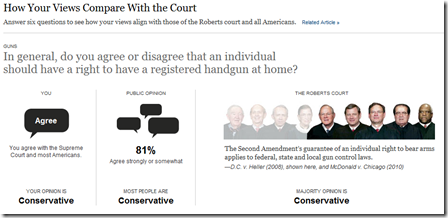
If You Were on the Supreme Court
29 Jul 2010For each of six questions, your answers will be compared to public opinion polls and recent decisions of the supreme court.
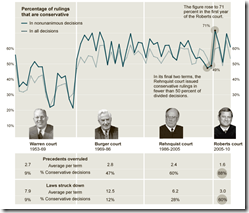
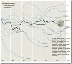
How Conservative is the US Supreme Court?
29 Jul 2010The Roberts Court has issued conservative decisions at a slightly higher rate than the Rehnquist or the Burger Courts. [Related article]
Thanks to epetrela for the link!
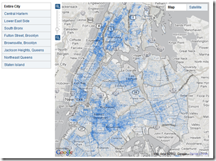
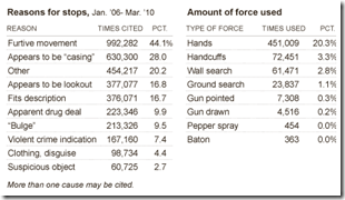
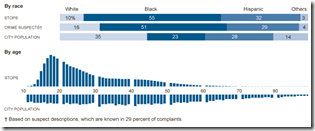
Where to Get Harassed by Cops in NYC
12 Jul 2010The NYT has an interactive map and related charts of where NYC police have been utilizing the “stop, question, and frisk” policy. Related article.
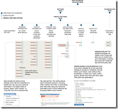
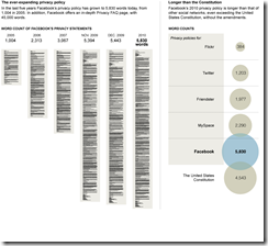
Facebook’s 170 Privacy Options
13 May 2010Driving Habits vs Gas Prices
12 May 2010Interesting chart and analysis. I question a bit how accurate the underlying data is (does an unweighted mean of gas prices really reflect a year?; how is miles per capita measured?). Still, nicely done. (via)
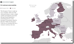
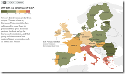
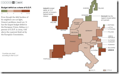
Europe Debt Maps
4 May 2010Web of European Debt
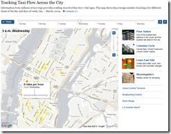
3 May 2010NY Cabs – Where to Find One
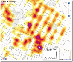
5 Apr 2010Interactive map of cab pickups in NYC Jan-Mar, 2009, based on millions of taxi trips. Apparently they also used the data to create a phone app. (via FlowingData).
Executive Pay 2009
In: Bailout Employment Finance Source: NYT Stock Market US Economy
5 Apr 2010This time from the NYT, covering 200 CEOs. Related article.
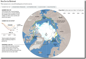
Sea Ice in Retreat?
In: Environment/weather Interactive Maps Science Source: NYT
25 Mar 2010I really liked the below NYT feature until I realized it was from 2007.
Looking around, I found this quicktime movie that shows 1979-2009:
So 2007 was a bad year, but now it’s rebounding? Well, not really.
So is it melting or not? I recommend watching the below:
Bank Competition Map
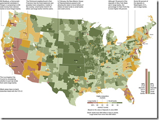
16 Mar 2010Big banks vs small. (via)
NCAA Brackets
15 Mar 2010There are many others out there, but here are some of the slickest:
Interactive version from the NYT where you can enter and save your picks and compare your results to others over time. 
ESPN’s is kind of nice as you can drag a pick straight through to the final and has popup background info:
The NCAA.com version has a bit of background info on each team in popups:
NBC’s bracket let’s you fill in and print out your picks, provides analysis on each matchup, and has prizes(?).
What is Chart Porn?
An addictive collection of beautiful charts, graphs, maps, and interactive data visualization toys -- on topics from around the world.
Categories
- Bailout (118)
- Chartporn Related (3)
- Commentary (21)
- Culture (669)
- Emerging Markets (66)
- Employment (245)
- Environment/weather (133)
- Finance (298)
- Food (92)
- Global Economy (373)
- Graphic Design (bad) (26)
- Graphic Design (general) (183)
- Graphic Tools (23)
- History (158)
- Housing (162)
- Humor (204)
- Innovative (183)
- Interactive (545)
- Internet/tech (97)
- Maps (578)
- News Media (34)
- Politics (329)
- Reference (97)
- Science (331)
- Source: Economist (101)
- Source: FT (92)
- Source: NYT (147)
- Source: Ritholtz (76)
- Source: USA Today (27)
- Source: Washington Post (90)
- Source: WSJ (135)
- Sports (58)
- Stock Market (74)
- Uncategorized (2)
- Updated regularly (76)
- US Economy (553)
- Video (22)
- Aram Korevaar: This chart is now being used as a projection in which countries such as China see themselves as in a [...]
- David: Welcome back Chart Porn! [...]
- J S: Thanks for the great story. Miss reading this blog. Hope to see you more active again. [...]
- jake: I lived in a DC row house for 6 years, and I'm writing this comment from my tiny 1 bedroom apartment [...]
- ronny pettersen: Hilarious and unfortunately accurate... ;-) [...]


