Source: FT Archive:
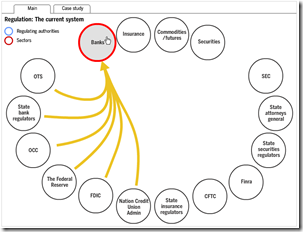
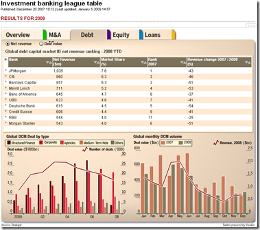
Overlapping Banking Supervision
14 Jun 2009Interactive chart from FT. Related article.
US Auto Market Share 1980-2008
31 May 2009roll-overs show the ten-year data trends. What surprised me was how GM has taken the bulk of the loss, with Chrysler actually holding pretty steady.
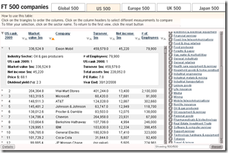
The FT 500
In: Finance Global Economy Interactive Source: FT Stock Market US Economy
29 May 2009Interactive table of top 500 companies in the world (and for US/EU/UK/Japan) by market cap. You can sort any column, filter by sector, and drill down each company to see stats and historical rankings.
Pension Losses
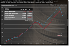
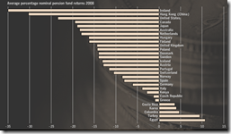
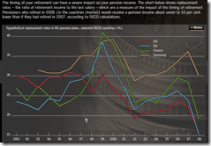
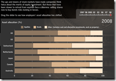
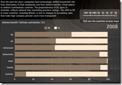
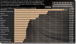
27 May 2009Buried in a lot of videos and audio analysis on this FT tool are some very interesting charts showing how much damage has been done to pension systems around the world (and not just in the past year).
European Economic Forecast Map (5/13/09 update)
In: Emerging Markets Global Economy Innovative Maps Source: FT Updated regularly
15 May 2009Click on the timeline at the top to view past versions. Roll over country names to see real GDP growth 2007-10.
Writedown Estimates (again)
In: Bailout Finance Global Economy Interactive Source: FT US Economy
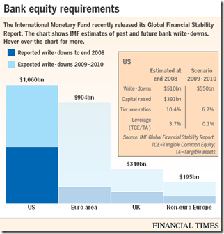
14 May 2009As we noted a couple weeks ago, the IMF released estimates of bank writedowns past and future in this years GFSR. Below is today’s FT interactive graphic of the same info (the total is $4 trillion if you were wondering).
OECD Composite Leading Indicators
12 May 2009“OECD composite leading indicators (CLIs) for March 2009 continue to point to a strong slowdown in the OECD. However France, Italy and the United Kingdom are showing tentative signs of, at least, a pause in the economic slowdown. Weak though these signals are, they are present in the majority of the CLI component series for these countries. In other major OECD economies the CLIs continue to point to deterioration in the business cycle, but at a decreasing rate. However, with the exception of China, where signs of a pause have also emerged, major non-OECD economies still face deteriorating conditions.”
Related FT article.
OECD press release and data website (will be updated regularly)
Follow the Sub-Prime Money
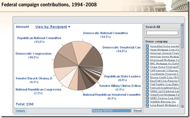
11 May 2009Interactive summary of $370 million in US campaign contributions made by originators of sub-prime mortgages, 1994-2008. Related article.
Stress Test Results (more)
11 May 2009Global Malaria Map
23 Apr 2009Global Equity Performance Map
In: Emerging Markets Finance Global Economy Interactive Maps Source: FT Stock Market Updated regularly US Economy
14 Apr 2009Interactive map displays the performance of all the major global equity markets for today, or versus a selection of time periods (5days/10days/1month/etc up to a year). You can also click on any exchange to drill down to more information.
[Note: There is no direct link to the map (silly java), you have to click on the "Market Macromap" window on this page]
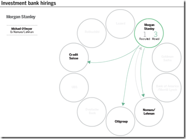
Banker Musical Chairs
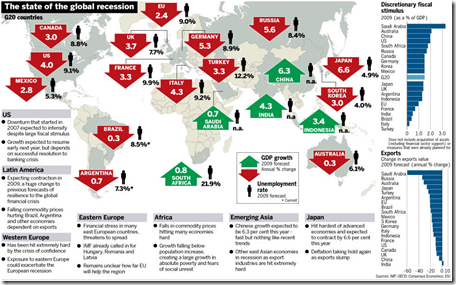
8 Apr 2009Global Recession Summary
2 Apr 2009What is Chart Porn?
An addictive collection of beautiful charts, graphs, maps, and interactive data visualization toys -- on topics from around the world.
Categories
- Bailout (118)
- Chartporn Related (3)
- Commentary (21)
- Culture (669)
- Emerging Markets (66)
- Employment (245)
- Environment/weather (133)
- Finance (298)
- Food (92)
- Global Economy (373)
- Graphic Design (bad) (26)
- Graphic Design (general) (183)
- Graphic Tools (23)
- History (158)
- Housing (162)
- Humor (204)
- Innovative (183)
- Interactive (545)
- Internet/tech (97)
- Maps (578)
- News Media (34)
- Politics (329)
- Reference (97)
- Science (331)
- Source: Economist (101)
- Source: FT (92)
- Source: NYT (147)
- Source: Ritholtz (76)
- Source: USA Today (27)
- Source: Washington Post (90)
- Source: WSJ (135)
- Sports (58)
- Stock Market (74)
- Uncategorized (2)
- Updated regularly (76)
- US Economy (553)
- Video (22)
- Aram Korevaar: This chart is now being used as a projection in which countries such as China see themselves as in a [...]
- David: Welcome back Chart Porn! [...]
- J S: Thanks for the great story. Miss reading this blog. Hope to see you more active again. [...]
- jake: I lived in a DC row house for 6 years, and I'm writing this comment from my tiny 1 bedroom apartment [...]
- ronny pettersen: Hilarious and unfortunately accurate... ;-) [...]

