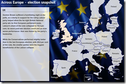
Source: FT Archive:
Nuclear is Making a Comeback
10 Sep 2009Maps of operational reactors, those under construction, planned, and as a percent of total electricity:
Asia Economic Weather Forecast (Aug. 09 version)
10 Sep 2009European Economic Weather Map (updated Aug 09)
In: Emerging Markets Global Economy Innovative Interactive Maps Source: FT Updated regularly
21 Aug 2009I’ve been tempted to steal this design many times. it’s a nice way to present mostly qualitative information for a large number of countries – and people understand it intuitively.
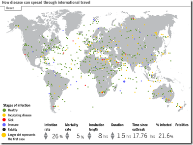
Fun With Infectious Diseases
In: Global Economy Innovative Interactive Maps Science Source: FT
6 Aug 2009A morbid tool from the FT. Click on any traveler on the map to make him sick, then watch the disease spread. Modify the infection rate, mortality rates, and other factors to see how they affect the simulation.
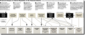
Financial Regulation
3 Aug 2009The FT has some nice charts on proposed changes to financial oversight. Related article.
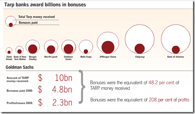
Bank Bonuses
3 Aug 2009Lots of talk last week about Wall Street still paying huge bonuses. Related article.
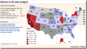
US States’ Fiscal Problem
13 Jul 2009As of 5/15/09. Roll-overs provide detailed data. Related article.
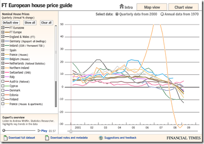
European Housing Prices (Q109 update)
8 Jul 2009In this case, the map view seems not very useful, but the chart view is well done, allowing a view of quarterly data from 2000 as well as annual from 1970. The links to the raw and meta data at the bottom is a nice touch I hope to see more often from everyone. Related article.
Iraq Oil
2 Jul 2009Interactive map showing the results of recent oil and gas partnerships/negotiations/auctions. I found the map of the different oil fields interesting – considering how many maps of Iraq we’ve seen in the past 5 years, this is the first time I’ve seen this info. Will be updated over time.
Tackling Inflation
In: Finance Global Economy Source: FT Updated regularly US Economy
2 Jul 2009Interactive display of central bank interest rates. It would be useful if you could scroll in and enlarge the last couple years, obviously. It looks like they might update this regularly.
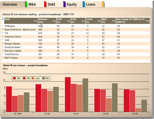
Investment Banking (1st Half 2009 update)
26 Jun 2009The FT has updated its interactive tables of investment banking activity. Lots of good data in here.
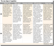
Financial Reform
In: Finance Global Economy Source: FT Source: NYT Source: Ritholtz Stock Market US Economy
23 Jun 2009Summary of EU and US reforms. The related article is a very good read on the subject.
NYT’s version of just the USA (hat-tip to Ritholtz). Related article.
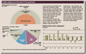
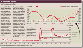
The State of Britain
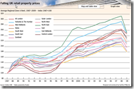
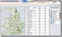
23 Jun 2009UK Retail Property Prices
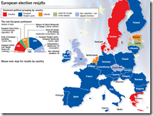
19 Jun 2009EU Elections
14 Jun 2009What is Chart Porn?
An addictive collection of beautiful charts, graphs, maps, and interactive data visualization toys -- on topics from around the world.
Categories
- Bailout (118)
- Chartporn Related (3)
- Commentary (21)
- Culture (669)
- Emerging Markets (66)
- Employment (245)
- Environment/weather (133)
- Finance (298)
- Food (92)
- Global Economy (373)
- Graphic Design (bad) (26)
- Graphic Design (general) (183)
- Graphic Tools (23)
- History (158)
- Housing (162)
- Humor (204)
- Innovative (183)
- Interactive (545)
- Internet/tech (97)
- Maps (578)
- News Media (34)
- Politics (329)
- Reference (97)
- Science (331)
- Source: Economist (101)
- Source: FT (92)
- Source: NYT (147)
- Source: Ritholtz (76)
- Source: USA Today (27)
- Source: Washington Post (90)
- Source: WSJ (135)
- Sports (58)
- Stock Market (74)
- Uncategorized (2)
- Updated regularly (76)
- US Economy (553)
- Video (22)
- Aram Korevaar: This chart is now being used as a projection in which countries such as China see themselves as in a [...]
- David: Welcome back Chart Porn! [...]
- J S: Thanks for the great story. Miss reading this blog. Hope to see you more active again. [...]
- jake: I lived in a DC row house for 6 years, and I'm writing this comment from my tiny 1 bedroom apartment [...]
- ronny pettersen: Hilarious and unfortunately accurate... ;-) [...]


