Source: Economist Archive:
US Health System
8 Jul 2009Getting Old
8 Jul 2009Animated charts with talk-over commentary on why most countries’ pension systems are in trouble.
In 1935, when America first introduced state pensions to relieve poverty in old age, the average life expectancy was 62. The official pension age was 65. That meant the cost of the pension system was very modest.
These days people live a lot longer. America’s official pension age is now 66, but people on average retire at 64 and can then expect to draw their pension for 16 years.
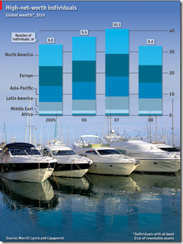
The Rich Lost Money Too
8 Jul 2009But they still have plenty left.
The wealth of the world’s richest people fell by almost a fifth last year to $33 trillion
Food Inflation
19 Jun 2009CHANGES in global food prices are affecting some countries much more than others. Despite a big fall from peaks in 2008, food-price inflation remains high in places such as Kenya and Russia. In China, however, falling international commodity prices have been passed on to consumers faster.
Oil Speculation
19 Jun 2009THE oil market is behaving like a bucking bronco again, and politicians are once more blaming speculators for careening prices. It is difficult to assemble a definitive explanation for the rally: a weak dollar helps oil prices, but evidence for improving supply and demand remains thin. Positions held on NYMEX, the New York commodities exchange, have indeed soared.
World’s Youngest Leaders
15 Jun 2009Global Housing Prices
15 Jun 2009Obviously I’m catching up on Economist charts. here’s one on global housing prices. They include three different measures, with the 97-09 long term one probably being the most interesting. I think sparklines probably would have worked better for this.
Future Government Debt
15 Jun 2009These numbers have been making the rounds. the interesting part is the “fiscal adjustment required” to get debt to sustainable levels.
Global Oil Reserves
15 Jun 2009The Economist is getting fancy with its daily chart – this one if animated and includes audio commentary.
Global Breeding Incentives
14 May 2009In all but one of 30 OECD countries, a married one-earner couple with two children takes home more money than a single person with no children on the same average annual salary. (from Economist)
The Aging World
11 May 2009If recent economic data isn’t depressing enough, here’s some from the future to remind you that everyone has some nice Malthusian demographic mountains to climb in the next 20+ years.
Green Shoots
22 Apr 2009What is Chart Porn?
An addictive collection of beautiful charts, graphs, maps, and interactive data visualization toys -- on topics from around the world.
Categories
- Bailout (118)
- Chartporn Related (3)
- Commentary (21)
- Culture (669)
- Emerging Markets (66)
- Employment (245)
- Environment/weather (133)
- Finance (298)
- Food (92)
- Global Economy (373)
- Graphic Design (bad) (26)
- Graphic Design (general) (183)
- Graphic Tools (23)
- History (158)
- Housing (162)
- Humor (204)
- Innovative (183)
- Interactive (545)
- Internet/tech (97)
- Maps (578)
- News Media (34)
- Politics (329)
- Reference (97)
- Science (331)
- Source: Economist (101)
- Source: FT (92)
- Source: NYT (147)
- Source: Ritholtz (76)
- Source: USA Today (27)
- Source: Washington Post (90)
- Source: WSJ (135)
- Sports (58)
- Stock Market (74)
- Uncategorized (2)
- Updated regularly (76)
- US Economy (553)
- Video (22)
- Aram Korevaar: This chart is now being used as a projection in which countries such as China see themselves as in a [...]
- David: Welcome back Chart Porn! [...]
- J S: Thanks for the great story. Miss reading this blog. Hope to see you more active again. [...]
- jake: I lived in a DC row house for 6 years, and I'm writing this comment from my tiny 1 bedroom apartment [...]
- ronny pettersen: Hilarious and unfortunately accurate... ;-) [...]


