Source: Economist Archive:
What countries have improved the most since 1990? (it’s an index of life expectancy, literacy, education, and per capita GDP).
Income Inequality
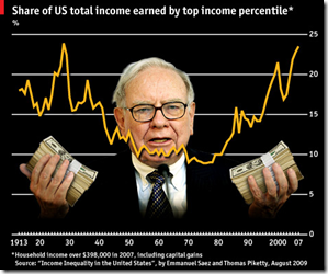
8 Oct 2009As usual, Michael Moore isn’t completely right, but the distribution of income growth isn’t what it used to be.
Two-thirds of the country’s total gains in the five years to 2007 accrued to the top 1%, whereas the bottom 90th percentile saw only 12% of the extra income.
Who Knew?
30 Sep 2009It turns out the Economist has a series of very well produced explanatory videographics on a variety of economic and political topics:
International Housing Indicators
In: Global Economy Housing Innovative Interactive Source: Economist Updated regularly
28 Sep 2009The Economist just released a nice new tool for looking at several housing indicators across major countries. They plan to expand and update it as more information becomes available.
Airline Baggage Hubris
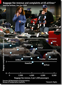
25 Sep 2009Baggage fee revenue versus baggage complaints. I like it. I would like it even more if the Economist would stop putting distracting photos behind their charts that make it hard to read the data. (also, I’m flying United tomorrow – which doesn’t bode well).
FDI Continues to Fall
In: Emerging Markets Finance Global Economy Source: Economist
21 Sep 2009Global Debt
In: Global Economy Interactive Maps Politics Source: Economist
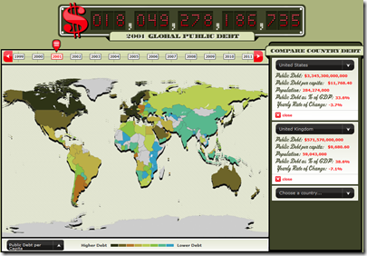
18 Sep 2009From the Economist, an interactive map and clock of global debt (1999-2011). Spotted over at Infectious Greed.
Effective Tax Rates
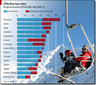
14 Sep 2009Can you tell I’m catching up on Economist charts? Well, suffer – because they’re pretty good, despite the overuse of distracting background graphics.
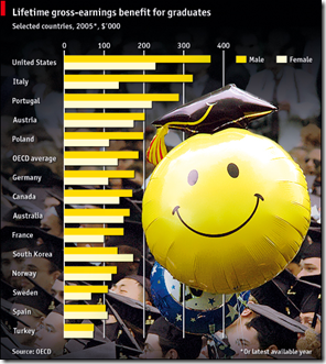
Is College Worth the Cost?
14 Sep 2009Comparison of lifetime earnings of college graduates vs non. I think this is the originating OECD report for the data. Reminds me of the articles on whether MBAs are worth the cost. And for the record: a giant smiley face should never ever be the visual focal point of an infographic.
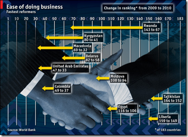
Doing Business Around the World
14 Sep 2009The World Bank’s Doing Business survey analysis has come under some criticism recently, but still provides a good broad cross-country indicator of business related practices.
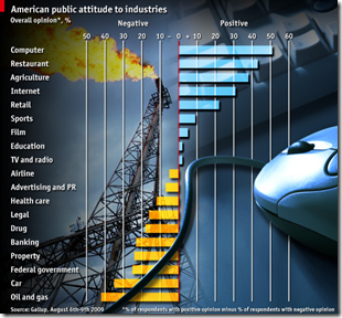
Computers Good. Oil Bad.
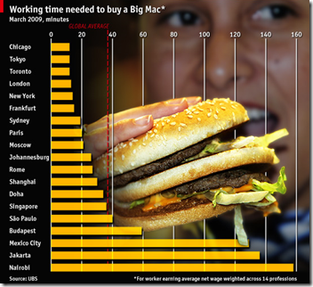
21 Aug 2009Variation on the Big Max index
20 Aug 2009Global Recession Map
In: Global Economy Maps Source: Economist Updated regularly US Economy
3 Aug 2009From the Economist:
Which is just a recycled version of Moody’s regularly updated map (that includes pop-up drill downs):
What is Chart Porn?
An addictive collection of beautiful charts, graphs, maps, and interactive data visualization toys -- on topics from around the world.
Categories
- Bailout (118)
- Chartporn Related (3)
- Commentary (21)
- Culture (669)
- Emerging Markets (66)
- Employment (245)
- Environment/weather (133)
- Finance (298)
- Food (92)
- Global Economy (373)
- Graphic Design (bad) (26)
- Graphic Design (general) (183)
- Graphic Tools (23)
- History (158)
- Housing (162)
- Humor (204)
- Innovative (183)
- Interactive (545)
- Internet/tech (97)
- Maps (578)
- News Media (34)
- Politics (329)
- Reference (97)
- Science (331)
- Source: Economist (101)
- Source: FT (92)
- Source: NYT (147)
- Source: Ritholtz (76)
- Source: USA Today (27)
- Source: Washington Post (90)
- Source: WSJ (135)
- Sports (58)
- Stock Market (74)
- Uncategorized (2)
- Updated regularly (76)
- US Economy (553)
- Video (22)
- Aram Korevaar: This chart is now being used as a projection in which countries such as China see themselves as in a [...]
- David: Welcome back Chart Porn! [...]
- J S: Thanks for the great story. Miss reading this blog. Hope to see you more active again. [...]
- jake: I lived in a DC row house for 6 years, and I'm writing this comment from my tiny 1 bedroom apartment [...]
- ronny pettersen: Hilarious and unfortunately accurate... ;-) [...]


