Science Archive:
America’s Health (1990-2010)
In: Interactive Maps Science
7 Dec 2010A nice interactive exploration of America’s health based on 42 different indicators. One minor complaint: There’s no data for Washington, DC (where I live).
American Human Development Index
In: Employment Food Housing Interactive Maps Science US Economy
21 Nov 2010Based on the idea that well-being cannot be measured by GDP alone, the Human Development Index looks at over 100 indicators, which you can explore on maps and charts at the most detailed level, or as aggregates (health, education, income). The chart display does seem to have problems separating out Washington DC, however – since we don’t actually have a congressional district — <sigh>. (via)
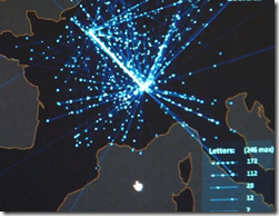
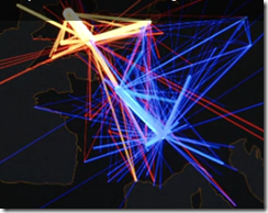
The 18th Century’s Internet
21 Nov 2010A very cool video describing Stanford University’s tracking of written letter networks of the 18th century. (Project site; related article; via)
Sensory Mapping Timeline
10 Nov 2010An interesting way to map out an experience of positive/negative feelings across all five senses. (via)
The Graduate Thesis Repulsor Field
10 Nov 2010The Thesis Repulsor Field is characterized by an attractor vector field directed towards completion, but accompanied by an intensive repulsive singularity at the center. Thanks to Claire for the link.
Most Harmful Drugs
1 Nov 2010A new study ranks 20 drugs on 16 measures of harm (both to users and to society). Thanks to Drave Cramer for sending the link.
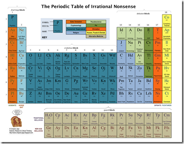
Updated: Periodic Table of Irrational Nonsense
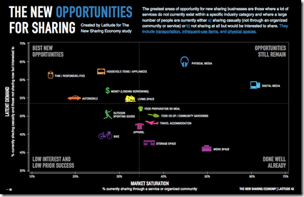
25 Oct 2010Share Your Stuff
In: Internet/tech Science
23 Oct 2010A matrix of potential sharing businesses. Full report.
Scale of the Universe
In: Interactive Science
22 Oct 2010Alternative Medicine Flowchart
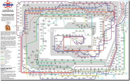
19 Oct 2010Science Subway Map
19 Oct 2010I’m getting pretty sick of subway style maps (when used for anything other than a subway), but this one is actually pretty good.
Some fantastic graphics over at Crispian Jago’s blog. First up, the Periodic Table of Irrational Nonsense:
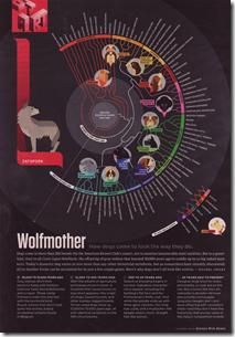
From Wolves to Dogs
In: Science
12 Oct 2010A timeline of dog breeds. (originally produced by AWH).
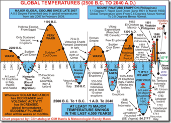
Global Warming Explained(?)
29 Sep 2010I post a lot of charts establishing that industrialization is causing global warming — it’s only fair to share one that gives an alternative explanation. Of course, it would be more convincing if it included a scale. (here’s a big discussion of it)
Yummy Yummy Fall
24 Sep 2010Some seasonal interactive toys: Why the seasons happen? Why the leaves change color and fall? How to make maple syrup? and a couple of foilage peak maps.
What is Chart Porn?
An addictive collection of beautiful charts, graphs, maps, and interactive data visualization toys -- on topics from around the world.
Categories
- Bailout (118)
- Chartporn Related (3)
- Commentary (21)
- Culture (669)
- Emerging Markets (66)
- Employment (245)
- Environment/weather (133)
- Finance (298)
- Food (92)
- Global Economy (373)
- Graphic Design (bad) (26)
- Graphic Design (general) (183)
- Graphic Tools (23)
- History (158)
- Housing (162)
- Humor (204)
- Innovative (183)
- Interactive (545)
- Internet/tech (97)
- Maps (578)
- News Media (34)
- Politics (329)
- Reference (97)
- Science (331)
- Source: Economist (101)
- Source: FT (92)
- Source: NYT (147)
- Source: Ritholtz (76)
- Source: USA Today (27)
- Source: Washington Post (90)
- Source: WSJ (135)
- Sports (58)
- Stock Market (74)
- Uncategorized (2)
- Updated regularly (76)
- US Economy (553)
- Video (22)
- Aram Korevaar: This chart is now being used as a projection in which countries such as China see themselves as in a [...]
- David: Welcome back Chart Porn! [...]
- J S: Thanks for the great story. Miss reading this blog. Hope to see you more active again. [...]
- jake: I lived in a DC row house for 6 years, and I'm writing this comment from my tiny 1 bedroom apartment [...]
- ronny pettersen: Hilarious and unfortunately accurate... ;-) [...]

