Science Archive:
Japan Crisis
13 Mar 2011Want to understand some of the technical aspects of the disaster?
Here’s a NYT interactive explanation of the quake itself:
A Washington Post explanation of what’s been happening at the nuclear plants:
Interactive graphs of the last 7 days of Japanese earthquakes on the left, historical comparison on the right:
And one that really brings home how much bigger this quake was than previous ones:
Artist Ward Shelly draws some fascinating cultural flow charts, as I’ve mentioned before. I’m never quite sure what the size and width of the shapes are supposed to represent, but shit — they’re done by hand, comprehensive, and gorgeous. (via via)
Why Traffic Jams Happen
7 Mar 2011I hate traffic. Nothing makes me hate humanity more (except perhaps watching commercials – thank god for DVRs). If you want to know more about why we drive the way we do, read Tom Vanderbilt’s Traffic (which, somewhat strangely, includes no diagrams). (via Ritholtz)
Here’s a life-scale experiment that illustrates the shockwave effect:
Exo-Planets
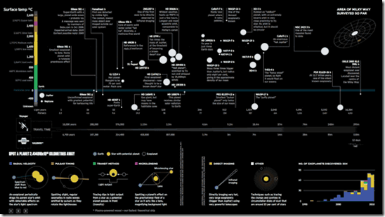
24 Feb 2011This infographic lays out what is known about all of the planets that have been identified outside of our solar system. Also, Information is Beautiful has put together a lovely post about the steps that went into creating it.
American Shame
In: Culture Employment Global Economy Science Source: NYT US Economy
21 Feb 2011How America compares to other industrial countries based on a variety of basic indicators (income inequality, life expectancy, education) as well as some uncommon ones (prison population, level of democracy, and “wellbeing”). Conclusion: America is not #1! Can anyone think of indicators that WOULD make us look good in this crowd?
UFO Sightings
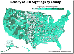
4 Feb 2011Apparently aliens prefer the west coast.
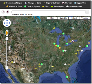
There’s also an interactive version that overlays type of sighting by week onto Google maps.
If Earth Was the Center of the Solar System
In: Science
2 Feb 2011Ok, this is one of the coolest toys I’ve played with in a while (or maybe I’m just a science geek). Piotr Kaczmarek has modeled the solar system using both Copernican (sun-centered) and Tychonian (earth-centered) physics. You can set the particular date you want to view, the speed that time goes by, view the zodiac, and even the phases of the moon. If you turn on the planet tracing in the Tychonian model you can see what odd orbits it requires. (via)
US Energy Production and Consumption
23 Jan 2011I have no idea why this wasn’t done as a proper sankey diagram. It might as well just be a table.
You Are Not The Center of the Universe
In: Science
11 Jan 2011I think everyone loved those cool visualizations of relative scale (example one, two) we’ve seen lately. Here’s a new one showing the relative size of planetary objects. Three thoughts occurred to me while watching this: 1: This guy has some crazy good animation skills. 2: We really are insignificant specks floating in an endless black void. 3: I can’t believe I recognize that annoying music from the Black Hole movie.
Bloodwork Results Re-Visualized
In: Innovative Science
24 Dec 2010Information is Beautiful won a Wired contest to re-design the standard medical bloodwork test results – you know, so you could actually understand what they meant. The result is much easier to understand.
 | to |  |
Carbon Counting, Global Warming, and Dumbass Comments
In: Environment/weather Science Source: NYT Source: Ritholtz
23 Dec 2010 | The New York Times has an excellent article and accompanying charts about the scientist who first discovered rising CO2 levels. I came across the article via Barry Ritholtz’s blog, where he delivered this lovely bit of snark:
|
Seven Billion People
22 Dec 2010The Economist produced this video explaining population trends using a series of well designed radial diagrams, including the birth of the 7th billion living person, expected in 2011. The surprising part: after ridiculous growth in the past century, things are starting to slow down.
Do It Yourself Climate Change Analysis
20 Dec 2010Kelly O’Day runs a fantastic blog where he takes publicly available datasets and walks you through how to visualize them in excel and R. If you just want to view his personal conclusions on climate change, check out ProcessTrends.
Baltimore Trash Migration
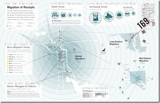
20 Dec 2010Artist Cameron Zotter collected discarded receipts over a 48 hour period and mapped out how far they had traveled. I love the resulting infographic. Note, the image below is linked to Cameron’s site; here is a higher resolution version of the image on Flickr. (via)
FYI, MIT has a higher tech version of this idea, where they tag trash with GSM cellular phone markers that periodically call home with their location:
Lunar Eclipse Tonight (Dec 20-21)
In: Science
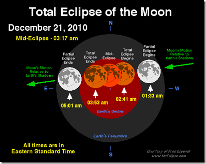
20 Dec 2010if you are residing in the US particularly in the East Coast, expect to see the lunar eclipse as it begins half an hour after midnight on Tuesday, December 21, 2010. On the West Coast, it begins around 9:30 p.m. PST Monday. In all cases, the whole eclipse will be observable before the moon sets in the west just as the sun is rising in the east. Maximum eclipse is at 3:17 a.m. (via)
For the geekier details check out MrEclipse.com:
What is Chart Porn?
An addictive collection of beautiful charts, graphs, maps, and interactive data visualization toys -- on topics from around the world.
Categories
- Bailout (118)
- Chartporn Related (3)
- Commentary (21)
- Culture (669)
- Emerging Markets (66)
- Employment (245)
- Environment/weather (133)
- Finance (298)
- Food (92)
- Global Economy (373)
- Graphic Design (bad) (26)
- Graphic Design (general) (183)
- Graphic Tools (23)
- History (158)
- Housing (162)
- Humor (204)
- Innovative (183)
- Interactive (545)
- Internet/tech (97)
- Maps (578)
- News Media (34)
- Politics (329)
- Reference (97)
- Science (331)
- Source: Economist (101)
- Source: FT (92)
- Source: NYT (147)
- Source: Ritholtz (76)
- Source: USA Today (27)
- Source: Washington Post (90)
- Source: WSJ (135)
- Sports (58)
- Stock Market (74)
- Uncategorized (2)
- Updated regularly (76)
- US Economy (553)
- Video (22)
- Aram Korevaar: This chart is now being used as a projection in which countries such as China see themselves as in a [...]
- David: Welcome back Chart Porn! [...]
- J S: Thanks for the great story. Miss reading this blog. Hope to see you more active again. [...]
- jake: I lived in a DC row house for 6 years, and I'm writing this comment from my tiny 1 bedroom apartment [...]
- ronny pettersen: Hilarious and unfortunately accurate... ;-) [...]


