Science Archive:
NASA iPad Visualization Explorer
27 Dec 2011Who has some of the coolest data around? NASA, of course. While you can dig around their numerous websites looking for gems, they have pulled together many of their best work into a free iPad App. The quality of the visualizations is incredible, and most of them are well annotated/narrated. They add 8-10 new visualizations each month.
Here are stills from some of the videos:
Wind currents:
Ocean currents:
Snow cover:
Carbon absorption:
Preventing Cancer
In: Science
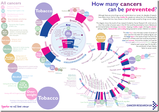
15 Dec 2011The key is a bit complicated at first, but there’s lots of interesting information here.
For additional info, check out http://cancerhelp.cancerresearchuk.org/type/lung-cancer/
Which Checkout is Fastest?
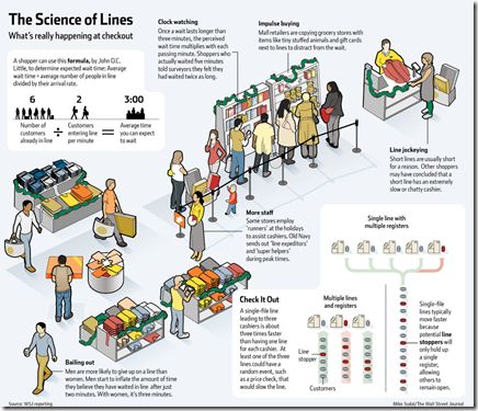
8 Dec 2011The WSJ explains some of the science behind new checkout procedures you might be seeing this holiday season. I saw the one-to-many recently at a local Whole Foods and it reminded me a little too much of cows going to the slaughter house – but then, I hate lines of all kinds. Hat tip to Jennifer DuMars for sending it along. (related article)
Antarctica’s Underground
5 Dec 2011Using ice penetrating radar, scientists have mapped out the ground and mountains that lie beneath Antarctica’s ice sheets. The project is interesting because it draws on decades of work from many different teams and datasets, and will help create more accurate models of melt rates.
Resistance is Futile
In: Science
2 Dec 2011Twinkle twinkle little star, Voltage equals I times R. My physics classes would have sunk in quicker if there were more diagrams like this one.
Life Expectancy (1960-2009)
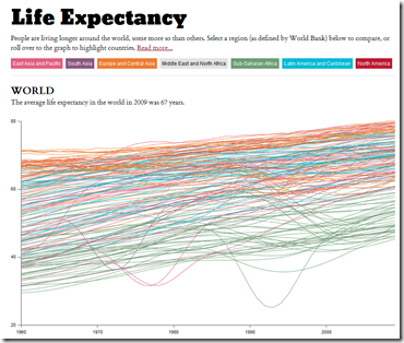
15 Oct 2011Highlight by region, roll over for individual country info. The interface is a little janky – you can join the discussion over at FlowingData if you have any suggestions.
USA: Still A Nobel Country
In: Science
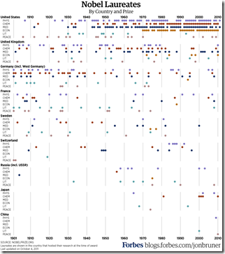
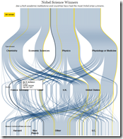
14 Oct 2011Nobel Prize winners by topic and country.
Here’s a weird version from the WSJ, and an interactive summary of the 2011 winners.
US Energy Production
In: Interactive Science
16 Aug 2011“More than half of the energy produced in the U.S. isn’t put to use.” A lovely interactive sankey diagram of energy production and waste. As you rollover the diagram it highlights different flows. (via)
Lifespan Calculator
In: Science
12 Aug 2011Answer a series of questions about your health and lifestyle choices and see how long you’ve got to live.
There’s also a slightly more entertaining version called the Longevity Game:
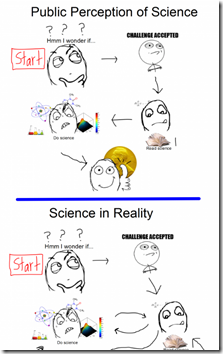
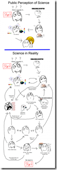
Scientific Process Flowchart
10 Aug 2011Satellites in Google Earth
In: Interactive Maps Science
25 Jul 2011Real-time mapping of ~13,000 satellite in Google Earth (updated every 30 seconds). Completely ridiculous.
Bloodstain Analysis
In: Science
21 Jul 2011Belief in Evolution vs GDP
15 Jul 2011USA is an outlier. Hahaha! USA! USA! USA!
Why is it so hard to believe we’re just a bunch of monkeys?
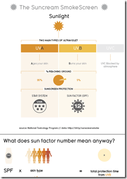
David McCandless and his team over at Information is Beautiful did a ton of research into sunscreen and threw it all into one massive infographic. It’s rather overwhelming and I’m not sure it turned out that great – and it’s kind of blurry for some reason (the excerpt over at the Guardian looks fine).
Topically speaking, I can’t help but agree with Lewis Black that it’s odd that we’ve all assimilated the idea that smearing chemicals on our skin is the healthy thing to do. Being in the sun isn’t unhealthy – not going in the sun until July and then burning to a crisp is what’s unhealthy.
Thanks to Caryn Sykes for sending in the link!
What is Chart Porn?
An addictive collection of beautiful charts, graphs, maps, and interactive data visualization toys -- on topics from around the world.
Categories
- Bailout (118)
- Chartporn Related (3)
- Commentary (21)
- Culture (669)
- Emerging Markets (66)
- Employment (245)
- Environment/weather (133)
- Finance (298)
- Food (92)
- Global Economy (373)
- Graphic Design (bad) (26)
- Graphic Design (general) (183)
- Graphic Tools (23)
- History (158)
- Housing (162)
- Humor (204)
- Innovative (183)
- Interactive (545)
- Internet/tech (97)
- Maps (578)
- News Media (34)
- Politics (329)
- Reference (97)
- Science (331)
- Source: Economist (101)
- Source: FT (92)
- Source: NYT (147)
- Source: Ritholtz (76)
- Source: USA Today (27)
- Source: Washington Post (90)
- Source: WSJ (135)
- Sports (58)
- Stock Market (74)
- Uncategorized (2)
- Updated regularly (76)
- US Economy (553)
- Video (22)
- Aram Korevaar: This chart is now being used as a projection in which countries such as China see themselves as in a [...]
- David: Welcome back Chart Porn! [...]
- J S: Thanks for the great story. Miss reading this blog. Hope to see you more active again. [...]
- jake: I lived in a DC row house for 6 years, and I'm writing this comment from my tiny 1 bedroom apartment [...]
- ronny pettersen: Hilarious and unfortunately accurate... ;-) [...]


