Science Archive:
Science Fiction to Reality Timeline
25 Apr 2012When scientific advances were first theorized vs when they became reality. After a close viewing I would say whoever wrote this wasn’t particularly well-read, or even a very good geek – a lot of things on both sides are just plain wrong. Great idea. Crappy execution. Anybody want to try their hand at a version that includes da Vinci, Verne, and Heinlein (just for starters).
Apollo Astronaut Assignments
12 Apr 2012Not the most aesthetically pleasing figure I’ve ever seen – but there’s a ton of information crammed in.
MEGA MILLIONS!
30 Mar 2012Seemed timely considering tonight’s $640million drawing: how many times numbers have been picked?
A heatmap of variations from the standard deviation:
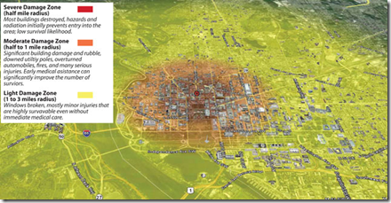
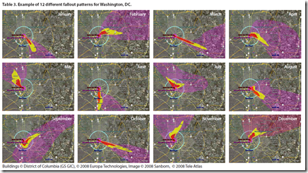
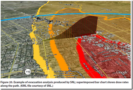
DC Terrorist Nuke Attack
27 Mar 2012A government report analyzed the impact of a ground 10-kiloton explosion in Washington DC. Turns out it wouldn’t be quite as bad as you might think (well, compared to what it would have looked like during the cold war when the scenario was multiple megaton air bursts). The full report contains a number of nice map visualizations of the severe fallout threat. The bad news? I live and work within the “severe damage, lifesaving not likely” region. Oh well…
All of History
19 Mar 2012Chronozoom provides an interactive timeline of the known history of the universe. Maybe think of it as a historical Prezi, where you can zoom in on information, images, and videos explaining what we know. The html5 animation was pretty shaky on my Firefox, but it ran nicely on Safari. The behind the scenes story about the team that created this is a good read.
High Costs of US Medical Procedures
In: Science US Economy
6 Mar 2012A recent study compared the cost of procedures across different countries. It’s interesting to me that some people think our “free market” medical system is the best, without realizing that health care services here in no way resemble a market. The related article runs through a number of ways our system is dysfunctional.
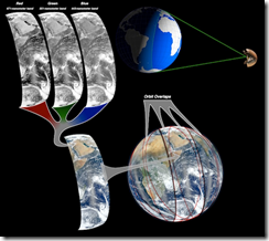
Earth Photos
16 Feb 2012Interesting article on how they composite satellite photos of earth into those beautiful globe shots:
While we’re on the subject, below is NASA’s gateway for Astronaut photography of Earth, including some stunning videos:
While in NYC recently I noticed that most of the traffic seems to consist of Taxis. Tom McKeogh, Eliza Montgomery, and Juan F Saldarriag collected Manhattan taxi GPS data and created this beautiful map of Taxi trips over just 24 hours. Nice! (via FlowingData)
How Carbs Make You Fat
31 Jan 2012In my experience, this is very true – whenever I jump off the carb/insulin roller coaster I lose weight very quickly.
I have to say I love the image from the top of the article:
NOT a Global Warming Map?
26 Jan 2012The USDA has upgraded it’s plant hardiness map, which is based on average annual extreme temperatures. Horticulturists and gardeners use the maps as a gauge of what types of plants to grow. Some people think the new data indicates that temperatures are rising, and having visible effects on growing seasons and plant diversity. The USDA is (probably wisely) dodging the climate change aspects, pointing out that the methodologies used weren’t quite the same in the two versions. If you want to have fun, do a google news search for “plant hardiness” and see how different media coverage is of this (Chicago Sun Times, ThinkProgress, MSNBC).
The Washington Post used an interactive slider design on their map to let you flip between views of 1990 and 2012:
You can view static and interactive versions at the USDA site, as well as download the dataset.
The Future of Technology
25 Jan 2012An interesting (ok, quick poll: should I stop calling things interesting? I only post stuff I think is interesting – seems a bit redundant, no?) long term look at new technology. At first look, it’s a bit boring and geeky – but the interactive popup descriptions really flesh it out. It would be easy to quibble about where things fall on the timeline, but overall I really enjoyed reading about all the hypothetical tech. Now that we have realized most of the science fiction from the 1900s, it was nice to see that we still have ways to dream and imagine. (via)
Population Pyramids
23 Jan 2012I’ve loved these types of charts since I first saw them used for insight into the Arab Spring discontent. What’s great about the version linked below is the country coverage that Worldlifeexpectancy.com has managed to pull together – it’s very impressive. If you wander the site, there are a lot of additional maps and charts on global causes of death, life expectancy, and other fun demographic topics. (via)
On a design note: Wow. I haven’t seen someone attempt a black background and glowing neon fonts in such a manner since the earliest days of the internet. I don’t know whether to applaud the boldness and bust out some glowsticks, or put on sunglasses to prevent a seizure. I suppose since it’s all about death, the black kinda works.
Where the Trees Are
18 Jan 2012A new high resolution (down to 30m) map of US forests created using a compilation of data from “space-based radar, satellite sensors, computer models, and a massive amount of ground-based data.” There’s also a detailed article about the project and the decisions that went into it. I guess I knew the midwest was sparse – but I didn’t think it was THAT sparse.
Humans Suck
In: Science
30 Dec 2011Luckily we have brains to figure out what’s really going on. (via)
Flavor Networks
29 Dec 2011Interesting work on flavors and food pairings over at Nature.com.
Each node denotes an ingredient, the node color indicates food category, and node size reflects the ingredient prevalence in recipes. Two ingredients are connected if they share a significant number of flavor compounds, link thickness representing the number of shared compounds between the two ingredients.
(via FlowingData)
What is Chart Porn?
An addictive collection of beautiful charts, graphs, maps, and interactive data visualization toys -- on topics from around the world.
Categories
- Bailout (118)
- Chartporn Related (3)
- Commentary (21)
- Culture (669)
- Emerging Markets (66)
- Employment (245)
- Environment/weather (133)
- Finance (298)
- Food (92)
- Global Economy (373)
- Graphic Design (bad) (26)
- Graphic Design (general) (183)
- Graphic Tools (23)
- History (158)
- Housing (162)
- Humor (204)
- Innovative (183)
- Interactive (545)
- Internet/tech (97)
- Maps (578)
- News Media (34)
- Politics (329)
- Reference (97)
- Science (331)
- Source: Economist (101)
- Source: FT (92)
- Source: NYT (147)
- Source: Ritholtz (76)
- Source: USA Today (27)
- Source: Washington Post (90)
- Source: WSJ (135)
- Sports (58)
- Stock Market (74)
- Uncategorized (2)
- Updated regularly (76)
- US Economy (553)
- Video (22)
- Aram Korevaar: This chart is now being used as a projection in which countries such as China see themselves as in a [...]
- David: Welcome back Chart Porn! [...]
- J S: Thanks for the great story. Miss reading this blog. Hope to see you more active again. [...]
- jake: I lived in a DC row house for 6 years, and I'm writing this comment from my tiny 1 bedroom apartment [...]
- ronny pettersen: Hilarious and unfortunately accurate... ;-) [...]


