Science Archive:
A Day in Our Solar System
In: Interactive Science
24 Oct 2012Beautiful gif illustrating simultaneous orbits.
There’s also an interactive version which allows you to do cool things like pick the year, and view Tychonian (earth-centric) orbits or zodiac houses.
p.s: sorry for not posting in a while – I was in Asia for several weeks, and while they do have internet there, I was busy exploring instead of digging up infographics:
Cheetahs!
2 Oct 2012To be honest, I get submitted so many crap info-posters, I almost didn’t catch this one. Lots of interesting content, and the animation is a nice aesthetic innovation (though probably not really necessary, of course).
In related news, the Washington DC Zoo has had a steady crop of adorable cheetah cubs the past few years. Click the link for some awww-some pictures.
Safest Seat on a Plane
In: Science
1 Oct 2012Based on a Popular Mechanics review of every commercial jet crash in the United States since 1971, that had both fatalities and survivors.
In 11 of the 20 crashes, rear passengers clearly fared better. Only five accidents favored those sitting forward. Three were tossups, with no particular pattern of survival. In one case, seat positions could not be determined.
Great Tree of Life
24 Sep 2012The angle threw me for a minute, and I wonder if the ending arc widths are proportionally representative or not – but overall, I like it!
Mortality (1960-2010)
In: Science
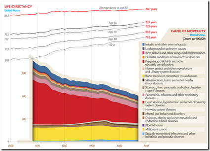
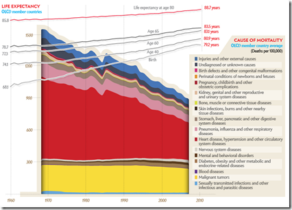
6 Sep 2012We covered a lot of this data back in June, but this is a nice presentation. The addition of the global data is useful, though trying to make comparisons by switching between the two isn’t easy – a static version would probably have worked better – so here are two screenshots to help you out.
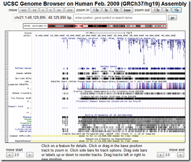
Human Genome Browser
In: Science
6 Sep 2012Orbital Motion
In: Science
16 Aug 2012Sure, the planets orbit the sun, but it’s all moving – so it’s really moving more like this:
Everything You’ll Ever Need to Know About Napping
In: Science
14 Aug 2012Not the best infographic, but I love napping. I love it so much.
Here’s a related oldie but goodie:
Thanks to LisaLisa for the link!
Mining and Metals
In: Science
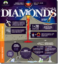
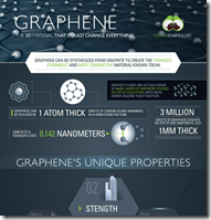
10 Aug 2012I don’t usually post these kinds of niche infographics, but the ones by Visual Capitalist are are pretty well done – both in terms of content and design. If you want a backgrounder on anything that comes out of the ground (copper, gold, lithium, gas, oil, diamonds, etc), check them out.
Energy Sankey
7 Aug 2012We’ve seen these systemically applied. In this case it’s to a multi-family home. Anyone have one for a single home?
The creator also has a blog post and demo of how he creates these diagrams: http://visualizegreen.posterous.com/pages/create-energy-diagram
More Death (1900-2001)
In: Science
25 Jun 2012The New England Journal of medicine looked through 200 years of back issues to see if we’re making any progress in health. Overall mortality is down, but heart disease and cancer are the two causes we haven’t managed to stamp down much yet.
There’s a nice interactive chart of the top10 causes over time:
A static comparison:
When You’re Gonna Die
In: Science
20 Jun 2012Water Consumption Sankey
11 Jun 2012It’s nice to see a sankey diagram be used for something besides energy. As some have noted, however, this should have been complemented with population adjusted stats.
Why Do I Feel Thirsty?
8 May 2012This visualization shows the size of a sphere that would contain all of the Earth’s water compared to the size of the Earth. Yikes! That’s a lot of dirt and rock!
Thanks to D. Cramer for emailing me the link!
Update: Scale of the Universe
In: Interactive Science
1 May 2012Cary and Michael Huang have updated their zoomable scale of everything (first seen in 2010). The graphics are nicer and smoother, they’ve replaced the annotations with a scale in the corner, and everything can be clicked on for popup detail. Thankfully, they also now let you turn off the dreadful music. Thanks to Shrub for sending me the link!
What is Chart Porn?
An addictive collection of beautiful charts, graphs, maps, and interactive data visualization toys -- on topics from around the world.
Categories
- Bailout (118)
- Chartporn Related (3)
- Commentary (21)
- Culture (669)
- Emerging Markets (66)
- Employment (245)
- Environment/weather (133)
- Finance (298)
- Food (92)
- Global Economy (373)
- Graphic Design (bad) (26)
- Graphic Design (general) (183)
- Graphic Tools (23)
- History (158)
- Housing (162)
- Humor (204)
- Innovative (183)
- Interactive (545)
- Internet/tech (97)
- Maps (578)
- News Media (34)
- Politics (329)
- Reference (97)
- Science (331)
- Source: Economist (101)
- Source: FT (92)
- Source: NYT (147)
- Source: Ritholtz (76)
- Source: USA Today (27)
- Source: Washington Post (90)
- Source: WSJ (135)
- Sports (58)
- Stock Market (74)
- Uncategorized (2)
- Updated regularly (76)
- US Economy (553)
- Video (22)
- Aram Korevaar: This chart is now being used as a projection in which countries such as China see themselves as in a [...]
- David: Welcome back Chart Porn! [...]
- J S: Thanks for the great story. Miss reading this blog. Hope to see you more active again. [...]
- jake: I lived in a DC row house for 6 years, and I'm writing this comment from my tiny 1 bedroom apartment [...]
- ronny pettersen: Hilarious and unfortunately accurate... ;-) [...]


