Science Archive:
Master the Past: Time Machine Reference Page
In: Science
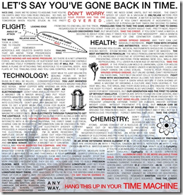
13 Oct 2009I don’t know why, but I’ve actually daydreamed about these before. I suppose it would also be useful for the wall of a science classroom. Can also be purchased as a poster or t-shirt.
How to Crack a Combination Lock
13 Oct 2009Simple instructions on how to break into a Master combo lock in less than 100 attempts (instead of trying all 64,000 possible combinations). (via)
Your Brain on God
8 Oct 2009Sort of an interactive article on recent brain research related to spiritual experiences, drill down through different topics and more detailed write-ups.
Nuclear Weapons
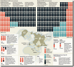
8 Oct 2009A decent infographic of nuclear weapons around the world. Having watched a documentary last weekend on what would happen to Washington DC after just a small detonation, I found this graphic and accompanying article interesting (I thought China had more, for example). (via)
Flu Tracker
In: Maps Science Source: WSJ
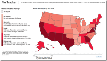
8 Oct 2009There are a lot of these maps out there. This one is interesting because the historical week-by-week animation illustrates the seasonality of the outbreak.
Instrumental Range
6 Oct 2009A wonderful interactive chart showing the frequency range of various musical instruments and how they correspond to human hearing.
Warm August
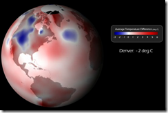
25 Sep 2009NOAA has a cool animated visualization of the temperature in August compared to the historical average. It would be nice to see this in an interactive toy over time. (via)
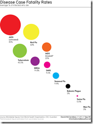
Death is a Risk
25 Sep 2009Fatality rates for a number of diseases, and fatality rate vs survival time outside the body (why you should wash your hands). Designed and researched beautifully by Information is Beautiful.
Ten Dimensions?
In: Science
13 Sep 2009Something a little different: a visualization of the 10 dimensions currently postulated by physics:
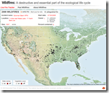
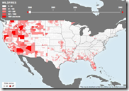
Wildfires
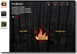
10 Sep 2009Along the lines of the interactive hurricane trackers, but if you click around you also find information on historical trends, how wildfires grow, and even some basic fire ecology info and an explanation of why prescribed fires are a good idea.
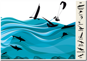
Fastest Things in/on Water
In: Science
10 Sep 2009Global Diseases
In: Global Economy Interactive Maps Science Updated regularly
10 Sep 2009A map of the “current global state of infectious diseases and their effect on human and animal health.” Filter by country, type of disease, etc. Spotted at Cool Infographics.
Nuclear is Making a Comeback
10 Sep 2009Maps of operational reactors, those under construction, planned, and as a percent of total electricity:
Helicopter Crashes
In: Interactive Maps News Media Science Source: Washington Post
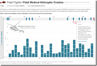
21 Aug 2009From a Washington Post article on fatal helicopter accidents. What first looked like just one kind of interesting chart turned out to be three solid ones once you started clicking around. (Thanks to Jane An for pointing them out).
Hurricane Season 2009
In: Environment/weather Interactive Maps Science Source: WSJ Updated regularly
21 Aug 2009A map of the paths of several hurricanes. Looks like they plan to update it throughout the hurricane season. This is very similar to the AP tool I mentioned in June.
What is Chart Porn?
An addictive collection of beautiful charts, graphs, maps, and interactive data visualization toys -- on topics from around the world.
Categories
- Bailout (118)
- Chartporn Related (3)
- Commentary (21)
- Culture (669)
- Emerging Markets (66)
- Employment (245)
- Environment/weather (133)
- Finance (298)
- Food (92)
- Global Economy (373)
- Graphic Design (bad) (26)
- Graphic Design (general) (183)
- Graphic Tools (23)
- History (158)
- Housing (162)
- Humor (204)
- Innovative (183)
- Interactive (545)
- Internet/tech (97)
- Maps (578)
- News Media (34)
- Politics (329)
- Reference (97)
- Science (331)
- Source: Economist (101)
- Source: FT (92)
- Source: NYT (147)
- Source: Ritholtz (76)
- Source: USA Today (27)
- Source: Washington Post (90)
- Source: WSJ (135)
- Sports (58)
- Stock Market (74)
- Uncategorized (2)
- Updated regularly (76)
- US Economy (553)
- Video (22)
- Aram Korevaar: This chart is now being used as a projection in which countries such as China see themselves as in a [...]
- David: Welcome back Chart Porn! [...]
- J S: Thanks for the great story. Miss reading this blog. Hope to see you more active again. [...]
- jake: I lived in a DC row house for 6 years, and I'm writing this comment from my tiny 1 bedroom apartment [...]
- ronny pettersen: Hilarious and unfortunately accurate... ;-) [...]

