Science Archive:
If All the Ice Melted
5 Nov 2013Hypothetical mapping of what coastlines would look like if all the ice in the world melted, raising ocean levels by 216 feet.


DC Gunfire
4 Nov 2013A map of gunshots detected in Washington DC since 2009 using triangulated sonic sensors. The system allows police to be quickly dispatched to within yards of where the guns were fired (though the related article doesn’t go into much detail about whether that leads to catching the shooters).

How a Car Engine Works
In: Internet/tech Science
16 Sep 2013Beautiful annotated animation of how gas engines work. Check out the full size version by Jacob O’Neal.

Chart of Electromagnetic Radiations
In: Science
22 Aug 2013A beautiful classic from 1944:

What Lands Did Europeans Really Discover?
14 Aug 2013Nice work by Bill Rankin over at Radial Cartography. He tries to map out lands that were really uninhabited prior to discovery. You’ll notice they were mostly small islands.

If you like maps and haven’t browsed that site before, you should. Lots of cool projects:
A table of projections:

Comparison of subways in the USA:

Make a personalized celestial calendar:

Its Crowded Around Here
In: Science
14 Aug 2013Below is a map of the orbits of 1400+ asteroids as collected by NASA’s Jet Propulsion Lab. Thankfully, none of these potentially hazardous asteroids (PHAs) are expected to intersect the Earth’s orbit in the next 100 years, since they are all at least 460 feet in size and would hurt.

What’s Hurting Us
In: Science
5 Aug 2013From the New England Journal of Medicine comes this chart of world injuries. The differences between regions are interesting, but beg explanation. Also, the article fails to give a good definition of the indicators (Years of Life Lost, Years Lived with Disability?), and you have to wonder how accurate the data is for many regions.

Meteorite Sightings (1913-2013)
26 Jul 2013Meteorite fireballs witnessed from 1913. I’m not sure what is gained by putting this on a map. Also, since this is just eyewitness accounts, it suffers from population density bias.

Animated Wind Map
6 Jun 2013A very cool real time animated map of wind.

Also some historical snapshots, like Hurricane Sandy:

Energy Flow Maps
31 May 2013We’ve seen similar maps before, but it’s nice to have them all together from one reliable source.


31 Charts to Restore Your Faith in Humanity
31 May 2013A lot of these are misleading – but hey, so are most charts. For more entertaining interpretations of the same figures, check out The Washington Post’s “31 Charts to Destroy Your Faith in Humanity.”


 and so on.
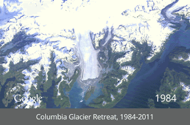
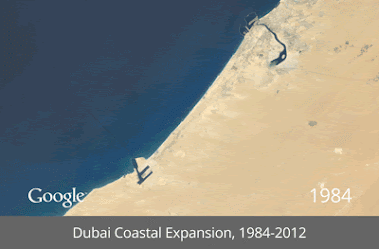
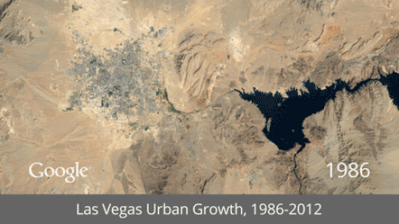
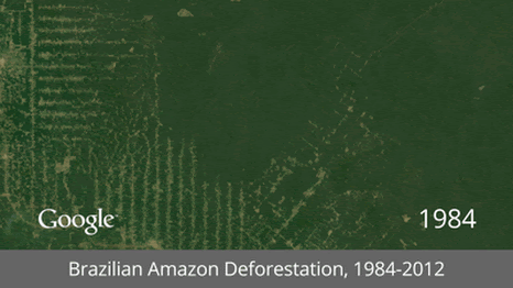
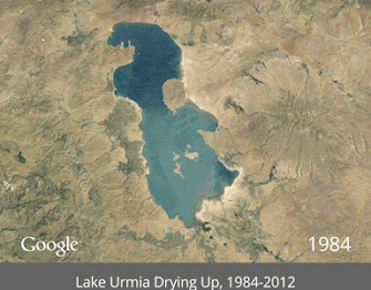
Satellite GIFs
15 May 2013It’s interesting how popular animated gifs have become again. I guess that even with high speed internet people are a little fed up with player load times and lags. Here GIFs are used to show time lapse satellite images of mankind’s impact on the earth. (google earth link)


Average Dissertation Length by Topic
In: Science
8 May 2013The R is my friend blog used some nifty coding to analyze 2,500+ dissertations (though only those since 2007). (via)
Most were between 100 and 200 pages. 
The below boxplot shows the length by topic. It could have used a legend to verify, but traditionally, the vertical line is the median, the colored areas are the 1st and third quartiles, the horizontal line is the range of extreme values (1.5x the inter quartile from the upper and lower quartile, and the dots are outliers (greater than 1.5 the inter-quartile range). Make sense? Of course, page length doesn’t actually indicate much of anything… so this whole exercise is pointless – just like most PhDs. 🙂

Is it Worth the Time to be More Efficient?
29 Apr 2013More awesomeness from xkcd. It needs a third axis to factor in how annoying the task is.

What the Space Station is Taking Pictures of
In: Innovative Maps Science
25 Mar 2013Using location data from over 1 million photos taken by astronauts on the International Space Station provides us with another “revealed” map of the world. These big data meta analysis generally annoy me, but for some reason when they are done on a map I find them downright artistic.

The author, Nathan Bergey, has additional breakdown maps by mission, etc on his website if you’re interested.


What is Chart Porn?
An addictive collection of beautiful charts, graphs, maps, and interactive data visualization toys -- on topics from around the world.
Categories
- Bailout (118)
- Chartporn Related (3)
- Commentary (21)
- Culture (669)
- Emerging Markets (66)
- Employment (245)
- Environment/weather (133)
- Finance (298)
- Food (92)
- Global Economy (373)
- Graphic Design (bad) (26)
- Graphic Design (general) (183)
- Graphic Tools (23)
- History (158)
- Housing (162)
- Humor (204)
- Innovative (183)
- Interactive (545)
- Internet/tech (97)
- Maps (578)
- News Media (34)
- Politics (329)
- Reference (97)
- Science (331)
- Source: Economist (101)
- Source: FT (92)
- Source: NYT (147)
- Source: Ritholtz (76)
- Source: USA Today (27)
- Source: Washington Post (90)
- Source: WSJ (135)
- Sports (58)
- Stock Market (74)
- Uncategorized (2)
- Updated regularly (76)
- US Economy (553)
- Video (22)
- Aram Korevaar: This chart is now being used as a projection in which countries such as China see themselves as in a [...]
- David: Welcome back Chart Porn! [...]
- J S: Thanks for the great story. Miss reading this blog. Hope to see you more active again. [...]
- jake: I lived in a DC row house for 6 years, and I'm writing this comment from my tiny 1 bedroom apartment [...]
- ronny pettersen: Hilarious and unfortunately accurate... ;-) [...]