Science Archive:
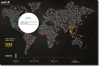
Aids Research
1 Dec 2009Interactive map of the activities of the amfAR organization in 2008.
Cost of Getting Sick
23 Nov 2009GE has put together an interactive toy for looking at how expensive different illnesses are at different ages. Use the slider at the bottom to pick the age. “Wedges are colored by chronic condition and wedge size (angle), represents the percentage of patients with the condition. Wedge length from center to edge is cost. The lightly colored portions are personal cost and the darkly colored are insurer cost.” (via FlowingData) Robert Kosara has a detailed critique of the chart over at eagereyes.
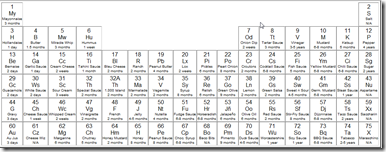
Table of Condiments that Periodically Go Bad
20 Nov 2009Too funny. (via Jon Peltier’s Periodic Table of What?)
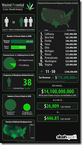
Marijuana Legalization
16 Nov 2009Infographic on potential tax receipts and savings. (via)
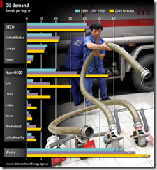
Oil Demand
13 Nov 20092012 is just a number
12 Nov 2009A fantastic graphic laying out the doomsday arguments for the believers AND the skeptics. Great work from Information is Beautiful (as usual).
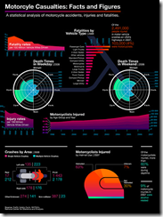
Motorcycle Fatalities
9 Nov 2009Stylized statistics (perhaps overly so). (via)
Asian Pentagon/Spoke
9 Nov 2009I like the idea of using spokes for different series, though it could be confusing. I have no idea why they included the same data as pie charts, unless just as an example of how much clearer bar-charts are. (via)
That Time of Month
In: Science
9 Nov 2009From an odd little website called “I Heart Guts” which appears to focus on our innards, comes this colorful infographic of the menstrual cycle.
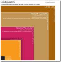
Dogs are Bad for the Environment
8 Nov 2009An odd graphic looking at the green footprint of pets; based on a New Scientist article.
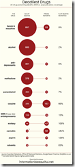
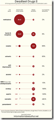
Deadly Drugs
8 Nov 2009Hurricane Tracker
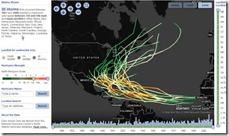
8 Nov 2009Another historical look at hurricanes. This one has a number of very interesting filters and sliders. I wish someone would do something like this for recessions (not on a map, obviously). (via Vizworld)
What is Chart Porn?
An addictive collection of beautiful charts, graphs, maps, and interactive data visualization toys -- on topics from around the world.
Categories
- Bailout (118)
- Chartporn Related (3)
- Commentary (21)
- Culture (669)
- Emerging Markets (66)
- Employment (245)
- Environment/weather (133)
- Finance (298)
- Food (92)
- Global Economy (373)
- Graphic Design (bad) (26)
- Graphic Design (general) (183)
- Graphic Tools (23)
- History (158)
- Housing (162)
- Humor (204)
- Innovative (183)
- Interactive (545)
- Internet/tech (97)
- Maps (578)
- News Media (34)
- Politics (329)
- Reference (97)
- Science (331)
- Source: Economist (101)
- Source: FT (92)
- Source: NYT (147)
- Source: Ritholtz (76)
- Source: USA Today (27)
- Source: Washington Post (90)
- Source: WSJ (135)
- Sports (58)
- Stock Market (74)
- Uncategorized (2)
- Updated regularly (76)
- US Economy (553)
- Video (22)
- Aram Korevaar: This chart is now being used as a projection in which countries such as China see themselves as in a [...]
- David: Welcome back Chart Porn! [...]
- J S: Thanks for the great story. Miss reading this blog. Hope to see you more active again. [...]
- jake: I lived in a DC row house for 6 years, and I'm writing this comment from my tiny 1 bedroom apartment [...]
- ronny pettersen: Hilarious and unfortunately accurate... ;-) [...]

