Science Archive:
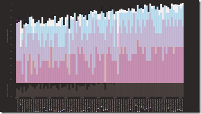
Music is Getting Louder
4 Jan 2010A Visual History of Loudness: Christopher Clark graphed the peak levels and RMS level of three hit songs from every year since 1979 to illustrate the rising use of compression in music production. Also on the chart is a nice discussion of dynamic space and perceived loudness. Related NPR article. Coincidentally, I just made an appointment with my ear doctor to get custom earplugs made.(Thank to Ben Chun for pointing out the article.)
True Odds of Airborne Terror
29 Dec 2009Some things I just don’t worry about. apparently with good reason. (via Gizmodo and C. Nguyen – Thanks!)
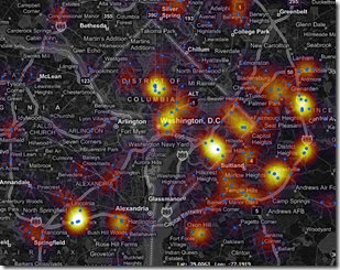
Collision Watch
18 Dec 2009Interactive map of fatal collisions in 2007. In the example below I’ve zoomed in on DC, but you can zoom around to any area you want. There are also some interesting filters.
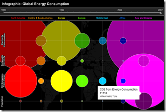
Global Energy Consumption
18 Dec 2009Interactive timeline of electricity, CO2, and population, 1980-2007. (via VizWorld)
Slot Machines
18 Dec 2009How they work. What are the odds. How your money disappears. Play a virtual version and watch it go. Click the tabs at the top for the stats behind the dials. (via FlowingData)
Why are Europeans White? Cereal?!
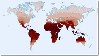
14 Dec 2009Using maps to investigate a simple puzzle. (via)
Four Degrees? So what?
14 Dec 2009Climate Anomalies, 2007-09
14 Dec 2009Global Warming Skeptics vs Consensus
10 Dec 2009Copenhagen
In: Environment/weather Interactive Maps Science Source: NYT
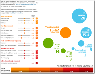
9 Dec 2009Personal Carbon Calculator
2 Dec 2009Modify your habits from the “average” and see how it impacts your footprint. Click on the ?’s to see what’s behind each category. There’s some discussion of the methodology here.
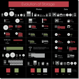
Evolution of Storage
In: Science
1 Dec 2009I might have preferred a uniform visual measure of size, but the information is interesting. Thanks to Mark and Chicho for pointing it out.
What is Chart Porn?
An addictive collection of beautiful charts, graphs, maps, and interactive data visualization toys -- on topics from around the world.
Categories
- Bailout (118)
- Chartporn Related (3)
- Commentary (21)
- Culture (669)
- Emerging Markets (66)
- Employment (245)
- Environment/weather (133)
- Finance (298)
- Food (92)
- Global Economy (373)
- Graphic Design (bad) (26)
- Graphic Design (general) (183)
- Graphic Tools (23)
- History (158)
- Housing (162)
- Humor (204)
- Innovative (183)
- Interactive (545)
- Internet/tech (97)
- Maps (578)
- News Media (34)
- Politics (329)
- Reference (97)
- Science (331)
- Source: Economist (101)
- Source: FT (92)
- Source: NYT (147)
- Source: Ritholtz (76)
- Source: USA Today (27)
- Source: Washington Post (90)
- Source: WSJ (135)
- Sports (58)
- Stock Market (74)
- Uncategorized (2)
- Updated regularly (76)
- US Economy (553)
- Video (22)
- Aram Korevaar: This chart is now being used as a projection in which countries such as China see themselves as in a [...]
- David: Welcome back Chart Porn! [...]
- J S: Thanks for the great story. Miss reading this blog. Hope to see you more active again. [...]
- jake: I lived in a DC row house for 6 years, and I'm writing this comment from my tiny 1 bedroom apartment [...]
- ronny pettersen: Hilarious and unfortunately accurate... ;-) [...]

