Science Archive:
Online Dating
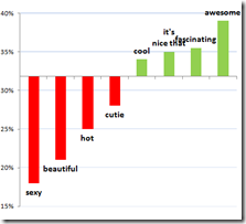
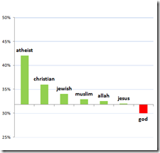
22 Jan 2010OkCupid has analyzed data, messages, and photos from it’s dating site and come up with some interesting (and highly entertaining) advice. Ok cupid articles: Photos; First Messages. (via Information is Beautiful).
What kind of picture should you post? 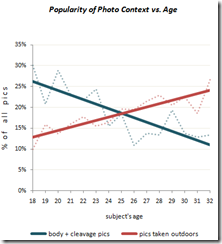
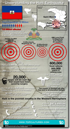
Understanding Haiti’s Earthquakes
20 Jan 2010Trends
In: Culture Environment/weather Global Economy Politics Science
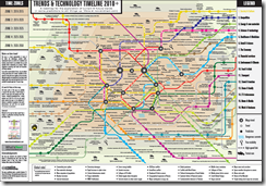
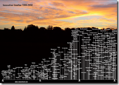
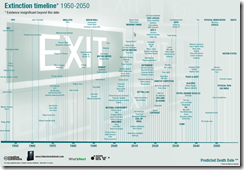
19 Jan 2010Nowandnext.com has a number of interesting timelines. Thanks to Sam Freund for pointing them out!
Haiti
In: Culture Environment/weather Global Economy Maps Science Source: NYT Source: USA Today Source: Washington Post Source: WSJ
15 Jan 2010Crazy amount of damage. and Haiti wasn’t in very good shape to start with. I’ll keep adding finds to this same post as I come across them.
I kept hearing that the shipping port was out of commission and was wondering what exactly that meant. Here it is. (via Washington Post print edition) 
Damage zone and location of aftershocks : 
Faultlines, cities, population density, shaking: 
Zoomable satellite map of Port-au-Prince from 10:30 Wednesday:
NYT side-by-side before and after satellite pictures: 
Auto Charts
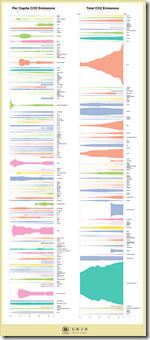
12 Jan 2010The UNEP GEO Data Portal has recently automated some chart production with a custom Illustrator script, for cross-country comparison purposes. The below example is for total CO2 emissions vs per capita. While I really like the waveform-type display aesthetically, I’m not sure of it’s analytical value compared to a bar chart.
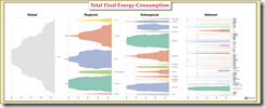
It works a little better here (Total Final Energy Consumption):
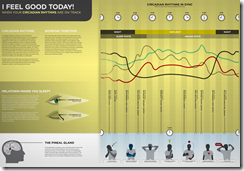
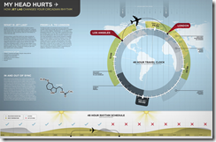
Circadian Rhythms
In: Science
12 Jan 2010Caffeine Delivery Vehicles
11 Jan 2010I don’t think most people realize that coffee usually has more than twice the caffeine of a Red Bull.
As much as I dislike pie charts, I like the simple information here and the popup detail mediates somewhat the radial perception issues.
Major Trends and Events 1750-2100
In: Culture Global Economy History Politics Reference Science
8 Jan 2010Would make a good poster. Some of the predictions are questionable, of course. (via)
Climate Wizard
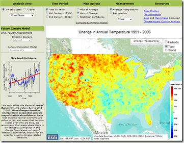
6 Jan 2010Take a look at temperature changes over the past 50 years, then select from several different models to simulate changes for the next 100. Produced by the Nature Conservancy, University of Washington, and University of Southern Mississippi, the amount of detail and explanation is welcome versus some of the more popular projection maps out there. (via)
Expiring Patents
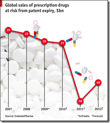
5 Jan 2010A RECORD number of drug patents will expire over the next few years, which should heighten competition from generic drugs and force down prices. In 2009, $26 billion of sales were at risk from patent expiries. This will nearly double in 2011 according to EvaluatePharma, a consultancy. The price of any given drug falls by more than 85% within a year of a patent expiring in markets like America. About 13% of global drug sales are at risk from generic competition over the next two years.
Visual Dictionary
4 Jan 2010Visuwords: An interactive visual representation of the relationships between words. (via The Big Picture)
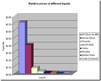
This chart illustrates why I want to buy a laser printer. BoingBoing has a discussion of whether it’s a fair comparison. Thanks to Cookie for pointing it out to me!
What is Chart Porn?
An addictive collection of beautiful charts, graphs, maps, and interactive data visualization toys -- on topics from around the world.
Categories
- Bailout (118)
- Chartporn Related (3)
- Commentary (21)
- Culture (669)
- Emerging Markets (66)
- Employment (245)
- Environment/weather (133)
- Finance (298)
- Food (92)
- Global Economy (373)
- Graphic Design (bad) (26)
- Graphic Design (general) (183)
- Graphic Tools (23)
- History (158)
- Housing (162)
- Humor (204)
- Innovative (183)
- Interactive (545)
- Internet/tech (97)
- Maps (578)
- News Media (34)
- Politics (329)
- Reference (97)
- Science (331)
- Source: Economist (101)
- Source: FT (92)
- Source: NYT (147)
- Source: Ritholtz (76)
- Source: USA Today (27)
- Source: Washington Post (90)
- Source: WSJ (135)
- Sports (58)
- Stock Market (74)
- Uncategorized (2)
- Updated regularly (76)
- US Economy (553)
- Video (22)
- Aram Korevaar: This chart is now being used as a projection in which countries such as China see themselves as in a [...]
- David: Welcome back Chart Porn! [...]
- J S: Thanks for the great story. Miss reading this blog. Hope to see you more active again. [...]
- jake: I lived in a DC row house for 6 years, and I'm writing this comment from my tiny 1 bedroom apartment [...]
- ronny pettersen: Hilarious and unfortunately accurate... ;-) [...]

