Science Archive:
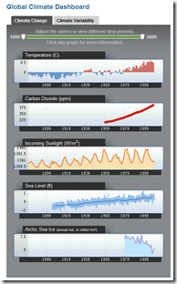
Global Climate Dashboard
17 Feb 2010From NOAA. Nice quick display of data and indices.
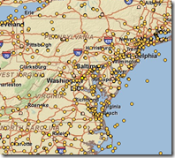
They also have an interactive Map of weather stations from which you can download raw data:
Depths of the Ocean
In: Science
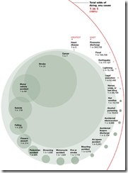
15 Feb 2010The scale of the ocean. I couldn’t find the original image, but Reddit has a long discussion on the graphic’s accuracy (as usual).
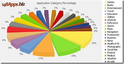
How Much Pie Charts Suck (in 3D!)
5 Feb 2010Jon Peltier executes another one of his wonderful critiques/rants about the uselessness of pie charts.
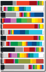
What Color are Words?
1 Feb 2010Cymbolism.com creates graphs based on surveys of what colors people associate with different words. The blog has a lot of interesting articles about color theory, cultural differences, etc. (via)
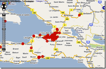
Crowdsourcing Crisis Management
31 Jan 2010Several articles about the Ushahidi system : TED blog. Washington post. Guardian.
Winter Weather – ummmm and More Weather
In: Environment/weather Interactive Maps Science Source: USA Today
29 Jan 2010I think most of us absorbed this in earth science class, but if you need a refresher on how different air layers create different types of precipitation, here it is. (Also, the animations are quite pretty).
Looking around the site it turns out this is just one in a very large series of weather related interactives. Check it out. Some very cool stuff, including my hometown favorite: Lake Effect Snow (Irondequoit, NY).
Electromagnetic Spectrum
In: Science
28 Jan 2010I like all the explanatory boxes on the side.
Of course, there’s the slightly less scientific, but more memorable xkcd version:
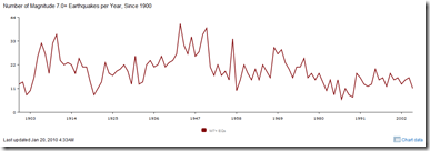
Large Earthquakes 1990-2005
25 Jan 2010Stages of a Photographer
25 Jan 2010Accurate and hilarious. (via DataViz)
What is Chart Porn?
An addictive collection of beautiful charts, graphs, maps, and interactive data visualization toys -- on topics from around the world.
Categories
- Bailout (118)
- Chartporn Related (3)
- Commentary (21)
- Culture (669)
- Emerging Markets (66)
- Employment (245)
- Environment/weather (133)
- Finance (298)
- Food (92)
- Global Economy (373)
- Graphic Design (bad) (26)
- Graphic Design (general) (183)
- Graphic Tools (23)
- History (158)
- Housing (162)
- Humor (204)
- Innovative (183)
- Interactive (545)
- Internet/tech (97)
- Maps (578)
- News Media (34)
- Politics (329)
- Reference (97)
- Science (331)
- Source: Economist (101)
- Source: FT (92)
- Source: NYT (147)
- Source: Ritholtz (76)
- Source: USA Today (27)
- Source: Washington Post (90)
- Source: WSJ (135)
- Sports (58)
- Stock Market (74)
- Uncategorized (2)
- Updated regularly (76)
- US Economy (553)
- Video (22)
- Aram Korevaar: This chart is now being used as a projection in which countries such as China see themselves as in a [...]
- David: Welcome back Chart Porn! [...]
- J S: Thanks for the great story. Miss reading this blog. Hope to see you more active again. [...]
- jake: I lived in a DC row house for 6 years, and I'm writing this comment from my tiny 1 bedroom apartment [...]
- ronny pettersen: Hilarious and unfortunately accurate... ;-) [...]

