Science Archive:
Measurements
In: Science
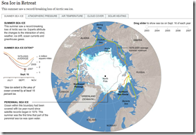
28 Mar 2010Sea Ice in Retreat?
In: Environment/weather Interactive Maps Science Source: NYT
25 Mar 2010I really liked the below NYT feature until I realized it was from 2007.
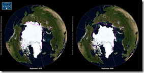
Looking around, I found this quicktime movie that shows 1979-2009:
So 2007 was a bad year, but now it’s rebounding? Well, not really.
So is it melting or not? I recommend watching the below:
Life Expectancy in America
25 Mar 2010Periodic Table of Periodic Tables
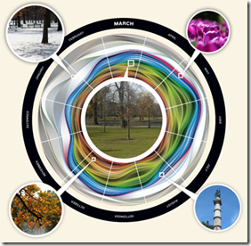
24 Mar 2010Seasonal Flickr Colors
19 Mar 2010The graphic presents Flickr pictures of Boston Commons by color. March is at top, time progressing clockwise. I’d love to see this for a wider range of locations. (via Mark McDonald)
Most Common Flag Colors
14 Mar 2010Used a python script to analyze the colors of the the world’s flags. Not to be confused with this earlier post which weighed it’s colors by population.
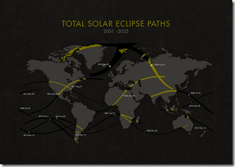
Solar Eclipse Map 2001-25
14 Mar 2010Google Public Data Explorer
In: Employment Global Economy Graphic Design (general) Innovative Maps Reference Science
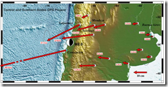
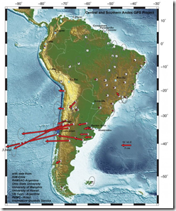
9 Mar 2010Based on GPS data, the entire city of Concepcion moved 10 feet to the west. Note that in the maps below the arrow scale and map scale are different – it looks a little odd at first, but makes sense.
137 Years of Popular Science
9 Mar 2010Popular Science magazine has partnered with Google to make available it’s entire archive. Keyword searches bring up an entire month/issue with your search result highlighted. It looks they have OCR’d every page, making for some cool search results. (via)
For example, a search of “map” brought up this map of US science sites from 1967:
and this first air-map of the north pole from 1931:
“Chart” brings up radiological diagrams from 1950 (among many many others)
What is Chart Porn?
An addictive collection of beautiful charts, graphs, maps, and interactive data visualization toys -- on topics from around the world.
Categories
- Bailout (118)
- Chartporn Related (3)
- Commentary (21)
- Culture (669)
- Emerging Markets (66)
- Employment (245)
- Environment/weather (133)
- Finance (298)
- Food (92)
- Global Economy (373)
- Graphic Design (bad) (26)
- Graphic Design (general) (183)
- Graphic Tools (23)
- History (158)
- Housing (162)
- Humor (204)
- Innovative (183)
- Interactive (545)
- Internet/tech (97)
- Maps (578)
- News Media (34)
- Politics (329)
- Reference (97)
- Science (331)
- Source: Economist (101)
- Source: FT (92)
- Source: NYT (147)
- Source: Ritholtz (76)
- Source: USA Today (27)
- Source: Washington Post (90)
- Source: WSJ (135)
- Sports (58)
- Stock Market (74)
- Uncategorized (2)
- Updated regularly (76)
- US Economy (553)
- Video (22)
- Aram Korevaar: This chart is now being used as a projection in which countries such as China see themselves as in a [...]
- David: Welcome back Chart Porn! [...]
- J S: Thanks for the great story. Miss reading this blog. Hope to see you more active again. [...]
- jake: I lived in a DC row house for 6 years, and I'm writing this comment from my tiny 1 bedroom apartment [...]
- ronny pettersen: Hilarious and unfortunately accurate... ;-) [...]

